Most Shopify merchants use about 20% of what their theme can actually do. That's not a criticism — it's just the reality of running a business. You install a theme, set up the basics, get your products loaded, and move on to the hundred other things demanding your attention. The customizer becomes something you open when you need to swap a banner image or change a heading, not a tool you sit down with and explore.
But here's the thing: that customizer is where your theme lives. Every visual decision, every layout choice, every small detail that shapes how your store feels to a customer — it's all controlled from that sidebar. And the difference between a store that looks like a slightly modified template and one that feels like a fully realized brand often comes down to how deeply someone has explored what's already available to them.
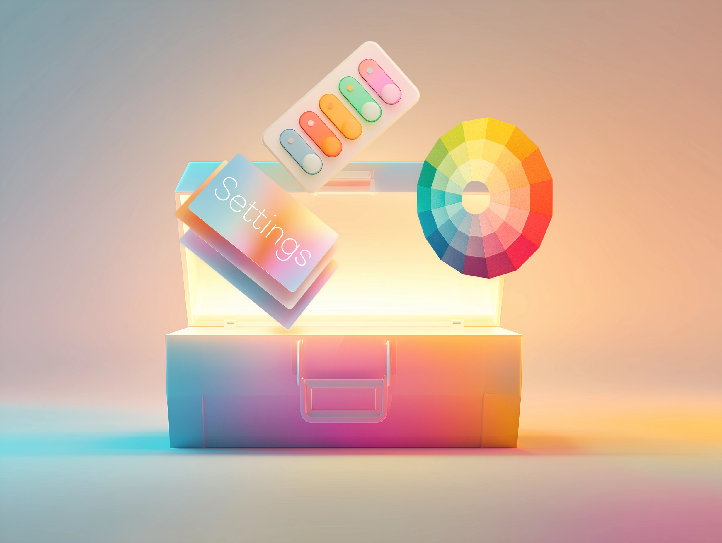
This guide isn't about code. It's about learning to see your theme's customizer not as a settings panel, but as a design tool — and using it to build a store that actually looks and feels like yours.
Understanding how the customizer actually works
Before you start changing things, it helps to understand the structure you're working with. Shopify's theme customizer is built around a simple hierarchy: your store has pages, pages have sections, and sections have blocks. Everything you see on your storefront maps to something in that hierarchy, and once you internalize that relationship, the whole system starts to feel intuitive rather than overwhelming.
Theme settings are the global controls. These are the decisions that affect your entire store at once — your color palette, your typography, your logo, your favicon, your social media links, your cart behavior. Think of these as the DNA of your brand's visual identity within the theme. Changes here ripple across every page without you having to touch individual sections.
Sections are the building blocks of each page. A hero banner is a section. A featured collection grid is a section. A testimonial carousel, a newsletter signup, an image with text overlay — all sections. Since Shopify's Online Store 2.0 architecture, you can add, remove, and rearrange sections on any page, not just the homepage. This is a powerful capability that many merchants underuse, sticking with whatever sections came pre-loaded in the demo.
Blocks are the elements within sections. A slideshow section might contain individual slide blocks. A multi-column section contains column blocks. Some themes support universal blocks that can be dropped into almost any section — a heading, a button, an image, a video — giving you compositional freedom that goes well beyond what the section was originally designed for.
The customizer isn't a settings panel — it's a design tool. The more fluent you become with it, the less you'll need a developer.
Start with your theme settings — they matter more than you think
Most merchants rush through theme settings during initial setup and never revisit them. That's a missed opportunity, because these global controls are where you establish the visual foundation that everything else builds on. Getting them right — really right — can transform how your entire store feels.
Color schemes
Modern themes don't just give you a single color palette. They offer multiple color schemes — sometimes called "color presets" or "color groups" — that you can assign to individual sections throughout your store. This means your homepage hero can use a dark, dramatic palette while your product sections use a clean, light one, all within a cohesive system. The key is to set these up intentionally, not just accept the defaults. Define a primary scheme for most of your content, a contrasting scheme for sections you want to emphasize, and perhaps an accent scheme for calls to action or promotional areas.
Typography
Your font choices communicate as much about your brand as your logo does — maybe more, since customers encounter your typography on every page. Most themes let you set separate fonts for headings and body text, along with controls for size, weight, and letter spacing. A common mistake is choosing decorative or display fonts for body text, which hurts readability. Keep body text clean and legible. Save personality for your headings, and use size and weight differences to create clear visual hierarchy.
Spacing and layout
Many premium themes offer global spacing controls — adjustments to the vertical rhythm between sections, the padding within sections, or the overall content width. These settings are subtle but powerful. Increasing vertical spacing between sections gives your store a more open, premium feel. Tightening it creates a denser, more editorial layout. The right choice depends on your brand, but the important thing is that it is a choice, not an accident.
A quick exercise: Open your theme settings and go through every single option, even the ones you set during initial setup. You'll almost certainly find controls you didn't know existed — and at least a few that will make a noticeable difference.
Thinking strategically about sections
Sections are where most of the creative work happens in the customizer. And the most common mistake merchants make isn't choosing the wrong sections — it's not realizing how many options they have.
Open your customizer on any page and click "Add section." Scroll through the full list. If you're using a well-built theme, you'll likely find dozens of section types you've never tried. Image banners, video backgrounds, scrolling announcements, comparison tables, countdown timers, tabbed content areas, collapsible FAQ sections, shoppable lookbooks, editorial timelines — the library is almost always deeper than merchants expect.
The strategic question isn't "which sections look cool?" It's "what does my customer need on this page, and which section best delivers it?" Your homepage, for example, has one job: orient the visitor and move them toward a product or collection. Every section should serve that goal. A hero banner establishes your brand. A featured collection shows your best sellers. A testimonial section builds trust. An image with text block tells your story. If a section doesn't serve a clear purpose, it's just adding load time.
Page-specific customization
One of the most powerful features of Online Store 2.0 is the ability to customize pages beyond the homepage. Your collection pages, product pages, and even your blog posts can all have unique section layouts. A collection page for a premium product line might benefit from a full-width image banner at the top, setting the mood before the products appear. A product page for a complex item might include a comparison table or a detailed feature breakdown section below the main product information. These aren't hypothetical — they're configurations you can build entirely within the customizer.
Section ordering and flow
The order of your sections creates a narrative. Think about the emotional journey you want a visitor to take. On a homepage, that might be: inspiration (hero image) → social proof (press mentions or reviews) → exploration (featured collections) → trust (brand story or values) → action (newsletter signup or promotional offer). On a product page, the flow might be: product details → social proof (reviews) → complementary products → brand reassurance (shipping info, return policy). Drag your sections into an order that tells a story, not one that just fills space.
The section settings most merchants overlook
Every section in your theme has its own settings panel, and most merchants interact with only the obvious ones — the image field, the heading, the button text. But the real customization power lives in the settings you scroll past.
Color scheme overrides
Most modern themes let you assign a different color scheme to each individual section. This is incredibly useful for creating visual rhythm on a page. Alternating between light and dark sections breaks up the content naturally and guides the eye. A dark section in the middle of a light page draws attention. A warm-toned section creates a moment of intimacy. Use this deliberately — it's one of the most effective ways to make a page feel designed rather than assembled.
Spacing controls
Many sections offer individual padding adjustments — the ability to increase or decrease the space above and below that specific section. This is how you create visual breathing room between dense content areas, or tighten up sections that belong together conceptually. Two related sections with minimal spacing between them feel like a unit. A section with generous padding above and below feels like a standalone statement.
Visibility and conditional display
Some themes allow you to control whether a section appears on desktop, mobile, or both. This is valuable when you have content that works well at one screen size but not the other. A complex multi-column layout might be perfect on desktop but cramped on mobile — hide it on mobile and replace it with a simpler, stacked alternative. This kind of responsive curation is what separates a thoughtful mobile experience from one that's just a narrower version of the desktop site.
The difference between a store that looks templated and one that feels custom often comes down to how someone used the settings that were already there.
Making the most of your product page
The product page is where purchases happen — or don't. It's the single most important template in your store, and the customizer gives you more control over it than most merchants realize.
Start with the product form itself. Most themes offer options for how variant selectors are displayed — dropdowns versus buttons versus color swatches. If you sell products with visual variants like color, swatches are almost always the better choice. They reduce friction by letting customers see their options without clicking through a dropdown. Size selectors as buttons let customers scan available sizes at a glance.
Look at your product image gallery settings. How many images display before the customer needs to scroll or click? Is there a zoom feature? Can you enable video within the gallery? If your products benefit from being seen from multiple angles or in motion, make sure your gallery settings support that. The default configuration is rarely the optimal one.
Below the main product information, consider what additional sections will help close the sale. A collapsible content section with tabs for "Details," "Shipping," and "Returns" keeps important information accessible without cluttering the page. A related products section keeps customers browsing if this particular product isn't the right fit. A reviews section provides social proof at the moment of decision. These are all configurable in the customizer — you just need to add them.
Pro tip: Create a product page template specifically for your best-selling or highest-margin products. Give it extra sections — a lifestyle image banner, a detailed feature breakdown, an FAQ — that you wouldn't include on every product. Then assign that template to the products that deserve the extra attention. Shopify lets you create multiple product page templates, each with its own section layout.
Using templates to create different page experiences
Templates are one of the most underused features in the Shopify customizer. By default, every product page uses the same template, every collection page uses the same template, and every standard page uses the same template. But you can create alternatives — and assign them to specific pages, products, or collections.
Imagine you have a flagship product line that deserves a premium presentation. Create a new product template with a full-width hero image at the top, an expanded product gallery, a brand story section, and a curated "complete the look" collection at the bottom. Assign that template to your hero products. Your standard products keep the default template. Same theme, completely different experiences — no code required.
The same logic applies to collection pages. A "New Arrivals" collection might benefit from a different layout than your "Sale" collection. A "Gift Guide" page could have editorial sections between product grids, creating a more curated, magazine-like browsing experience. Templates give you this flexibility within the customizer.
To create a new template, open the customizer, use the page selector at the top, and look for the option to create a new template. Give it a descriptive name — "product-premium" or "collection-editorial" — so you can easily identify it when assigning it to specific pages later in the Shopify admin.
Don't neglect your header and footer
The header and footer are on every page of your store, which makes them the most viewed — and often the least optimized — parts of the entire site. Small improvements here compound across every visit.
Your header navigation is how customers move through your store. If it's cluttered, confusing, or poorly organized, every other optimization you make is undermined. Review your menu structure in the customizer. Are your top-level categories clear and scannable? Do dropdown menus group items logically? If your theme supports a mega menu, use it to showcase key collections with images, not just links. A visual navigation experience helps customers find what they want faster and makes your store feel more polished.
For the footer, think about what information a customer might need after scrolling through an entire page and not finding what they wanted. Quick links to customer service, FAQ, shipping info, and your return policy belong here. So does a newsletter signup if you have one. Social media links give customers another way to connect with your brand. A well- organized footer isn't exciting, but it's a trust signal — it tells customers that your store is professional, complete, and attentive to details.
Always preview on mobile
The customizer includes a device preview toggle — typically at the top of the screen — that lets you switch between desktop, tablet, and mobile views. Use it constantly. Not occasionally, not when you remember. Every time you make a change, check how it looks on mobile.
This matters because the majority of your customers are on their phones. A beautifully arranged three-column layout on desktop might stack into an awkward, endlessly scrolling column on mobile. A heading that looks perfectly sized on a wide screen might dominate the entire viewport on a phone. An image that has just the right amount of breathing room on desktop might feel cramped or get cropped badly on smaller screens.
Some settings only affect one device size. Many themes let you set different column counts for desktop and mobile separately. Some let you hide specific blocks or even entire sections on mobile. Take advantage of these controls. The goal isn't to make mobile look like a shrunken desktop — it's to create an experience that feels native to a smaller screen.
Go beyond the preview: The customizer's mobile preview is helpful but not perfect. After making changes, open your actual store on your phone and browse it like a customer would. Tap, scroll, add something to cart. You'll catch things the preview can't show you — like how a button feels under your thumb or whether the text is actually readable at arm's length.
Common mistakes to avoid
Even with good intentions, there are a few patterns that consistently lead merchants astray in the customizer.
Using every section available. Just because your theme offers 50 sections doesn't mean your homepage needs 15 of them. Every section you add increases load time and extends the scroll. Be selective. A focused page with six well-chosen sections will outperform a sprawling one with twelve every time — both in performance and in conversions.
Ignoring the defaults. Theme developers set default values for a reason — they represent a considered starting point. But defaults are starting points, not destinations. If you never change the default heading sizes, the default section spacing, or the default color scheme assignments, your store will look like every other store using the same theme. Take the time to make it yours.
Inconsistent styling. When you override color schemes and spacing on a per-section basis, it's easy to lose consistency. One section has extra padding, another doesn't. One uses your accent scheme, two others use slight variations. Step back periodically and look at your pages as a whole. The goal is variety with coherence — different sections that clearly belong to the same brand.
Forgetting about empty states. What happens when a collection has no products? What does your search results page look like with no results? What about the cart when it's empty? These states are often configurable in the customizer, and they matter more than you think. An empty cart page with a thoughtful message and a link back to your collections is a recovery opportunity. A blank one is a dead end.
The customizer is an ongoing practice
The biggest shift you can make is to stop thinking of the customizer as something you configure once during setup and then leave alone. Your store is a living thing. Your product catalog changes. Seasons shift. Promotions come and go. Your understanding of what your customers respond to deepens over time. The customizer should evolve with all of that.
Set a recurring reminder — monthly, quarterly, whatever works for your business — to spend thirty minutes in the customizer. Not fixing things. Exploring. Try a section you haven't used before. Experiment with a different color scheme on a key page. Adjust the spacing on your product page and see if it changes how the page feels. Create a new template for an upcoming collection launch.
The merchants who get the most from their themes aren't the ones who hire developers for every change. They're the ones who develop fluency with the tools they already have. The customizer is the most powerful tool in your Shopify toolkit. Learn it well, and you'll be surprised how far it takes you — without writing a single line of code.