A product listing tells your customer what something is. A product story tells them why it matters. That distinction — between information and feeling — is the difference between a store that sells and a store that connects. And in an online environment where your customer can't pick something up, turn it over in their hands, or ask a salesperson about it, the way you present your products visually is often the only story they'll get.
Visual storytelling isn't a marketing buzzword. It's the practice of using imagery, layout, motion, and composition to create an emotional experience around your products — one that goes deeper than specifications and pricing. It's what separates the stores that feel like curated experiences from the ones that feel like searchable databases. And it's more accessible than most merchants realize, because the tools to do it well are already built into modern Shopify themes. You just have to know how to use them.
Why story matters more than specs
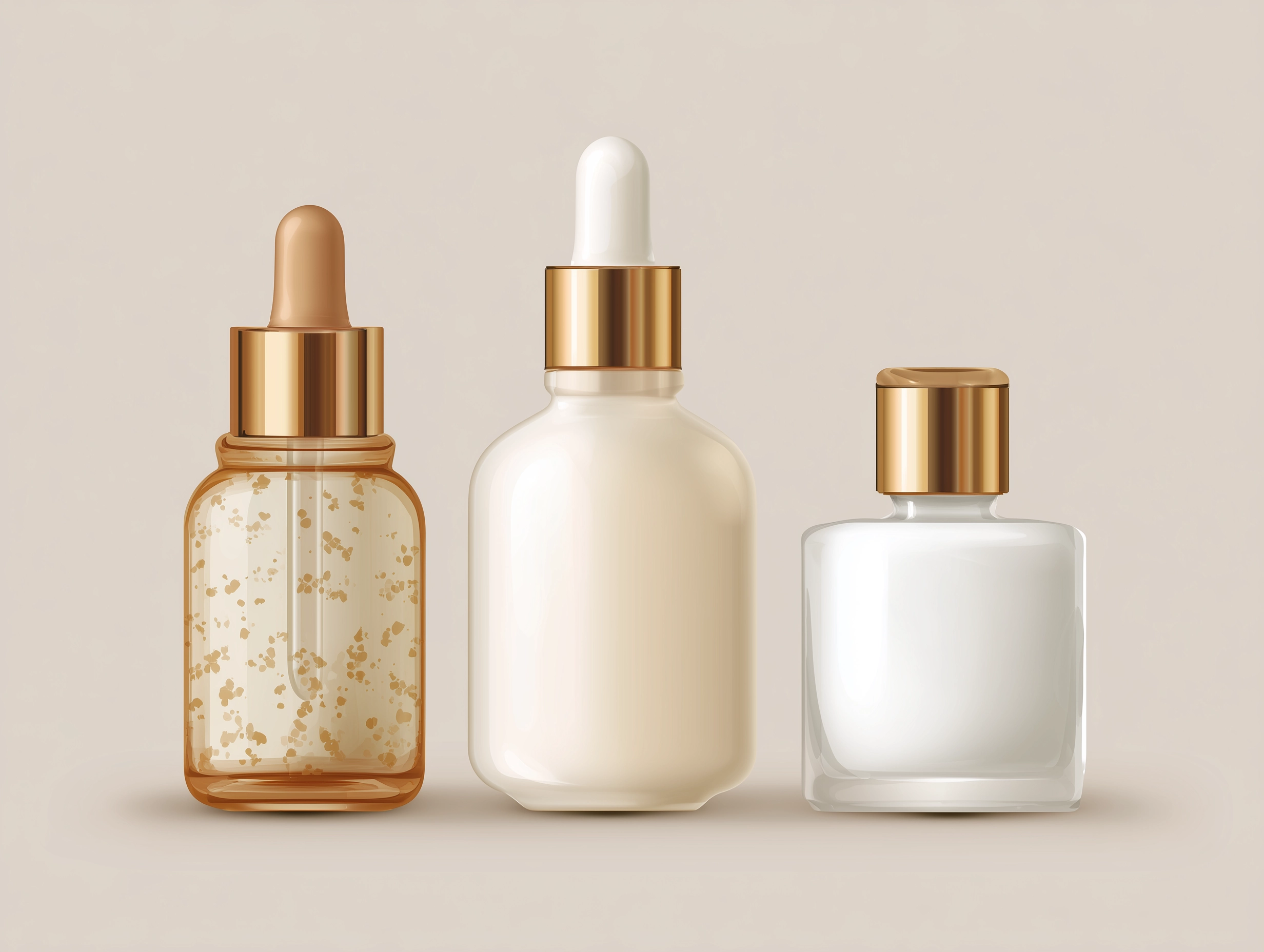
People don't buy products. They buy the version of their life that includes the product. A candle isn't wax and a wick — it's a quiet evening, a warm room, a feeling of calm. A leather bag isn't stitching and hardware — it's confidence walking into a meeting, the smell of something well-made, the knowledge that it'll look better in five years than it does today. The merchants who understand this — and who build their storefronts around it — consistently outperform those who don't.
This isn't about being manipulative or aspirational in a way that feels hollow. It's about context. When a customer sees a product on a white background with a title and a price, they're evaluating it analytically. They're comparing. They're looking for reasons not to buy. But when they see that same product in a setting — styled on a table, held by a person, part of a scene that reflects how it might actually fit into their life — something shifts. The decision becomes less about logic and more about desire. And desire is what drives purchases.
The best product photography doesn't show customers what something looks like. It shows them what it feels like to own it.

Research consistently shows that consumers process images 60,000 times faster than text. In a medium where you have roughly three seconds to capture someone's attention before they bounce, that speed matters. Your visuals aren't supporting your copy — they're doing the heavy lifting. The copy supports them.
The hero moment: your store's first impression
The first thing a customer sees when they land on your store sets the tone for everything that follows. This is your hero moment — the full-width image or video at the top of your homepage that either pulls someone in or lets them scroll past. And yet, it's one of the most underutilized opportunities in e-commerce.
A strong hero section isn't a banner ad. It's an invitation. The best ones use a single, striking image — or a looping video — that communicates your brand's identity in an instant. Not a product shot. Not a promotional graphic. A feeling. A lifestyle photograph that makes someone think, "this brand gets me." The headline and call-to-action should be minimal and purposeful, guiding the visitor without competing with the visual.
Modern themes handle this well when they offer hero sections with full-bleed imagery, video backgrounds, and thoughtful control over text placement and overlay opacity. The ability to adjust how text sits over an image — its position, its contrast against the background, its size on mobile versus desktop — is what separates a hero that looks intentional from one that looks like a template. Themes like Boardwalk, for instance, treat the hero as a compositional canvas, giving merchants control over layout alignment, color scheme coordination, and mobile-specific cropping so the visual impact translates across every screen size.
If your hero section uses a slideshow, be intentional about it. Multiple slides can work beautifully when each one tells a different chapter of the same story — a seasonal collection, a brand campaign, a curated edit. But they fall flat when they feel like a rotating banner ad. The key is cohesion: consistent photography style, a shared color palette, transitions that feel smooth rather than jarring. Auto-advancing slides should move slowly enough for the visitor to absorb each one, and the navigation should make it easy to go back to something that caught their eye.
Beyond the product grid
The standard product grid — rows of evenly spaced product cards — is functional. It's efficient. And it's the visual equivalent of a spreadsheet. For some stores, that's fine. If you sell commodity products where comparison shopping is the primary behavior, a clean grid does the job. But if your brand has a visual identity, if your products have texture and character, if the way something looks is part of why someone buys it — the grid alone isn't enough.
Visual storytelling happens in the spaces between your product pages. It's the editorial sections on your homepage that give context to a collection. It's the lifestyle gallery that shows your products in use, not just in isolation. It's the split content layouts that pair a beautiful image with a short piece of copy that tells the story behind a material, a process, or a design decision.
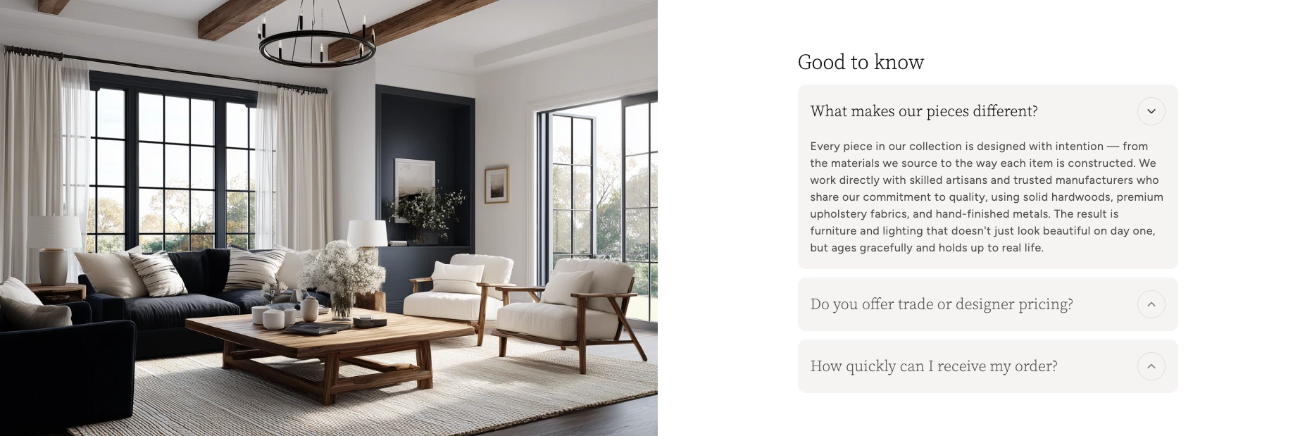
Split content and editorial layouts
One of the most versatile storytelling tools in any theme is the split content section — a two-column layout that places an image alongside text. It sounds simple, and it is. But simplicity is exactly why it works. A well-composed photograph on one side and a few lines of thoughtful copy on the other can communicate more about your brand than an entire About page. Use it to explain your sourcing. To introduce a maker. To describe why a particular fabric was chosen. These are the details that build trust and emotional connection, and they deserve a layout that gives them room to breathe.
The best implementations let you control which side the image falls on, how the content is vertically aligned, and whether the image is contained within the grid or bleeds to the edge of the screen. That last detail matters more than you'd think — a full-bleed image feels immersive and editorial, while a contained image feels more structured and informational. Alternating between the two as you scroll down a page creates a visual rhythm that keeps the visitor engaged.
Gallery sections
A gallery section is your opportunity to let your photography do the talking without the structure of product cards or the linearity of a grid. Think of it as a mood board embedded directly in your store. The strongest gallery implementations offer flexible grid arrangements — mixing image sizes, aspect ratios, and column counts — so you can create compositions that feel curated rather than automated. Some even support lightbox functionality, letting visitors tap into a full-screen view of each image without leaving the page.
Use galleries strategically. A lookbook gallery at the top of a seasonal collection page establishes the mood before a customer starts browsing individual products. A behind-the- scenes gallery on your About page humanizes your brand. A gallery of user-generated content — customers wearing or using your products — provides social proof that no amount of professional photography can replicate.
Making the story shoppable
The most powerful visual storytelling doesn't just inspire — it converts. And the gap between "I love this" and "I bought this" is often just a matter of friction. If a customer sees a beautiful lifestyle image and has to go hunting through your catalog to find the product in it, you've lost the moment. The best e-commerce experiences eliminate that gap entirely.
Product hotspots
Imagine a lifestyle photograph of a beautifully styled living room. A customer's eye is drawn to the throw blanket draped over the sofa. In a traditional store, they'd have to leave the image, navigate to the right collection, and scroll through products hoping to find it. With product hotspots, they tap a small indicator on the blanket and get an instant preview — the product name, the price, a link to buy. The inspiration and the transaction happen in the same moment.
This is one of the most effective storytelling-to-commerce bridges available in modern themes. Hotspot sections let you upload a lifestyle image, place interactive markers on specific products within it, and connect each marker to a product in your catalog. The customer never has to leave the scene. They're shopping inside the story. Boardwalk's implementation of this is particularly well-considered — each hotspot connects directly to a Shopify product, complete with variant information and pricing, so the experience feels native rather than bolted on.
Shoppable video
Video has become the dominant content format across the internet, and e-commerce is no exception. But there's a difference between having a product video on your product page and having a shoppable video experience on your homepage. The latter lets customers watch a brand video — a campaign film, a behind-the-scenes reel, a styling tutorial — while product cards appear alongside or overlay the video, allowing them to add items to their cart without pausing, leaving, or breaking the flow.
This is storytelling at its most direct. The video provides the emotion, the context, the aspiration. The product cards provide the action. Together, they create an experience that feels more like shopping on Instagram or TikTok than browsing a traditional e-commerce site — which is exactly the behavior modern consumers are conditioned for. The themes that handle this best support both self-hosted video and external sources, give you control over product card placement and timing, and ensure the experience is smooth on mobile where most video consumption happens.
The best shoppable experiences don't feel like shopping at all. They feel like discovering something you didn't know you wanted — and being able to act on it immediately.
Building your brand narrative into the page
Every brand has a story. The question is whether your storefront is telling it, or whether that story lives exclusively on your Instagram bio and your About page. The most compelling stores weave their narrative into the fabric of the shopping experience itself — not as a detour the customer has to opt into, but as something they absorb naturally while they browse.
Timelines and origin stories
If your brand has a meaningful history — a founding story, a journey from idea to product, a set of milestones that shaped who you are — a timeline section can communicate that with elegance and economy. Rather than burying this information in paragraphs of text on an About page that most visitors will never read, a well-designed vertical timeline presents your story as a visual journey. Each milestone gets its own moment — an image, a date, a short description — and the visitor scrolls through it like chapters in a book.
This works especially well for brands with a craft or heritage angle. A pottery studio can walk visitors through the evolution of their glazing techniques. A coffee roaster can show the journey from farm to cup. A fashion label can trace the development of a signature silhouette across seasons. The timeline format turns what could be a wall of text into something genuinely engaging — and it builds the kind of depth and credibility that justifies premium pricing.
Testimonials as social narrative
Customer testimonials are often treated as a trust element — a block of star ratings and quotes dropped somewhere on the page to reassure hesitant buyers. And they do serve that function. But thoughtfully presented testimonials are also a form of storytelling. Each review is a micro-narrative about how your product showed up in someone's life and what it meant to them.
The most effective testimonial sections go beyond plain text. They pair quotes with customer photos, connect reviews to specific products, and present them in a format — a carousel, a featured grid — that feels editorial rather than functional. When a potential customer reads a review that's visually connected to the product being discussed, with a star rating and a direct link to purchase, the social proof and the commercial opportunity are perfectly aligned.
Showing the difference: comparison and detail
Some products tell their story through differentiation. A skincare brand's narrative might hinge on before-and-after results. A home renovation company might want to show the transformation. A furniture maker might need to communicate the difference between their handcrafted piece and a mass-produced alternative. For these stories, static images side by side can work — but interactive comparison is far more powerful.
Comparison slider sections let visitors drag a handle across an image to reveal two states — before and after, with and without, old and new. It's an inherently engaging interaction because the visitor is in control of the reveal. They're not passively viewing a comparison; they're actively exploring it. That sense of agency creates a deeper connection to the content and, by extension, to the product.
This works for more than just before-and-after shots. Use it to compare a product in two colorways. To show a space with and without your product styled into it. To reveal the interior construction of something whose quality isn't visible from the outside. The slider becomes a storytelling device that turns a static claim — "our product is better" — into something the customer can see and feel for themselves.
A practical note: Interactive elements like comparison sliders and product hotspots are most effective when they're used sparingly and intentionally. One well-placed comparison slider on a landing page tells a story. Five of them on the same page feel like a gimmick. Let each interactive moment earn its place.
Giving individual products the spotlight
Not every product in your catalog carries the same weight. Some are flagship items. Some are new arrivals you want to build buzz around. Some are bestsellers that deserve more real estate than a standard card in a collection grid. Featured product sections exist for exactly this purpose — they give a single product the kind of dedicated, editorial treatment that communicates importance.
A strong featured product section goes well beyond a larger image and a buy button. It includes a full image gallery — multiple angles, lifestyle context, detail shots — alongside the product description, variant selection, and purchase options. It might incorporate complementary product suggestions, size guides, or trust badges. The effect is something closer to a magazine product feature than a standard product page, and it can live anywhere in your store — on the homepage, on a landing page, within a blog post.
This matters for storytelling because it lets you control the narrative around your most important products. Instead of letting every product compete equally in a grid, you're curating the experience. You're saying, "this one is special, and here's why." That editorial confidence translates directly to perceived value.
Maintaining the narrative across the journey
Visual storytelling isn't just about individual sections or pages — it's about the continuity of the experience as a customer moves through your store. The mood you set on the homepage should carry through to the collection page, the product page, the cart, and beyond. Every touchpoint is a chapter in the same story, and inconsistency breaks the spell.
This is where details like color scheme consistency, typography choices, and photography style become critical. If your homepage feels warm and editorial but your product pages feel clinical and sparse, you've introduced a narrative discontinuity that erodes the emotional connection you worked so hard to build. The same applies to interactive elements — if your homepage uses smooth scroll animations and your collection pages feel static and flat, the experience feels disjointed.
Even functional elements can contribute to narrative continuity. A recently viewed products section, for example, isn't just a convenience feature — it's a reminder of the story the customer has already been telling themselves. It says, "remember this piece you were drawn to?" and gently pulls them back into the browsing experience. When styled consistently with the rest of your store — same card design, same image treatment, same typographic hierarchy — it feels like a natural part of the journey rather than an afterthought.
Consistency isn't about being repetitive. It's about being coherent — so every page your customer visits feels like part of the same world.
Photography principles that drive the story
No amount of clever theme design can compensate for poor photography. The sections and layouts we've discussed are containers — they give your visuals structure and context. But the visuals themselves are what carry the emotional weight. A few principles go a long way.
Show context, not just product
For every product shot on a white background, you should have at least one lifestyle shot that shows the product in use, in a setting, as part of a scene. The white background image answers "what does this look like?" The lifestyle image answers "what does this feel like in my life?" Both are necessary, but only one creates desire.
Invest in consistency
A consistent photography style — similar lighting, similar color grading, similar compositional approach — creates visual cohesion across your entire catalog. When a customer scrolls through a collection page and every image feels like it belongs to the same family, the store feels curated and intentional. When every image looks like it was shot by a different photographer in a different decade, the store feels chaotic — no matter how good the theme is.
Think in sequences
If your theme supports slideshows, galleries, or multi-image sections, think about your photography in sequences rather than individual shots. A slideshow of three images should feel like three frames from the same film — connected by mood, color, and narrative. A gallery should tell a visual story when viewed as a whole, not just display a collection of unrelated images. This sequencing is what elevates a set of product photos into a visual narrative.
A rule of thumb: Before uploading any image to your store, ask yourself two questions. Does this image make someone feel something? And does it feel like it belongs with the other images on this page? If the answer to either is no, it's not ready.
Your storefront is your story
The merchants who build stores that truly resonate — the ones that customers remember, return to, and recommend — are the ones who treat their storefront as a storytelling medium. Not a catalog. Not a checkout machine. A place where someone can arrive, feel something, learn something, and leave with something they're genuinely excited about.
The tools to do this are more accessible than ever. Modern Shopify themes — particularly those built with visual merchandising in mind — offer section libraries that would have required custom development just a few years ago. Hero videos, shoppable content, interactive comparisons, editorial timelines, product hotspots, curated galleries — these aren't features reserved for enterprise brands with agency budgets. They're available to any merchant willing to invest the time in learning how to use them well.
The investment isn't primarily financial. It's creative. It's the willingness to think about your store not just as a place where transactions happen, but as an experience your customer walks through. To care about the sequence of what they see, the rhythm of image and text, the moments of discovery you build into the scroll. To treat every section of every page as an opportunity to deepen the connection between your brand and the person on the other side of the screen.
Your products have a story. Make sure your store is telling it.