About
An accordion is a collapsible content panel that lets you organize information into expandable sections. Visitors click a title to reveal or hide the content underneath, which helps keep your pages clean and easy to scan — especially useful for FAQs, product details, shipping policies, or any content that benefits from a show-and-hide format.
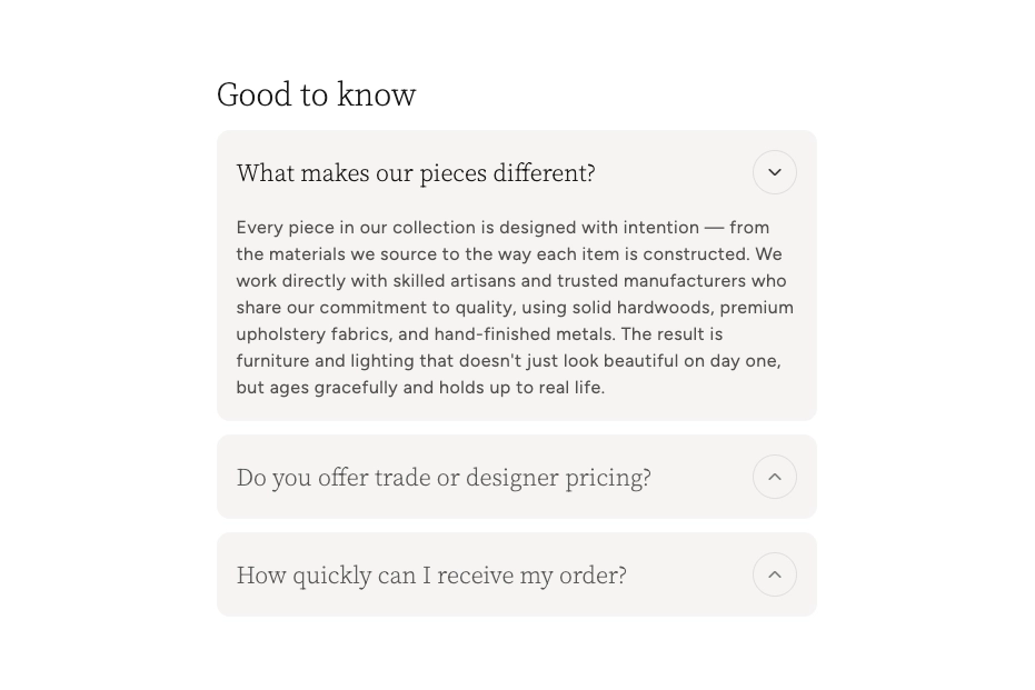
In the Boardwalk theme, the Accordion block is a card-style panel with a clickable title bar and a chevron icon that rotates when opened. Each accordion can hold nested content blocks such as text, buttons, and dividers. Accordions are designed to be placed inside an Accordion Group, which controls shared styling and ensures that opening one accordion automatically closes the others in the same group.
How to Set Up Accordion Blocks
Follow these steps to add collapsible accordion panels to any page of your Shopify store using the Boardwalk theme.
Open the Theme Editor
In your Shopify admin, go to
Online Store → Themes, find Boardwalk,
and click Customize. Navigate to the page
where you want to display accordions using the page
selector dropdown at the top center of the editor.
Add an Accordion Group
Accordion blocks live inside an Accordion Group. In the Theme Editor sidebar, click Add block inside the section where you want to place accordions and choose Accordion group. The group acts as a container that controls shared styling for all of the accordions inside it.
Note: You must add an Accordion Group first. Individual Accordion blocks are added inside the group — they cannot be placed directly into a section on their own.
Add Accordion Blocks
Inside the Accordion Group, click Add block and choose Accordion. Each Accordion block you add becomes a separate collapsible panel with its own title. Add as many as you need.
Set the Accordion Title
Click on an Accordion block in the sidebar and enter the Title — this is the text visitors see on the clickable header bar. The title field supports inline rich text, so you can apply bold or italic formatting if needed.
Add Content Inside Each Accordion
Each Accordion block can hold nested content blocks. Click Add block inside an Accordion and choose from Text, Button, or Divider. You can combine multiple content blocks to build rich accordion panels — for example, a text block followed by a button linking to more information.
Configure the Accordion Group Settings
Click on the Accordion Group in the sidebar to access its settings. Here you can control the title font, card color scheme, corner radius, spacing, and whether the first accordion starts open. These settings apply to all Accordion blocks inside the group.
Save and Preview
Click Save in the Theme Editor. Preview your page to verify each accordion expands and collapses as expected and that your nested content displays correctly.
Accordion Block Settings
Each Accordion block has a single setting that controls the text displayed on its clickable header bar.
Accordion Block Settings
The text displayed on the accordion header bar. This is the clickable label visitors see before expanding the panel. Supports inline rich text formatting (bold, italic).
Nested Content Blocks
Each Accordion block supports nested content blocks that appear inside the expandable panel when it is opened. You can add one or more of the following blocks to build your accordion content.
Text
A rich text block for adding paragraphs, lists, or formatted content inside the accordion panel. Use this for answers to frequently asked questions, product details, return policies, or any written content you want to present in a collapsible format.
Button
Adds a clickable button inside the accordion panel. This is useful for linking to related pages, such as a full shipping policy, a contact form, or a product collection. Pair a text block with a button block to give visitors a summary and a clear next step.
Divider
Inserts a horizontal line between content blocks inside the accordion panel. Use this to visually separate different pieces of content within a single accordion — for example, placing a divider between two text blocks that cover different topics.
Accordion Group Settings
The Accordion Group is the container that holds all of your individual Accordion blocks. Its settings control the shared appearance and behavior of every accordion inside it.
Accordion Group Settings
Sets the font used for the accordion title text.
Options: Heading or Body.
Controls the size of the accordion title text.
When turned on, the first Accordion block in the group will start in the open state when the page loads, so visitors immediately see its content.
Select a color scheme for the accordion card backgrounds and text. Color schemes are defined in Online Store → Themes → Customize → Theme settings → Colors.
Controls the roundness of the accordion card corners.
Options: None, Small,
Medium, or Large.
Sets the top and bottom padding inside each accordion card on desktop screens.
Sets the top and bottom padding inside each accordion card on mobile screens.
Controls the spacing between accordion cards on desktop screens.
Controls the spacing between accordion cards on mobile screens.
Sets the spacing between nested content blocks (text, buttons, dividers) inside each accordion panel.
Note: Color schemes are configured in your Shopify admin under Online Store → Themes → Customize → Theme settings → Colors. Make sure you've set up the color schemes you want to use before selecting them in the Accordion Group settings.
Built-In Features
The Accordion block comes with features that work automatically — no apps or custom code needed.
Feature Overview
Accordion panels open and close with a fluid height animation, creating a polished feel. The animation runs at a natural pace and can be interrupted — if a visitor clicks again mid-animation, it reverses smoothly without jumping or flickering.
Within the same Accordion Group, opening one accordion automatically closes any other that is currently open. This keeps the layout tidy and prevents the page from becoming too long with multiple panels expanded at once. Both the opening and closing animations play at the same time for a coordinated transition.
Each accordion header includes a chevron arrow inside a circular border. The icon rotates 180° when the panel opens and rotates back when it closes, giving visitors a clear visual cue of the current state.
When an accordion is expanded, its title text becomes darker to visually distinguish it from the collapsed accordions. The chevron icon also becomes more prominent, reinforcing which panel is currently active.
Accordion cards automatically adjust their padding, font sizes, and icon sizes on smaller screens. On mobile devices, the layout remains clean and easy to tap.
Each accordion panel can contain multiple content blocks (text, buttons, dividers) arranged vertically with consistent spacing. This lets you build rich, detailed content inside each panel without extra configuration.
Accordion blocks respond to live changes in the Theme Editor. When you add, remove, or reorder accordions, they re-initialize automatically so you can preview your changes in real time without reloading the editor.