About
A cart drawer is a slide-out panel that appears from the side of the screen when a customer clicks the cart icon. Instead of navigating to a separate cart page, the drawer lets shoppers review the items they've added, update quantities, remove products, and head straight to checkout — all without leaving the page they're on.
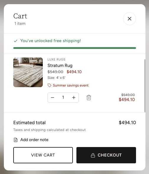
In the Boardwalk theme, the Cart Drawer is added as a block inside the Header section. It includes a free shipping progress bar, product images with quantity controls, discount and pricing details, an optional order note field, and both "View Cart" and "Checkout" buttons. When the cart is empty, a customizable empty state is displayed with an image, heading, and a button that links back to your store. The drawer updates automatically — items, totals, and the shipping bar all refresh without a full page reload whenever the cart changes.
How to Set Up the Cart Drawer
Follow these steps to add and configure the Cart Drawer on your Boardwalk theme store.
Open the Theme Editor
In your Shopify admin, go to
Online Store → Themes, find Boardwalk,
and click Customize.
Select the Header Section
In the Theme Editor sidebar, click on the Header section. The Cart Drawer is a block that lives inside the header, so you'll add it here.
Add the Cart Drawer Block
Click Add block inside the Header section and choose Cart Drawer from the list. The block will appear in the sidebar under your header.
Note: You only need one Cart Drawer block per header. Adding more than one may cause unexpected behavior.
Configure the Drawer Settings
Click on the Cart Drawer block in the sidebar to open its settings. Choose a drawer size, set up the free shipping progress bar, and configure which information to display for cart items and the cart footer.
Customize the Empty Cart State
Scroll down in the Cart Drawer settings to find the Empty cart options. Upload an optional image, set a custom heading, and configure the "Continue Shopping" button text and link. This is what customers will see when their cart has no items.
Set Up Free Shipping (Optional)
To motivate customers to add more items, enable the free shipping progress bar and set a dollar threshold. The bar will show how close the customer is to qualifying for free shipping.
Note: The free shipping progress bar is
a visual motivator only. You still need to create a
matching free shipping rate in your Shopify admin under
Settings → Shipping and delivery
to actually provide free shipping at checkout.
Save and Preview
Click Save in the Theme Editor. Visit your storefront and click the cart icon in the header to verify the drawer opens correctly, displays items as expected, and that the checkout button works.
Cart Drawer Settings
These settings are accessible by clicking the Cart Drawer block inside the Header section in the Theme Editor sidebar.
Cart Drawer Block Settings
Controls the width of the slide-out panel. Options:
Small, Medium, or
Large. On mobile devices the drawer always
takes up the full screen width regardless of this
setting.
When enabled, a progress bar appears near the top of the drawer showing how close the customer is to qualifying for free shipping. Once the threshold is reached, a success message displays instead.
The minimum order value (in dollars) a customer needs to reach for the progress bar to show as complete. Range: $0 to $500 in $10 increments.
Displays the brand or vendor name above each product title in the cart. Useful for stores that carry multiple brands.
Displays variant details (such as Size, Color, or Material) below each product title so customers can confirm they've selected the right option.
Adds an expandable text area in the cart footer where customers can leave special instructions for their order, such as gift wrapping requests or delivery notes.
Displays a note below the subtotal indicating whether taxes and shipping are included or calculated at checkout. The exact message adjusts automatically based on your store's tax and duty settings.
Upload an optional image to display when the cart is empty. If no image is provided, a default shopping bag icon is shown instead.
Sets the display width (in pixels) of the empty cart image. Adjust this to fit your image proportionally within the drawer.
The text displayed when the cart has no items. Use this to set a friendly message such as "Your cart is empty" or "Nothing here yet."
The label for the button shown in the empty cart state. Customize this to match your brand voice, for example "Start Shopping" or "Browse Collections."
The URL the continue shopping button points to. Link it to your collections page, a featured collection, or any page you'd like customers to browse when their cart is empty.
Select a color scheme to style the drawer panel's background and text colors. Use a scheme that contrasts well with your header for a polished look.
Built-in Features
The Cart Drawer includes several features that work automatically without any additional setup.
Live Cart Updates
When customers change quantities, remove items, or add products from anywhere on your site, the cart drawer updates automatically. Item counts, subtotals, discounts, and the free shipping bar all refresh without a full page reload, keeping the shopping experience fast and seamless.
Quantity Controls
Each cart item includes plus and minus buttons along with a direct-entry number field. The controls respect any quantity rules set on your product variants, such as minimum quantities, maximum limits, and custom increment steps.
Discount Display
The drawer automatically shows both line-level discounts (applied to individual items) and cart-level discounts (applied to the whole order). Sale prices appear alongside crossed-out original prices, and discount codes are listed with their savings amounts.
Subscription Details
If a product uses a selling plan (subscription), the plan name is displayed below the product details so customers can see their subscription frequency at a glance.
Line Item Properties
Custom properties added to a line item — such as personalization text or uploaded files — are displayed beneath the variant options. File uploads appear as clickable links.
Keyboard & Screen Reader Accessibility
The drawer traps focus when open so keyboard users can tab through the drawer without accidentally interacting with elements behind it. Pressing the Escape key closes the drawer. All buttons and interactive elements include descriptive labels for screen readers, and live status messages announce cart changes to assistive technology.
Backdrop Overlay
When the drawer opens, a semi-transparent backdrop with a blur effect appears behind the panel. Clicking anywhere on the backdrop closes the drawer.
View Cart & Checkout Buttons
The drawer footer includes two action buttons. View Cart takes the customer to the full cart page for a more detailed review, while Checkout sends them directly to Shopify's checkout. On mobile, these buttons stack vertically for easy tapping.
Frequently Asked Questions
/cart) instead of
opening a drawer.
sections.cart.