About
A Group in the Boardwalk theme is a flexible layout container that lets you organize multiple blocks together inside a single, controllable wrapper. Think of it like a box that can hold other blocks — you decide whether those blocks stack vertically (top to bottom) or sit side-by-side horizontally (left to right).
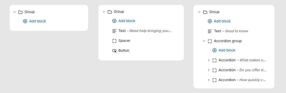
Groups are one of the most powerful building blocks in the Boardwalk theme because they accept any theme block as a child, including other Groups. This means you can nest Groups inside Groups to create complex, multi-column layouts without writing any code. They're commonly used in headers, footers, hero sections, and anywhere you need precise control over how content is arranged and aligned.
How to Set Up a Group Block
Follow these steps to add and configure a Group block in the Boardwalk theme.
Open the Theme Editor
In your Shopify admin, go to
Online Store → Themes, find Boardwalk,
and click Customize. Navigate to the page
or template where you want to add the Group.
Add a Group Block
In the section sidebar, click Add block and select Group from the Layout category. The Group will appear as a container you can expand in the sidebar to reveal its child blocks.
Choose a Layout Direction
Click the Group block to open its settings. Set the
Layout direction to
Vertical (blocks stack top to bottom) or
Horizontal (blocks sit side by side). This is
the most important setting — it determines how all child
blocks are arranged.
Add Child Blocks
With the Group selected, click Add block to insert child blocks inside it. You can add text, images, buttons, menus, dividers, icons, and more. You can also nest another Group inside to create multi-level layouts.
Adjust Sizing and Alignment
Configure the Group's Width, Height, and Content maximum width settings to control how much space the Group takes up. Use the Alignment options to control how child blocks are positioned within the Group both horizontally and vertically.
Set Spacing and Padding
Use the Gap setting to control the space between child blocks. Add horizontal and vertical Padding to create breathing room inside the Group container.
Save and Preview
Click Save in the Theme Editor and preview your page to verify the layout looks correct on both desktop and mobile.
Group Block Settings
These settings are available when you click on the Group block in the Theme Editor sidebar.
Group Settings
Controls how child blocks are arranged inside the Group.
Options: Horizontal (side by side) or
Vertical (stacked top to bottom).
Determines the Group's width behavior. Options:
Fit (shrinks to fit its content) or
Fill (expands to fill all available space).
Determines the Group's height behavior. Options:
Fit (shrinks to fit its content) or
Fill (stretches to fill the parent
container's height).
Limits the maximum width of the Group's content.
Options:
Auto (no limit) or
Narrow (caps the width at 600px, useful for
text-heavy content).
Sets the text alignment for all child blocks inside the
Group. Options: Left, Center,
or Right.
Controls the horizontal positioning of child blocks.
Options: Left, Center,
Right, or Space between
(distributes blocks evenly across the available width).
Controls the vertical positioning of child blocks.
Options:
Top, Middle,
Bottom, or Space between
(distributes blocks evenly across the available height).
The spacing between child blocks inside the Group. Range: 0px to 100px.
Left and right padding inside the Group container. Range: 0px to 200px.
Top and bottom padding inside the Group container. Range: 0px to 200px.
Available Child Blocks
The Group block accepts any theme block as a child. Below is a reference of all the blocks you can add inside a Group, along with their key settings.
Child Block
Layout
Structural blocks for organizing and spacing your content.
Group
Groups can be nested inside other Groups, allowing you to build complex multi-column and multi-row layouts. Each nested Group has its own independent direction, alignment, and spacing settings.
- Layout direction — Horizontal or Vertical
- Width — Fit or Fill
- Height — Fit or Fill
- Content maximum width — Auto or Narrow
- Alignment — Text, Horizontal, and Vertical
- Gap — 0px to 100px
- Padding — Horizontal and Vertical, 0px to 200px
Divider
A horizontal line for visually separating content inside the Group.
- Use section color — Match the parent section's foreground color, or set a custom color
- Line style — Solid or Dashed
- Line thickness — 1px to 10px
- Fade edges — Gradually fades the line at both ends
- Padding — Top and bottom
Button
A configurable button with a label, link, and multiple visual styles. Inherits alignment from the parent Group.
- Label — The button text
- Link — URL the button navigates to
- Open in new tab — Toggle
- Style — Solid, Outline, Ghost, or Text
- Size — Small or Medium (available for Solid and Outline styles)
- Show arrow — Adds an arrow icon to the button
- Full width — Stretches the button to fill the Group's width
- Override section color — Use a custom color scheme for the button
Spacer
An invisible spacing block for adding vertical or horizontal padding between other blocks inside the Group.
- Vertical padding — 0px to 40px
- Horizontal padding — 0px to 40px
Child Block
Media
Visual blocks for images, video, icons, and branding.
Image
A responsive image block with optional link and separate mobile image support. Alignment is inherited from the parent Group.
- Image — Upload a desktop image
- Aspect ratio — Adapt, Widescreen (16:9), Standard (4:3), Landscape (3:2), Square (1:1), or Portrait
- Width mode — Full width or Custom scale (10% to 100%)
- Corner radius — 0px to 40px
- Flip horizontal — Mirror the image
- Link — Optional URL to wrap the image in a link
- Mobile image — Upload a separate image for mobile devices
- Mobile aspect ratio — Independent aspect ratio for mobile
Image Reveal
A scroll-triggered effect where a top image fades and unblurs over a bottom image as the user scrolls. Can optionally transition from black-and-white to full color.
- Bottom layer — The image that shows initially
- Top layer — The image that reveals during scroll
- Greyscale to color — Bottom image transitions from black-and-white to color
- Aspect ratio — Adapt, Widescreen (16:9), Standard (4:3), Landscape (3:2), Square (1:1), or Portrait (3:4)
Promotion
An image block with an optional promotional overlay badge — perfect for sale announcements and special offers. Includes a hover zoom effect when linked.
- Image — Upload a promotional image
- Flip horizontal — Mirror the image
- Link — Optional URL
- Overlay type — None, Percent off, or Text only
- Percent off — 5% to 95% (for Percent off overlay)
- Show "up to" text — Adds "up to" above the percentage
- Header and body text — Custom text for the Text only overlay
- Overlay and text color — Custom colors for the overlay badge
Video
A video player that supports Shopify-hosted video uploads, YouTube embeds, and Vimeo embeds. Includes options for autoplay, looping, and an optional cover image for external videos.
- Video source — Upload (Shopify-hosted) or Link (YouTube / Vimeo URL)
- Video upload — Upload a video file directly to Shopify
- Video URL — Paste a YouTube or Vimeo link
- Cover image — Optional thumbnail shown over external videos
- Color overlay — Custom color overlay on top of the video
- Aspect ratio — Widescreen (16:9), Landscape (4:3), or Square (1:1)
- Autoplay — Automatically play the video (muted) on page load
- Loop — Continuously replay the video
- Show controls — Display playback controls (for uploaded videos)
- Video description — Accessibility text describing the video content
Icon
Displays a single icon from a built-in library covering navigation, e-commerce, shipping, apparel, furniture, communication, and more — over 60 icons available.
- Icon — Choose from grouped categories including Navigation, E-commerce, Shipping, Apparel, Furniture, and Miscellaneous
- Size — 12px to 120px
- Opacity — 10% to 100%
- Color — Custom icon color
Logo
Displays your store's logo image (light or dark variant) as configured in your theme settings. Falls back to a text logo if no image is uploaded.
- Type — Light or Dark logo variant
- Width (desktop) — 200px to 800px
- Width (mobile) — 100px to 400px
- Text logo — Fallback text when no logo image is uploaded
- Text color — Color for the text logo fallback
Child Block
Content
Text, navigation, and interactive content blocks.
Accordion Group
A container for accordion blocks with shared styling. Sets card appearance, title styling, and spacing for all child accordions at once. Ideal for FAQ sections, product details, or any expandable content.
- Title font family — Heading or Body
- Title font size — 14px to 32px
- Expand first — Automatically open the first accordion on page load
- Card color scheme — Color scheme for accordion cards
- Corner radius — None, Small, Medium, or Large
- Card padding — Desktop (12–48px) and Mobile (8–32px)
- Card gap — Desktop (0–32px) and Mobile (0–24px)
- Content gap — Spacing between content items inside each accordion, 0–32px
Text
A rich text block for adding headings, body copy, captions, or any formatted text content inside the Group. Supports bold, italic, links, and lists via the rich text editor.
- Text — Rich text editor
- Font family — Heading, Body, Caption, or Menu
- Font size — Configurable range per font family (e.g., 20–80px for Heading, 12–60px for Body)
- Line height — 1.0 to 2.0
- Padding — Top (0–36px) and Bottom (0–36px)
Tabs Group
A tabbed content container that displays horizontal tab buttons with a divider line. Clicking a tab switches the visible content panel below. Supports keyboard navigation and scrollable tabs with arrow buttons when there are many tabs. Ideal for organizing product details, descriptions, or feature comparisons into separate tabbed views.
- Tab font family — Heading or Body
- Tab font size — 12px to 32px
- Color scheme — Color scheme for the tabs area
- Divider line — Use section color or custom color, Solid or Dashed style, 1–4px thickness
- Content spacing from tabs — 8px to 48px
- Gap between content items — 0px to 32px
Timer
A countdown timer that displays days, hours, minutes, and seconds until a target date and time. Great for product launches, flash sales, events, and limited-time promotions. Automatically adapts its size to the container width.
- Year — 2026 to 2030
- Month — January through December
- Day — 1 to 31
- Time — Half-hour increments from 12:00 AM to 11:30 PM
- Time zone — 33 global time zones from Samoa to Chatham Islands
- Daylight saving time — Adjusts for DST when enabled
- Demo mode — Shows a running countdown for preview purposes
- Size — Small, Medium, or Large
- Alignment — Left, Center, or Right
- Label background — Custom background color for the timer digit boxes
Breadcrumbs
A breadcrumb navigation trail that automatically generates based on the current page hierarchy. Helps visitors understand where they are on your site.
- Divider — Slash, Pipe, Bullet, or Chevron
- Show current page — Toggle the last breadcrumb item
- Current page linked — Make the current page breadcrumb clickable
- Typography — Font family (Heading, Body, Caption, or Menu) and font size
- Padding — Top and bottom
Menu
Displays a navigation menu with an optional heading. Can show links from a Shopify navigation menu or your store's policy pages. On mobile, the menu can collapse into an accordion for a cleaner layout.
- Source — Site navigation or Policy links
- Menu — Select which navigation menu to display
- Heading — Optional title above the menu links
- Heading typography — Font family, size, and uppercase toggle
- Menu typography — Font size and uppercase toggle
- Gap — Spacing between menu items
- Accordion on mobile — Collapses the menu into an expandable accordion on small screens
Marquee
A horizontally scrolling marquee that loops child content (text, logos, images) in a continuous animation. Pauses on hover and respects reduced motion preferences.
- Speed — 1x to 30x
- Movement direction — Forward or Reverse
- Gap — Spacing between items, 0px to 120px
- Font family — Heading or Body
- Font size — 20px to 80px
- Gradient edges — Adds a fade-out effect at both ends of the marquee
Custom Liquid
An advanced block that lets you insert custom Liquid code, HTML, or CSS directly into the Group. Useful for custom integrations, embedded widgets, or unique content that isn't covered by other blocks.
- Custom Liquid — A code editor for entering Liquid, HTML, or CSS
Child Block
Footer & Utility
Blocks for email capture, social links, payment icons, and more.
Newsletter Signup
An email subscription form with an input field and submit button. Automatically handles success and error messages. Commonly used in footer Groups to collect email subscribers.
- Button text — Customize the submit button label
- Show arrow — Adds an arrow icon to the submit button
- Alignment — Left, Center, or Right
- Vertical padding — 0px to 100px
Social Icons
Displays your store's social media icons as circular linked buttons. Supports Facebook, Instagram, YouTube, TikTok, X (Twitter), Threads, LinkedIn, Bluesky, Snapchat, Pinterest, Tumblr, Vimeo, and a custom "Other" link. Icons are pulled automatically from your theme settings.
- Icon size — 16px to 28px
- Gap — Spacing between icons, 8px to 32px
- Padding — Top (0–200px) and Bottom (0–200px)
Social Share
Share buttons that let visitors share a product or page to social media platforms. Includes a "Copy link" button that copies the URL to the clipboard with visual confirmation.
- Product — Select a specific product to share, or the block will use the current page
- Platforms — Toggle each platform individually: Facebook, X (Twitter), Pinterest, LinkedIn, Threads, Bluesky, Tumblr, Email, and Copy link
- Icon size — 16px to 28px
- Gap — Spacing between icons, 8px to 32px
Copyright
Displays a copyright notice with your store name and the current year. Optionally includes a "Powered by Shopify" link.
- Show powered by — Toggle the "Powered by Shopify" text
- Font size — 12px to 20px
Localization Button
A button that opens a country/language selector drawer. Automatically hidden if your store only has one country and one language configured.
- Icon — None, Globe, or Flag
- Show country name — Display the country name
- Show currency code — Display the currency code (e.g., USD)
- Show language — Display the language name
- Show arrow — Adds a chevron icon
- Alignment — Left, Center, or Right
Payment Icons
Automatically displays icons for all payment methods enabled in your Shopify Payments settings. No configuration needed — the icons update when you change your payment providers.
- No additional settings — icons are pulled automatically from your Shopify payment configuration
Policy Links
Displays links to your store's policy pages (Privacy Policy, Terms of Service, Refund Policy, etc.) in a horizontal row. Only shows policies that have been created in your Shopify admin.
- Font size — 10px to 20px
- Alignment — Left, Center, or Right
- Gap — Desktop and mobile spacing between links
- Padding — Desktop and mobile top and bottom padding
Follow on Shop
Adds a "Follow on Shop" button that lets customers follow your store through the Shop app by Shopify. Only visible to eligible stores.
- Alignment — Left, Center, or Right
Note: The Group block also supports
@app blocks, so any Shopify app with theme app
extensions can be embedded directly inside your Groups.
Additional child blocks not listed here may also be
available depending on your theme configuration.
Tips and Best Practices
Keep these tips in mind when working with Group blocks to get the best results.
Good to Know
You can place a Group inside another Group to create multi-level layouts. For example, use a Horizontal Group as the outer container and add Vertical Groups inside it to create a multi-column footer layout.
Use Fill when you want a Group to stretch and take up all available space (great for evenly splitting columns). Use Fit when the Group should only be as wide or tall as its content needs.
The Space between alignment option distributes child blocks evenly across the Group, with equal spacing between them. This is especially useful for header and footer layouts where you want items spread across the full width.
Use the Narrow content maximum width setting (600px) for text-heavy Groups like newsletter signups or body copy. This keeps line lengths comfortable for reading.
On smaller screens, horizontal Groups may automatically wrap their child blocks depending on available space. Test your layout on mobile to make sure everything stacks properly.
The Payment Icons and Policy Links blocks pull data directly from your Shopify settings. Make sure you've configured your payment providers under Settings → Payments and created your store policies under Settings → Policies for these blocks to display content.
Frequently Asked Questions
@app blocks, which means any Shopify app
that provides theme app extensions can be added inside a
Group alongside your other blocks.