About
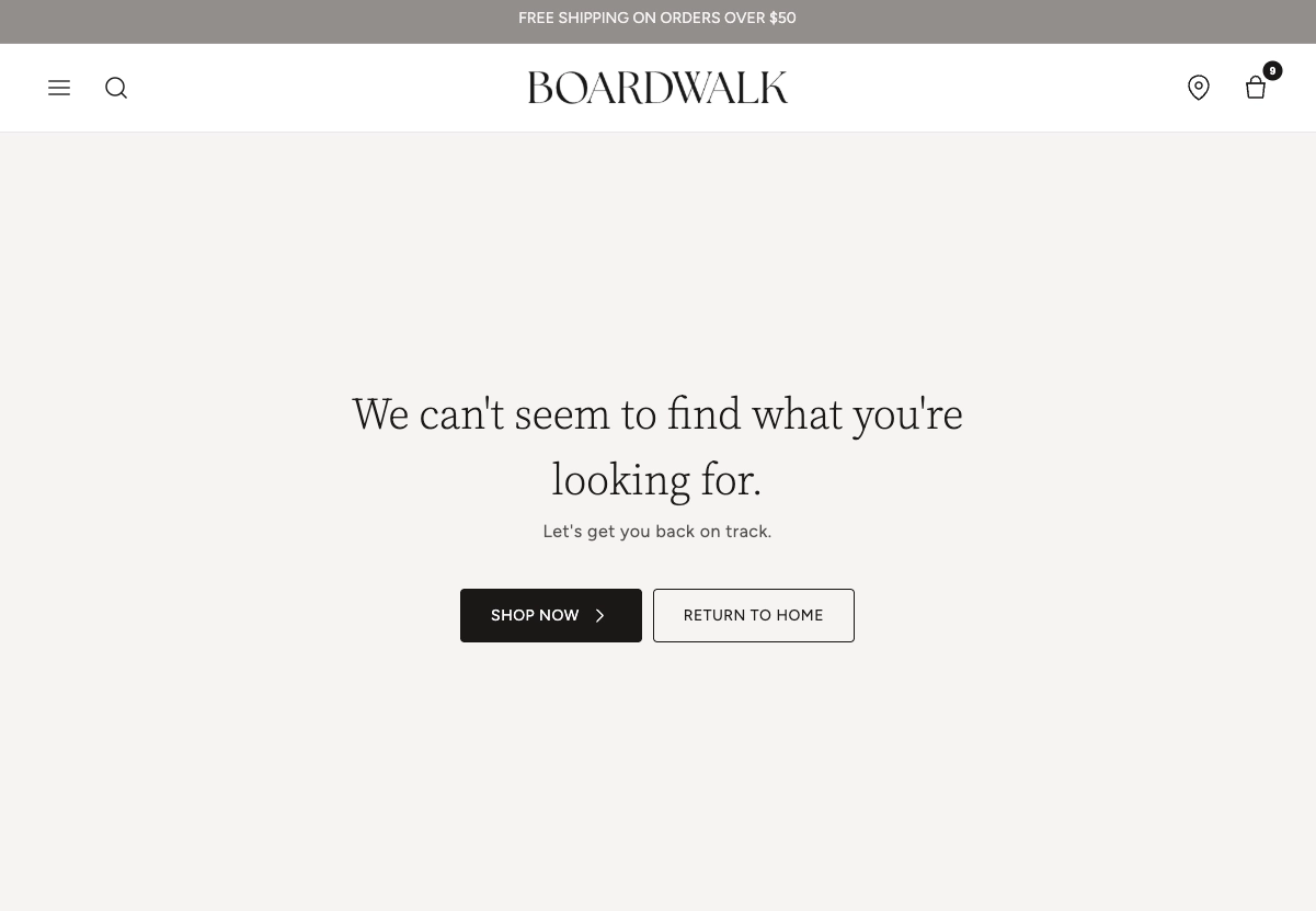
A 404 page (also called a "Not Found" page) is what visitors see when they try to visit a URL on your store that doesn't exist. This can happen when a page has been deleted, a link is mistyped, or a product is no longer available. A well-designed 404 page helps guide visitors back to useful parts of your store instead of leaving them at a dead end.
In the Boardwalk theme, the Not Found section is a fully customizable, block-based layout that displays whenever a visitor lands on an invalid URL. It uses the same flexible media-and-content container found throughout the theme, so you can add background images, videos, or patterns, adjust colors, and build your own content layout using Group, Text, and Button blocks. By default, it comes preset with a friendly message and buttons to guide visitors to your collections page or back to the home page.
How to set up the 404 Section
Follow these steps to customize your 404 error page in Shopify using the Boardwalk theme.
Open the Theme Editor
In your Shopify admin, navigate to
Online Store → Themes, find the
Boardwalk theme, and click Customize. In
the page selector dropdown at the top center of the
editor, choose Others → 404 page.
Configure Section Settings
Click the Not Found section in the sidebar. Here you can set the layout direction (horizontal or vertical), section width, content width, background media, color schemes, and padding. These control the overall look and feel of the page.
Add or Edit Group Blocks
The section uses Group blocks to organize your content. By default it comes with two groups: one for text content and one for buttons. Click any Group block in the sidebar to adjust its layout direction, alignment, spacing, and padding. You can add up to 3 blocks at the top level of the section.
Customize Text and Buttons
Inside each Group, add Text blocks for your 404 message (for example, "We can't seem to find what you're looking for") and Button blocks to link visitors to your collections, home page, or any other URL. You can style each block's typography, button appearance, and colors individually.
Optional: Add a Background Image or Video
To make the page more visually interesting, set the
Background media setting to
Image, Video, or
Pattern. Upload your media and adjust the
image height and color overlay to ensure your text stays
readable on top of the background.
Save and Preview
Click Save in the Theme Editor. To
preview the page, visit any invalid URL on your store (for
example,
yourstore.com/this-page-does-not-exist) and
confirm the layout, message, and links look correct.
Section-Level Settings
These settings apply to the entire Not Found section and are accessible by clicking the top-level section in the Theme Editor sidebar.
Not Found Section Settings
Controls how the top-level content blocks are arranged.
Options: Horizontal (side by side) or
Vertical (stacked on top of each other).
Sets the outer width of the section. Options:
Page (matches your theme's content width)
or Full (stretches to 100% of the screen).
Limits the width of the content area inside the section.
Options: Narrow, Page, or
Full.
Choose a background for the section. Options:
None, Image,
Video, or Pattern. Each option
reveals additional settings for uploading and
configuring the media.
Upload a Shopify-hosted video as the section background.
Only visible when Background media is set to
Video.
Upload an image as the section background. Only visible
when Background media is set to Image.
Upload a small image that repeats as a tiled pattern
across the section background. Only visible when
Background media is set to Pattern. For
best results, use a seamless, tileable image.
Controls how large or small each tile appears. Range:
50% to 300%. Smaller values repeat the pattern more
often; larger values make each tile bigger. Only visible
when Background media is set to Pattern.
Sets the overall height of the section. Options:
Adapt to image (matches the uploaded
image's aspect ratio), Small,
Medium, Large, or
Full screen.
Applies a color scheme to the entire section background and text. Select any color scheme defined in your theme settings.
Applies a separate color scheme to the inner content container. This allows you to style the content area differently from the section background.
Adds a semi-transparent color layer on top of the
background media. Useful for darkening an image or video
to make text easier to read. Supports transparency. Only
visible when Background media is not set to
None.
Rounds the corners of the section container. Range: 0px to 24px.
Top and bottom padding for the section. Range: 0px to 100px each.
Available Blocks
The Not Found section uses Group blocks as its top-level containers. Inside each Group, you can nest Text blocks, Button blocks, and many other theme blocks to build your page layout. The section allows a maximum of 3 top-level blocks.
Parent Block
The Group block is the top-level container used in the Not Found section.
Group
The Group block is a flexible layout container that holds your content blocks. It acts as a wrapper that controls how its children are arranged — either stacked vertically or placed side by side horizontally. You can nest multiple Groups to create more complex layouts.
The Group block can accept over 24 different types of theme blocks as well as app blocks. Not all of them are listed in this article. For the full list of supported child blocks, see the Group parent block article.
-
Layout direction —
Horizontal(side by side) orVertical(stacked) -
Width —
Fit(shrinks to content size) orFill(expands to fill available space) -
Height —
Fit(shrinks to content size) orFill(stretches to fill available space) -
Content maximum width —
AutoorNarrow(600px) - Text alignment — Left, Center, or Right
- Horizontal alignment — Left, Center, Right, or Space between
- Vertical alignment — Top, Middle, Bottom, or Space between
- Gap — Spacing between child blocks. Range: 0px to 100px
- Horizontal padding — Range: 0px to 200px
- Vertical padding — Range: 0px to 200px
Common Child Blocks
These blocks can be nested inside Group blocks to build your 404 page content.
Text
A rich text block for adding messages, headings, or descriptions to your 404 page. Use the built-in rich text editor to format your content with bold, italic, links, and more.
- Text — Rich text editor for your content
- Text style — Heading, Body, Caption, or Menu (each uses a different font from your theme settings)
- Font size — Adjustable range that varies by text style. Heading: 20px to 80px. Body: 12px to 60px. Caption: 10px to 60px. Menu: 12px to 60px
- Line height — 1.0 to 2.0
- Padding — Top and bottom, 0px to 36px each
Button
A call-to-action button that links visitors to another page on your store. Commonly used to direct people to your home page, collections, or search page from the 404 page.
- Label — The text displayed on the button
- Link — The URL the button leads to
- Open in new tab — Opens the link in a new browser tab when enabled
-
Style —
Solid(filled background),Outline(border only),Ghost(subtle, no border), orText(looks like a text link) -
Size —
SmallorMedium. Only visible for Solid and Outline styles - Show arrow — Adds a directional arrow icon to the button
- Full width — Stretches the button to fill the entire width of its container
- Override section color — When disabled, allows you to choose a separate color scheme for this specific button
- Color scheme — Select a custom color scheme for the button. Only visible when Override section color is disabled
Note: The Group block accepts over 24 different types of theme blocks plus app blocks, so you can add images, icons, dividers, spacers, and much more inside your 404 page. See the Group parent block article for the full list.
Things to Know
A few important details to keep in mind when setting up your 404 page.
Before You Begin
The 404 page is a special Shopify template that automatically displays when a visitor tries to access a URL that doesn't exist on your store. You don't need to create or assign this page manually — Shopify handles it for you.
The Not Found section allows up to 3 Group blocks at the top level. Each Group can contain as many nested child blocks as you need, so you still have plenty of flexibility to build complex layouts.
If you use a background image or video, consider adding a color overlay to improve text readability. The overlay supports transparency, so you can fine-tune how much the background shows through.
To edit your 404 page, you must navigate to it in the
Theme Editor. Go to
Online Store → Themes → Customize, then use the page selector at the top to choose
Others → 404 page. You cannot edit
the 404 section from a regular page or template view.
The 404 page sits between your theme's global header and footer, so visitors still have access to your site navigation and other global elements. The Not Found section cannot be added to the header section group.
Frequently Asked Questions
yourstore.com/test-404. Shopify will
automatically display your 404 page. You can also
preview it directly in the Theme Editor by navigating to
Others → 404 page from the page
selector dropdown.
Video and upload a Shopify-hosted video.
Consider adding a color overlay so that your text
content remains easy to read on top of the video.