About
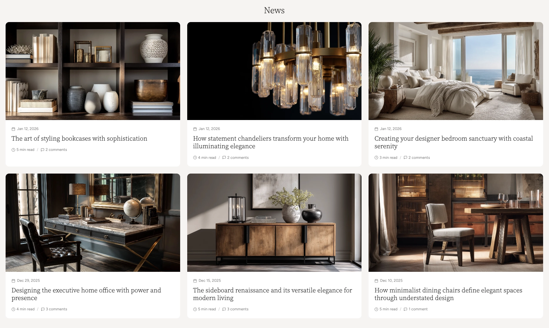
The Blog Posts section lets you feature articles from any of your blogs on any page of your store — your homepage, landing pages, product pages, or anywhere else. Unlike the full Blog listing page, this section is designed to highlight a curated selection of articles in a visually appealing grid or carousel layout.
In the Boardwalk theme, the Blog Posts section supports both grid and carousel display modes for desktop and mobile independently. Each article is rendered through a modular, block-based Article Card that you can fully customize with child blocks like media, title, date, excerpt, tags, meta, and more. A built-in "View all" link lets visitors navigate to your full blog with a single click.
How to Set Up the Blog Posts Section
Follow these steps to add and configure the Blog Posts section on any page of your store.
Create a Blog and Write Articles
In your Shopify admin, go to
Content → Blog posts. If you don't
already have a blog, click
Manage blogs and create one (e.g.,
"News," "Journal," or "Stories"). Then add articles with a
title, body content, featured image, excerpt, and tags.
Open the Theme Editor
Navigate to Online Store → Themes, find
Boardwalk, and click Customize. Use the
page selector dropdown at the top center to navigate to
the page where you want to add the section (e.g., your
homepage).
Add the Blog Posts Section
Click Add section in the sidebar, search for Blog posts, and select it. Once added, click the section to open its settings. Use the Blog picker to select which blog to pull articles from.
Choose Your Layout Mode
Decide whether articles should display in a static grid or a swipeable carousel. You can enable carousel mode independently for desktop and mobile. When carousel is disabled, articles display in a responsive grid.
Customize the Article Card
Inside the Blog Posts section, click the Article Card block. This is the parent block that controls how each article appears. Set the card border radius, text alignment, and color scheme. Then add child blocks like Article Media, Title, Date, Excerpt, Tags, and Meta to build your desired card layout.
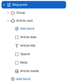
Arrange and Reorder Child Blocks
Drag and drop the child blocks inside the Article Card to change their display order. For example, you might show the Date above the Title, or place the Excerpt before the Meta line. Add Dividers or Spacers between blocks for visual separation.
Save and Preview
Click Save in the Theme Editor. Preview your page to verify the grid or carousel layout, card appearance, and navigation controls are working as expected.
Section-Level Settings
These settings apply to the entire Blog Posts section and are accessible by clicking the top-level section in the Theme Editor sidebar.
Blog Posts Section Settings
Select which blog to pull articles from. The section displays articles from this blog only.
Controls the maximum width of the section. Options:
Page (matches your theme's content width)
or Full (100% width). This setting only
applies when carousel is disabled.
When enabled, articles display in a horizontally swipeable carousel on desktop instead of a static grid.
When enabled, articles display in a swipeable carousel on mobile. When disabled, articles stack in a single-column grid.
Displays previous and next arrow buttons for navigating carousel slides. Only visible when carousel mode is enabled. Arrows are always hidden on mobile.
Displays a draggable progress slider below the carousel for quick navigation between slides. Only visible when carousel mode is enabled.
Number of article columns in the grid or visible slides in the carousel on desktop. Range: 2 to 5.
The total number of articles to display from the selected blog. Range: 2 to 15.
Spacing between article cards. Options:
Small, Medium, or
Large.
Displays a "View all articles" link below the grid or carousel that links to the full blog page.
Custom text for the view all link. Change it to match your brand voice (e.g., "Read more stories" or "Explore our journal").
Top, and bottom padding for the entire section. Top and bottom range: 0px to 100px.
Select any defined color scheme to style the section background and text.
Parent Block
The Article Card is the top-level block that wraps each article in the grid or carousel and serves as the container for all child blocks.
Article Card
The parent block that wraps each article. Controls the overall card appearance and holds all child blocks.
- Border radius — 0px to 24px
- Text alignment — Left, Center, or Right
- Card color scheme — Select any defined color scheme. When this differs from the section color scheme, card media automatically receives rounded corners.
Child Blocks
Child blocks are added inside the Article Card to build your desired card layout — arrange, reorder, or remove them to customize how each article appears.
Article Media
Renders the article's featured image. If no image is set, a placeholder icon is displayed.
- Aspect ratio — Adapt, Widescreen (16:9), Standard (4:3), Landscape (3:2), Square (1:1), or Portrait (3:4).
Article Title
Displays the article's title as a clickable heading that links to the full article page.
- Font family — Heading, Body, Menu, or Caption
- Font weight — Light, Normal, Medium, or Bold
- Font size — 14px to 48px
- Line height — 1.0 to 2.0
- Letter spacing — Tight, Normal, Wide, or Extra wide
- Padding — Top and bottom
Article Tags
Shows the article's tags as small, styled badges. Tags are assigned in the Shopify admin blog editor.
- Max tags — 1 to 5
- Show more indicator — Display a "+N" badge for additional tags
- Font size — 9px to 16px
- Background and text color — Custom colors for the tag badges
- Border radius — 0px to 20px
- Gap — Spacing between tags
- Padding — Top and bottom
Article Excerpt
Renders a short preview. Uses the excerpt field if set, otherwise auto-generates from body content.
- Excerpt length — 50 to 300 characters
- Max lines — 1 to 6 (text is clamped to this number of lines)
- Typography — Font family, size (12–20px), line height, and opacity
- Padding — Top and bottom
Article Meta
A compact, all-in-one metadata line combining the date, author name, read time, and comment count with configurable separators.
- Date — Show/hide, show icon, format (Full, Abbreviated, Numeric US, Numeric EU, ISO)
- Author — Show/hide, show icon
- Read time — Show/hide, show icon (auto-calculated at 200 words per minute)
- Comments count — Show/hide, show icon, show when zero
- Separator — Dot (·), Dash (—), Slash (/), or Pipe (|)
- Typography — Font family, size (10–18px), and opacity
Article Date
A standalone date block with six format options including relative "time ago."
- Date format — Full, Abbreviated, Numeric US, Numeric EU, ISO, or Relative ("3 days ago")
- Show icon — Toggle calendar icon
- Typography — Font family, size, and opacity
- Padding — Top and bottom
Article Author
Displays the article's author name with an optional prefix and user icon.
- Prefix — Custom text before the name (e.g., "By", "Written by")
- Show icon — Toggle user icon
- Typography — Font family, size, and opacity
- Padding — Top and bottom
Article Read Time
Auto-calculates estimated reading time at 200 words per minute.
- Format — Short ("5 min"), Abbreviated ("5 min read"), or Full ("5 minutes read")
- Show icon — Toggle clock icon
- Typography — Font family, size, and opacity
- Padding — Top and bottom
Comments
Displays the article's comment count on the card. Useful for showing engagement at a glance. Comments must be enabled in the Shopify admin for this block to display.
- Show comment date — Toggle date on each comment
- Comments per page — 5 to 50
- Section color scheme — For the background area
- Card color scheme — For the comment form card
- Card border radius — 0px to 40px
- Card shadow — Toggle drop shadow
- Padding — Top and bottom
Text
A rich text block for adding custom static text to every article card (e.g., a "Read more" label or promotional note).
- Text — Rich text editor
- Font family — Heading, Body, Caption, or Menu
- Font size — Configurable
Divider
A horizontal line for visually separating content inside the article card.
- Use section color — Match the parent's foreground color, or set a custom color
- Line style — Solid or Dashed
- Line thickness — 1px to 10px
Spacer
An invisible spacing block for adding vertical or horizontal padding between other blocks inside the article card.
- Vertical padding — 0px to 40px
- Horizontal padding — 0px to 40px
Tip: The Article Card also supports
@app blocks, so any Shopify app with theme app
extensions can be embedded directly inside your article
cards.
Card Layout Examples
By rearranging and toggling child blocks, you can create different card styles. Here are a few common configurations built from the same block system.
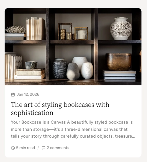
Standard card — Date, Title, Exerpt, Read Time, and Comments.
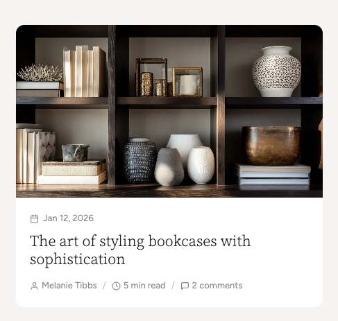
Author-focused card — Date, Title, Author, Read Time, and Comments.
Admin Steps and Requirements
Some features require action in the Shopify admin before they'll appear in your theme.
Before You Begin
The Blog Posts section requires at least one blog with published articles. Go to Content → Blog posts → Manage blogs and create a blog if you don't have one. You'll also need at least one published article for the grid or carousel to display content.
After adding the Blog Posts section, you must select a blog using the Blog picker in the section settings. If no blog is selected, placeholder cards will display in the editor. The "View all" link also requires a blog to be selected.
The Article Media block shows the article's featured image. If no featured image is set in the Shopify blog editor, a placeholder icon will display instead. For the best appearance, add a featured image to every article.
For the Excerpt block to show a custom preview, add an excerpt in the Shopify blog editor (under Excerpt in the sidebar). If left blank, an excerpt will be auto-generated from the article body content.
When the Article Card's color scheme differs from the Blog Posts section's color scheme, the card media automatically receives rounded corners based on your card border radius setting. This creates a clean, inset card appearance.
For the Comments block or the comments count in Article Meta to display, comments must be enabled for your blog. Go to Content → Blog posts → Manage blogs, edit your blog, and set Comments to either "Comments are allowed, pending moderation" or "Comments are allowed, and are published automatically."
The Article Meta block combines date, author, read time, and comments into a single row. You can also use standalone Date, Author, Read Time, and Comments blocks instead for greater layout flexibility. Use one approach or the other to avoid duplication.
Frequently Asked Questions
@app blocks. Any Shopify app with theme app
extensions can be embedded directly within your article
card layout.