About
A blog in Shopify is a built-in content management feature that lets you publish articles (blog posts) on your online store. Blogs are a powerful way to share news, tutorials, brand stories, and SEO-friendly content with your customers. Each blog can contain multiple articles and supports features like tagging, author attribution, and commenting.
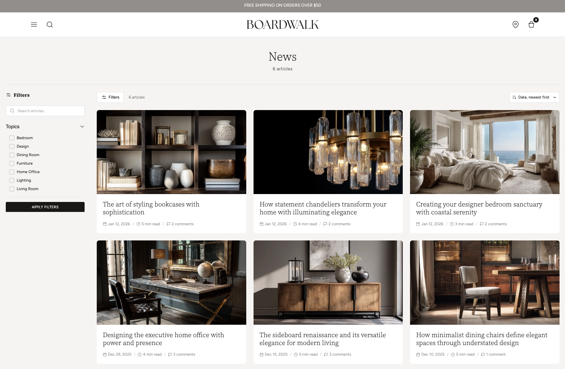
In the Boardwalk theme, the Blog section is a full-featured blog listing page that displays all your articles in a responsive, customizable grid. It includes a left sidebar with keyword search, tag-based topic filters, and author filters. The toolbar provides sort controls and an article count, while new content refreshes without full reloads. Each article is rendered through a modular, block-based Article Card that you can fully customize with child blocks like media, title, excerpt, tags, meta, and more.
How to set up the Blog Section
Follow these steps to configure and publish your blog listing page in Shopify using the Boardwalk theme.
Create a Blog and Write Articles
In your Shopify admin, go to
Content → Blog posts. If you don't
already have a blog, click
Manage blogs
and create one (e.g., "News," "Journal," or "Stories").
Then add articles with a title, body content, featured
image, excerpt, and tags.
Open the Theme Editor
Navigate to
Online Store → Themes, find Boardwalk,
and click Customize. In the page selector
dropdown at the top center, choose
Blogs → Default blog (or any custom
blog template you've created).
Configure the Blog Section Settings
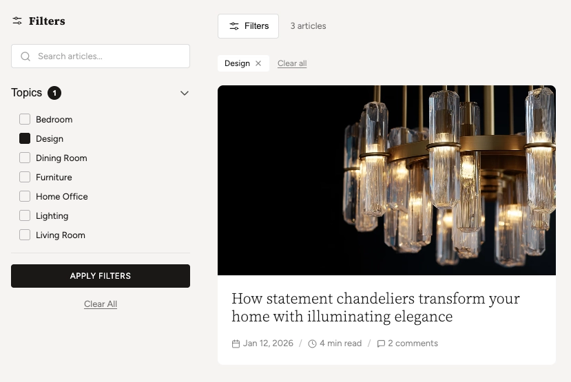
Click the Blog section in the sidebar. Set content width, header alignment, grid columns, gap spacing, articles per page, and your color scheme. Enable or disable filtering and choose whether filter groups start expanded or collapsed.
Customize the Article Card
Inside the Blog section, click the Article Card block. This is the parent block that controls how each article appears in the grid. Set card border radius, text alignment, and color scheme. Then add child blocks like Article Media, Title, Excerpt, Tags, and Meta to build your desired card layout.
Arrange and Reorder Child Blocks
Drag and drop the child blocks inside the Article Card to change their display order. For example, you might show Tags above the Title, or place the Excerpt before the Meta line. Add Dividers or Spacers between blocks for visual separation.
Add Tags to Your Articles (For Filters)
For the topic filters to appear in the sidebar, your
articles must have tags. Go to
Content → Blog posts, edit each article,
and add tags in the Tags field on the
right sidebar. Tags will automatically populate the Topics
filter group.
Note: The Author filter only appears when your blog has articles from more than one author. The filter is automatically built from the author data in your articles.
Save and Preview
Click Save in the Theme Editor. Preview your blog page to verify the grid layout, filtering, sorting, and pagination are working as expected.
Section-Level Settings
These settings apply to the entire Blog section and are accessible by clicking the top-level section in the Theme Editor sidebar.
Blog Section Settings
Controls the maximum width of the blog container.
Options: Page (matches your theme's content
width) or Full (100% width).
Aligns the blog title, description, and article count.
Options: Left, Center, or
Right.
Toggles the full filter system including keyword search, topic tag filters, and author filters. Shows in a sidebar on desktop and a slide-out drawer on mobile.
When disabled, the filters sidebar is hidden on desktop but can be opened with the Filters toolbar button.
When enabled, the Topics and Author filter groups start open instead of collapsed.
Number of article columns in the grid on desktop. Range: 2 to 4.
Number of columns on mobile. Options:
1 column or 2 columns.
Spacing between article cards in the grid. Range: 8px to 48px.
How many articles to display per page before pagination kicks in. Range: 4 to 36.
Top and bottom padding for the entire section. Range: 0px to 100px.
Select any defined color scheme to style the section background and text.
Custom background color for search inputs, sort dropdowns, and active filter tag badges.
Parent Block
The Article Card is the top-level block that wraps each article in the blog grid and serves as the container for all child blocks.
Article Card
The parent block that wraps each article in the blog grid. Controls the overall card appearance and holds all child blocks.
- Border radius — 0px to 24px
- Text alignment — Left, Center, or Right
- Card color scheme — Select any defined color scheme. When this differs from the section color scheme, card media automatically receives rounded corners.
Child Blocks
Child blocks are added inside the Article Card to build your desired card layout — arrange, reorder, or remove them to customize how each article appears.
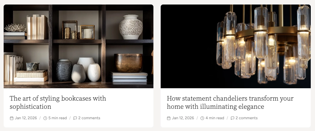
Article Media
Renders the article's featured image. If no image is set, a placeholder icon is displayed.
- Aspect ratio — Adapt, Widescreen (16:9), Standard (4:3), Landscape (3:2), Square (1:1), or Portrait (3:4).
Article Title
Displays the article's title as a clickable heading that links to the full article page.
- Font family — Heading, Body, Menu, or Caption
- Font weight — Light, Normal, Medium, or Bold
- Font size — 14px to 48px
- Line height — 1.0 to 2.0
- Letter spacing — Tight, Normal, Wide, or Extra wide
- Padding — Top and bottom
Article Tags
Shows the article's tags as small, styled badges. Tags are assigned in the Shopify admin blog editor.
- Max tags — 1 to 5
- Show more indicator — Display a "+N" badge for additional tags
- Font size — 9px to 16px
- Background and text color — Custom colors for the tag badges
- Border radius — 0px to 20px
- Gap — Spacing between tags
- Padding — Top and bottom
Article Excerpt
Renders a short preview. Uses the excerpt field if set, otherwise auto-generates from body content.
- Excerpt length — 50 to 300 characters
- Max lines — 1 to 6 (CSS line clamping)
- Typography — Font family, size (12–20px), line height, and opacity
- Padding — Top and bottom
Article Meta
A compact, all-in-one metadata line combining the date, author name, read time, and comment count with configurable separators.
- Date — Show/hide, show icon, format (Full, Abbreviated, Numeric US, Numeric EU, ISO)
- Author — Show/hide, show icon
- Read time — Show/hide, show icon (auto-calculated at 200 wpm)
- Comments count — Show/hide, show icon, show when zero
- Separator — Dot (·), Dash (—), Slash (/), or Pipe (|)
- Typography — Font family, size (10–18px), and opacity
Article Date
A standalone date block with six format options including relative "time ago."
- Date format — Full, Abbreviated, Numeric US, Numeric EU, ISO, or Relative ("3 days ago")
- Show icon — Toggle calendar icon
- Typography — Font family, size, and opacity
- Padding — Top and bottom
Article Author
Displays the article's author name with an optional prefix and user icon.
- Prefix — Custom text before the name (e.g., "By", "Written by")
- Show icon — Toggle user icon
- Typography — Font family, size, and opacity
- Padding — Top and bottom
Article Read Time
Auto-calculates estimated reading time at 200 words per minute.
- Format — Short ("5 min"), Abbreviated ("5 min read"), or Full ("5 minutes read")
- Show icon — Toggle clock icon
- Typography — Font family, size, and opacity
- Padding — Top and bottom
Comments
Displays the article's comment count on the card. Useful for showing engagement at a glance. Comments must be enabled in the Shopify admin for this block to display.
- Show comment date — Toggle date on each comment
- Comments per page — 5 to 50
- Section color scheme — For the background area
- Card color scheme — For the comment form card
- Card border radius — 0px to 40px
- Card shadow — Toggle drop shadow
- Padding — Top and bottom
Text
A rich text block for adding custom static text to every article card (e.g., a "Read more" label or promotional note).
- Text — Rich text editor
- Font family — Heading, Body, Caption, or Menu
- Font size — Configurable
Divider
A horizontal line for visually separating content inside the article card.
- Use section color — Match the parent's foreground color, or set a custom color
- Line style — Solid or Dashed
- Line thickness — 1px to 10px
Spacer
An invisible spacing block for adding vertical or horizontal padding between other blocks inside the article card.
- Vertical padding — 0px to 40px
- Horizontal padding — 0px to 40px
Tip: The Article Card also supports
@app blocks, so any Shopify app with theme app
extensions can be embedded directly inside your article cards.
Built-In Features
The Blog section comes packed with features that work automatically — no apps or custom code needed.
Feature Overview
A real-time search input in the filter sidebar that matches against article titles and excerpts. Results update as you type.
Filter articles by tags using checkboxes. Tag filtering loads results without a full page reload. You can combine multiple tags.
Filter by author using checkboxes. This filter appears automatically when your blog has articles by more than one author. Operates client-side for instant results.
Sort articles by date (newest or oldest first) or title (A–Z or Z–A) using the toolbar dropdown.
Page numbers load new results without a full page refresh. Supports browser back/forward navigation and updates the URL.
On tablet and mobile, the sidebar is replaced by a slide-out drawer with the same filter controls. The Filters button in the toolbar opens and closes it.
When filters are applied, active tags appear as removable badges above the grid. Clicking the "×" on a tag removes that filter, and a "Clear all" link resets everything.
When a filter group has more than 8 items, a search input automatically appears within the group so users can quickly find the tag or author they're looking for.
Admin Steps and Requirements
Some features require action in the Shopify admin before they'll appear in your theme.
Before You Begin
The Blog section requires at least one blog to exist. Go to Content → Blog posts → Manage blogs and create a blog if you don't have one. You'll also need at least one published article for the grid to display.
The Topics filter group only appears when your articles have tags. Edit your articles in Content → Blog posts and add tags in the Tags field on the right sidebar of each article.
The Author filter only appears when your blog has articles from more than one staff account. If you have a single author, this filter group will be hidden automatically.
The Article Media block shows the article's featured image. If no featured image is set in the Shopify blog editor, a placeholder icon will display instead. For the best appearance, add a featured image to every article.
For the Excerpt block to show a custom preview, add an excerpt in the Shopify blog editor (under Excerpt in the sidebar). If left blank, an excerpt will be auto-generated from the article body content.
When the Article Card's color scheme differs from the Blog section's color scheme, the card media automatically receives rounded corners based on your card border radius setting. This creates a clean, inset card appearance.
The Article Meta block combines date, author, read time, and comments into a single row. You can also use standalone Date, Author, Read Time, and Comments blocks instead for greater layout flexibility. Use one approach or the other to avoid duplication.
Frequently Asked Questions
@app blocks. Any Shopify app with theme app
extensions can be embedded directly within your article
card layout.