About
A collection list is a curated display of your store's product collections, giving visitors a quick overview of the categories you offer. Instead of listing individual products, it highlights the collections themselves — such as "Sofas," "Beds," or "End Tables" — so shoppers can browse by category and find what they're looking for faster.
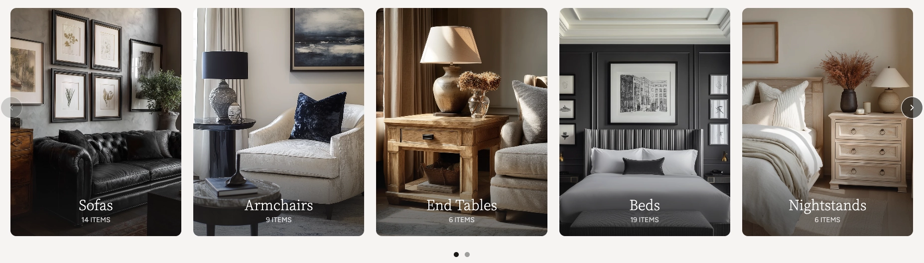
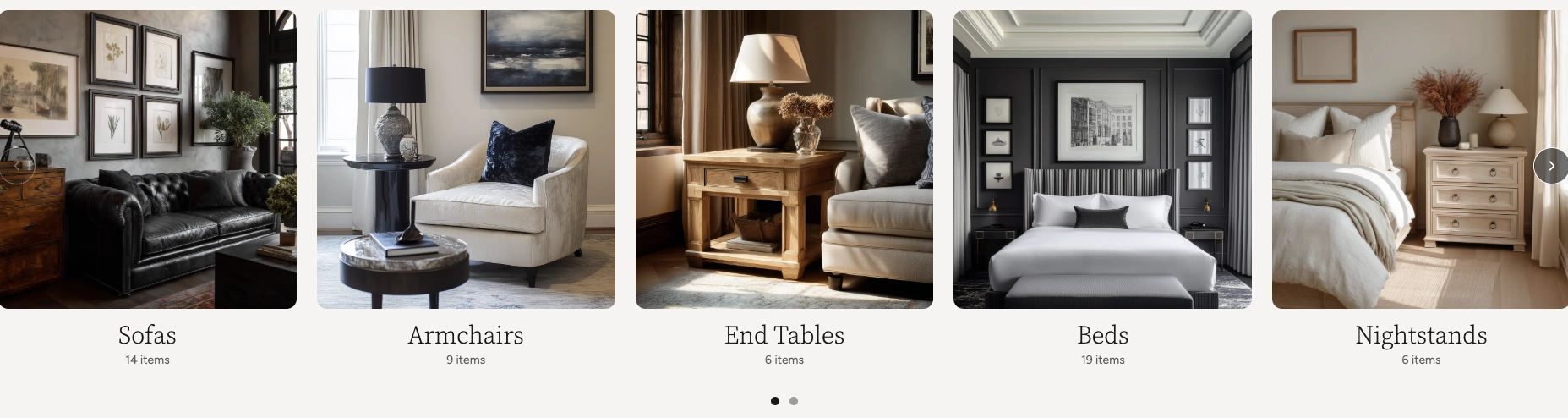
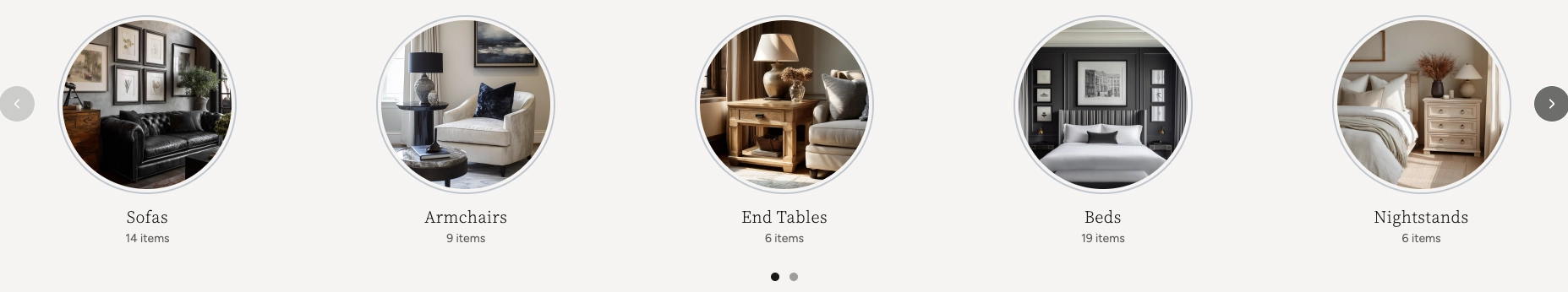
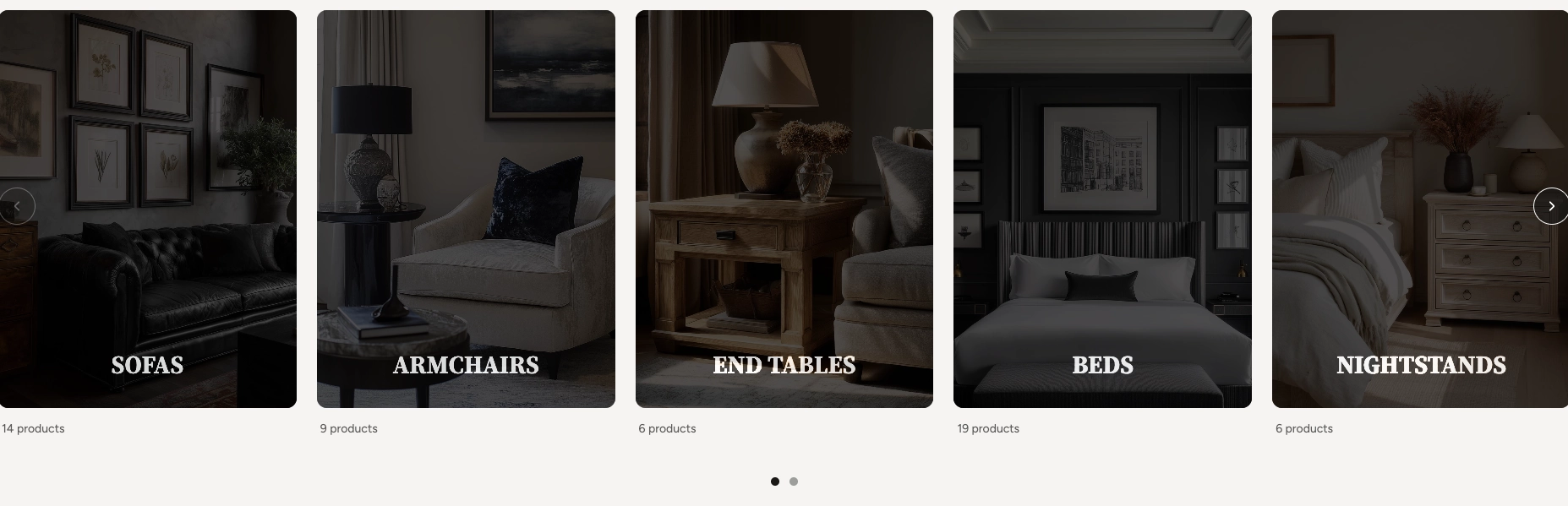
In the Boardwalk theme, the Collection List section displays your collections as visually rich cards in a responsive grid or swipeable carousel. Each collection card shows the collection's featured image, title, and product count. The section offers multiple card styles — Standard, Minimal, Circular, and Cutout — that completely change the look and feel of the layout. It also includes a heading group at the top for a title and description, and built-in carousel navigation with arrows and a draggable progress slider.
How to Set Up the Collection List Section
Follow these steps to add and configure a collection list on any page of your Shopify store using the Boardwalk theme.
Open the Theme Editor
In your Shopify admin, go to
Online Store → Themes, find Boardwalk,
and click Customize. Navigate to the page
where you want to display your collections using the page
selector dropdown at the top center of the editor.
Add the Collection List Section
Click Add section in the Theme Editor sidebar and choose one of the Collection list presets from the list. Five presets are available — Standard, Minimal, Banner, Circular, and Cutout — each preconfigured with a different card style. The section will appear on your page with placeholder collection cards.
Select Your Collections
Click on the Collection list section in the sidebar and use the Collections picker to choose which collections to display. You can add as many collections as you like — if you have more than your column count, the carousel will let visitors scroll through them.
Note: Collections must be created in your Shopify admin under Products → Collections before they can be selected here. Each collection should also have a featured image set for the best visual results.
Configure the Section Settings
Click the Collection list section in the sidebar. Set the layout mode (grid or carousel), navigation options, column count, column gap, padding, and color scheme. These settings control the overall look and behavior of the entire section.
Add a Heading (Optional)
The section includes a built-in heading group at the top where you can add text blocks for a title and description (e.g., "Our Collections"). Click the heading group in the sidebar and edit the text blocks to match your branding.
Customize the Collection Card
Click on the Collection card block in the sidebar to access the card-level settings. Here you can change the card type, toggle the product count, enable the card flip effect, adjust colors, corner radius, aspect ratio, and typography settings.
Save and Preview
Click Save in the Theme Editor. Preview your page to verify the collection cards, carousel navigation, and heading are displaying as expected.
Collection Card Types
The Collection List section includes four distinct card types that completely change the look and feel of the section. You can switch between card types at any time from the Collection card block settings — your collections and content stay the same, only the visual presentation changes.
Standard
The default card style. Each collection is displayed as a full-width image with the collection title and product count overlaid on top. You can choose from three overlay styles — Fade (a gradient that darkens toward the bottom), Solid (a uniform semi-transparent overlay), or None (text sits directly on the image with no background). The title appears in a serif font and the text position can be set to top, middle, or bottom of the card. The image aspect ratio is also customizable.
Minimal
A clean, no-frills card where the image and text are separated. The collection image appears in a square aspect ratio with the title and product count displayed below it. On hover, the title shows a subtle underline accent that animates from left to right. This style works well when you want a modern, editorial feel where the images speak for themselves.
Circular
Collection images are displayed as circles with a decorative ring border around each one. The title and product count are centered below the image. On hover, the ring expands slightly and becomes more prominent. This style is great for category or brand showcases where you want a softer, more approachable look.
Cutout
A striking, design-forward card that uses a text masking effect. The collection image sits behind a dark overlay, and the title text is "cut out" of that overlay so the image shows through the letters. Each card uses a portrait aspect ratio (3:4). Below the card, the product count is displayed alongside a "View all" link that animates in on hover. The text position can be set to top, middle, or bottom.
Card Flip Feature
The Standard and Minimal card types support an optional card flip effect that reveals additional information when visitors hover over a collection card.
When card flip is enabled, hovering over a collection card triggers a slide-up overlay that shows the collection title and its description text. The overlay uses a darkened background with a vignette effect to ensure the text is readable over the image. This gives shoppers a quick summary of the collection without leaving the page.
Note: The card flip overlay only appears when the collection has a description set in your Shopify admin. Go to Products → Collections, select the collection, and add text to the Description field. If a collection has no description, the flip effect won't activate even when the setting is enabled.
Section-Level Settings
These settings apply to the entire Collection List section and are accessible by clicking the top-level section in the Theme Editor sidebar.
Collection List Section Settings
Controls the maximum width of the collection list
container. Options: Page (matches your
theme's content width) or Full (100%
width). This setting only appears when both desktop and
mobile carousels are turned off.
A collection list picker that lets you choose which collections to display. You can add, remove, and reorder collections using this picker. If no collections are selected, placeholder cards are shown.
When turned on, collection cards display as a horizontally scrollable carousel on desktop instead of a static grid.
When turned on, collection cards display as a swipeable carousel on mobile devices instead of a stacked layout.
Displays previous and next arrow buttons on top of the carousel for manual navigation. Only visible when carousel mode is enabled. Arrows are automatically hidden on mobile devices.
Displays a draggable progress slider below the carousel that tracks scroll position and lets visitors scrub between slides. Only visible when carousel mode is enabled.
Number of collection columns displayed in the grid or visible at once in carousel mode on desktop. Range: 2 to 6.
Spacing between collection cards. Options:
None, Small,
Medium, or Large.
Controls the top and bottom padding of the section on desktop screens. Top and bottom range: 0px to 100px.
Select any defined color scheme to style the section background and text.
Collection Card Settings
The Collection card is a block inside the section that controls how each individual collection is displayed. These settings apply uniformly to all collections in the list.
Collection Card Block Settings
Selects the visual style for all collection cards.
Options: Standard, Minimal,
Circular, or Cutout. Each type
changes the layout, hover effects, and overall
appearance of the cards. See the
Card Types section above for
details on each style.
Displays the number of products in each collection below or alongside the collection title. Turning this off hides the count on all cards.
Enables a hover overlay that reveals the collection description. Only works on Standard and Minimal card types, and only when the collection has a description set in the Shopify admin.
Controls the background behind the title text on
Standard cards. Options: Solid (uniform
semi-transparent overlay), Fade (gradient
that darkens toward the bottom), or
None (no overlay). Only visible when the
card type is set to Standard.
Sets the color used for the card overlay, card flip background, and the Cutout mask layer.
Sets the color for decorative accents, such as the hover underline on Minimal cards and the ring border on Circular cards.
Sets the text color for the collection title and product count on the cards.
Rounds the corners of each collection card. Range: 0px to 24px.
Controls the shape of the collection image on Standard
cards. Options: Adapt (uses the image's
natural ratio), Widescreen (4:3),
Landscape (3:2), Square (1:1),
or Portrait (3:4). Only visible when the
card type is set to Standard.
Sets the horizontal alignment of the title text. Options: left, center, or right. Available on Standard, Minimal, and Cutout card types.
Controls the vertical position of the title text within
the card. Options: Top,
Middle, or Bottom. Available
on Standard and Cutout card types.
Controls the font size of the collection title on the cards. Range: 20px to 80px. Available on Standard, Minimal, and Cutout card types.
Built-In Features
The Collection List section comes with features that work automatically — no apps or custom code needed.
Feature Overview
Choose between a horizontally scrollable carousel or a static grid layout. Desktop and mobile can be set independently, so you can use a carousel on mobile and a grid on desktop (or vice versa).
In carousel mode, visitors can swipe on touch devices or scroll horizontally with a mouse. Cards snap smoothly into position for a polished browsing experience.
Optional arrow buttons and a draggable progress slider give visitors additional ways to browse through collections. Both can be toggled on or off.
Switch between Standard, Minimal, Circular, and Cutout card types to completely change the visual presentation. Your collections and content stay the same — only the design changes.
Standard and Minimal cards can show a hover overlay that reveals the collection description. This lets shoppers learn about a collection before clicking through.
Each card can display the number of products in the collection, pulled automatically from your Shopify data. The count updates whenever you add or remove products from a collection.
The grid automatically adapts across screen sizes. On large desktops, it displays your chosen number of columns. On tablets, it caps at 2 columns, and on mobile it stacks to a single column (or swipeable carousel if enabled).
Collection cards animate into view as visitors scroll down the page. Each card uses a slide-in effect with staggered timing, creating a smooth, cascading entrance.
Heading Group Settings
The Heading group is a container at the top of the section that holds text blocks for a title and description. It has its own layout and spacing settings.
Header Group Settings
Controls whether text blocks inside the group are stacked vertically or arranged side by side horizontally.
Sets whether the group fits its content
(Fit) or stretches to fill the available
space (Fill).
Limits the width of the heading content. Options:
Auto (no limit) or
Narrow (600px max). Useful for keeping
heading text from stretching too wide on large screens.
Sets the horizontal text alignment within the heading group. Options: left, center, or right.
Controls the positioning of content within the group. Options include left, center, right, and space between.
Controls the spacing between text blocks (gap: 0px to 100px) and the horizontal and vertical padding around the group (0px to 200px each).
Admin Steps and Requirements
Some features require action in the Shopify admin before they'll work as expected in your theme.
Before You Begin
You need to create collections in your Shopify admin before they can appear in this section. Go to Products → Collections and create the collections you want to feature. Each collection should have products assigned to it.
Each collection card displays the collection's featured image. For the best appearance, make sure every collection has a featured image set. Go to Products → Collections, select a collection, and upload an image in the Collection image area. If no image is set, a placeholder will be displayed instead.
The card flip feature displays the collection description on hover. To use this feature, make sure your collections have description text entered in the Shopify admin under Products → Collections → Description. The description is truncated to approximately 30 words on the overlay.
For best results, use images that work well when cropped to different aspect ratios. Standard cards support multiple aspect ratios, Minimal cards crop to square, Circular cards crop to a circle, and Cutout cards use a portrait ratio. Images with a clear subject centered in the frame tend to look best across all card types.
The section uses a color scheme for its background and text. Color schemes are defined in Online Store → Themes → Customize → Theme settings → Colors. Make sure you've set up the color schemes you want to use before configuring this section.