About
A collection in Shopify is a way to group and organize your products so customers can easily browse and find what they're looking for. You can create collections based on product type, season, sale items, or any criteria you choose. Collections can be built manually by hand-picking products, or automatically using conditions like tags, price, or vendor.
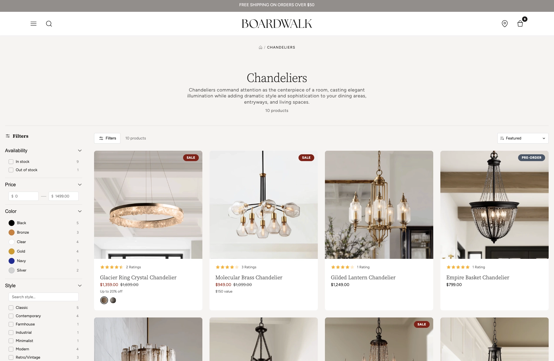
In the Boardwalk theme, the Collection section is a full-featured product listing page that displays all products in a responsive, customizable grid. It includes a left sidebar with filters for availability, price, color, vendor, and any other product filters you've set up in Shopify. The toolbar provides sort controls and a product count, while filtering, sorting, and pagination all update without a full page reload. Each product is rendered through a modular, block-based Product Card that you can fully customize with child blocks like media, title, price, ratings, sale info, swatches, and more.
How to Set Up the Collection Section
Follow these steps to configure and publish your collection page in Shopify using the Boardwalk theme.
Create a Collection and Add Products
In your Shopify admin, go to
Products → Collections. Click
Create collection, give it a title,
description, and image, then add products either manually
or by setting up automatic conditions. Make sure the
collection is set to Active so it appears
on your storefront.
Set Up Storefront Filters
Navigate to
Online Store → Navigation and look for
Collection and search filters. Add the
filter groups you'd like customers to use, such as
Availability, Price, Product type, Vendor, Color, or any
custom metafield filters. These filter groups will
automatically appear in the Collection section sidebar.
Note: The filters that show up in the Collection section sidebar come directly from your Storefront filtering settings in the Shopify admin — not from the theme editor. Make sure to configure your desired filters there first.
Open the Theme Editor
Navigate to Online Store → Themes, find
Boardwalk, and click Customize. In the
page selector dropdown at the top center, choose
Collections → Default collection (or
any custom collection template you've created).
Configure the Collection Section Settings
Click the Collection section in the sidebar. Set content width, header alignment, grid columns, gap spacing, products per page, and your color scheme. Enable or disable filtering and choose whether filter groups start expanded or collapsed.
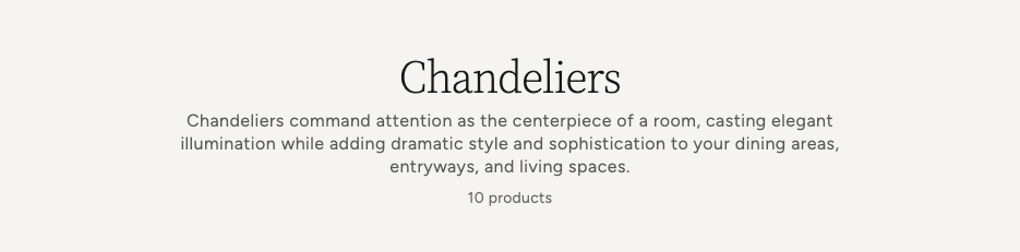
Customize the Collection Header
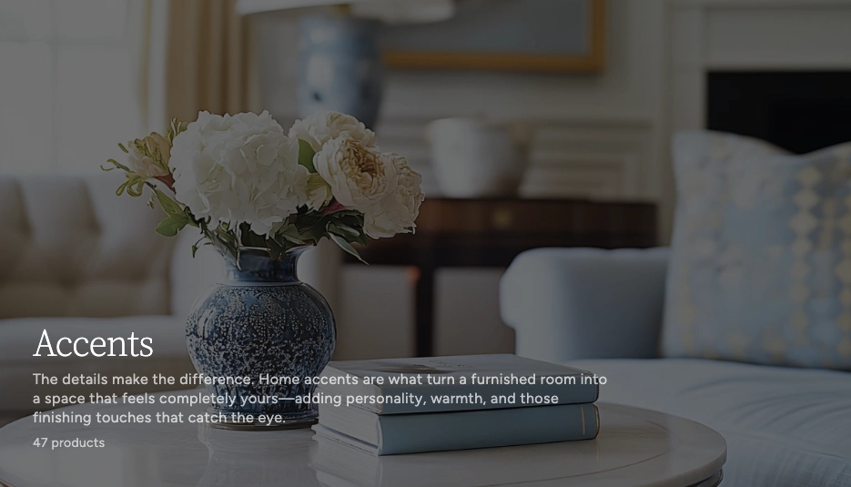
Inside the Collection section, click the Collection Header block. This is the hero-style banner at the top of your collection page. It can display the collection's image as a full-width background with your title, description, and product count layered on top. Adjust height, overlay style, text positioning, and colors. Add or remove child blocks like Title, Description, and Count to build your desired header layout.
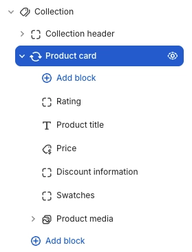
Customize the Product Card
Click the Product Card block inside the Collection section. This is the parent block that controls how each product appears in the grid. Set card border radius, text alignment, and color scheme. Then add child blocks like Product Media, Title, Price, Rating, Sale, and Swatches to build your desired card layout.
Save and Preview
Click Save in the Theme Editor. Preview your collection page to verify the grid layout, filtering, sorting, and pagination are working as expected.
Section-Level Settings
These settings apply to the entire Collection section and are accessible by clicking the top-level section in the Theme Editor sidebar.
Collection Section Settings
Controls the maximum width of the collection container.
Options: Page (matches your theme's content
width) or Full (100% width).
Toggles visibility of the collection description text in the header area. The description is set in the Shopify admin when editing the collection.
Aligns the collection title, description, and product
count. Options: Left, Center,
or Right.
Toggles the full filter system including availability, price, vendor, and any other filters configured in your storefront filtering settings. Shows in a sidebar on desktop and a slide-out drawer on mobile.
When disabled, the filters sidebar is hidden on desktop but can be opened with the Filters toolbar button.
When enabled, the filter groups start open instead of collapsed.
Number of product columns in the grid on desktop. Range: 2 to 4.
Number of columns on mobile. Options:
1 column or 2 columns.
Spacing between product cards in the grid. Range: 8px to 48px.
How many products to display per page before pagination kicks in. Range: 8 to 48.
Top and bottom padding for the entire section. Range: 0px to 100px.
Select any defined color scheme to style the section background and text.
Custom background color for filter search inputs, sort dropdowns, and active filter tag badges.
Collection Header Parent Block
The Collection Header is a hero-style banner that uses the collection's image (set in the Shopify admin) as a full-width background with your content layered on top. It acts as a parent block with its own child blocks.
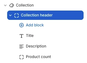
Collection Header (Parent)
Controls the header banner appearance including the background image, overlay, content positioning, and layout dimensions. Holds the Title, Description, and Count child blocks.
- Show image — Toggle the collection image as a background. When off, the header displays as a text-only area without a fixed height.
- Text alignment — Left, Center, or Right
- Content position (vertical) — Top, Middle, or Bottom
- Content position (horizontal) — Left, Center, or Right
- Content padding — 16px to 80px
- Content maximum width — 320px to 960px
- Desktop height — 160px to 640px (only when image is shown)
- Mobile height — 120px to 480px (only when image is shown)
- Overlay style — None, Solid, Gradient bottom, or Gradient full (only when image is shown)
- Overlay color — Custom color with transparency control (only when image is shown)
- Text color — Custom text color (only when image is shown)
Collection Header Child Blocks
Collection Title
Displays the collection's title. Automatically pulls the title from the Shopify admin.
- Heading tag — H1, H2, H3, or Paragraph
- Font size — 18px to 80px
- Font weight — Normal, Medium, Semibold, or Bold
- Line height — 0.9 to 1.6
- Letter spacing — Tight, Normal, or Wide
Collection Description
Renders the collection description set in the Shopify admin. Supports rich text content.
- Font size — 12px to 24px
- Opacity — 40% to 100%
- Max lines — 0 (no limit) to 8. Truncates long descriptions to the specified number of lines.
Product Count
Shows the number of products in the collection inside the header banner area.
- Display style — "10 products", "10 items", or just the number
- Font size — 10px to 20px
- Opacity — 30% to 100%
- Padding — Top and bottom
Product Card Parent Block
The Product Card is the top-level block that wraps each product in the collection grid and serves as the container for all child blocks.
Product Card (Parent)
The parent block that wraps each product in the collection grid. Controls the overall card appearance and holds all child blocks.
- Border radius — 0px to 24px
- Text alignment — Left, Center, or Right
- Card color scheme — Select any defined color scheme. When this differs from the section color scheme, card media automatically receives rounded corners.
Product Card Child Blocks
Child blocks are added inside the Product Card to build your desired card layout — arrange, reorder, or remove them to customize how each product appears.
Product Media
Renders the product's featured image. If no image is set, a placeholder is displayed. Supports a secondary image that appears on hover to give customers a quick preview of the product from a different angle. The Product Media block also serves as the container for overlay blocks like Sale and Stock badges.
- Aspect ratio — Adapt, Standard (4:3), Landscape (3:2), Square (1:1), or Portrait (3:4)
- Show secondary image on hover — Displays the second product image when customers hover over the card
Sale Overlay
A badge that appears on the product image when a product has a compare-at price higher than the current price. The badge is hidden automatically when the product is not on sale.
- Sale label — Custom text for the badge (e.g., "Sale", "On Sale", "Deal")
- Position — Top left or Top right
- Background and text color — Custom colors for the badge
Stock Overlay
Displays "Out of Stock" or "Pre-Order" badges on the product image based on inventory status. The out-of-stock badge shows when no variants are available, and the pre-order badge shows when a variant allows overselling with zero or negative inventory.
- Out of stock label — Custom text for the out-of-stock badge
- Out of stock colors — Background and text color
- Pre-order label — Custom text for the pre-order badge
- Pre-order colors — Background and text color
- Position — Top left or Top right
Product Title
Displays the product's title as a clickable link that takes customers to the full product page.
- Font family — Heading, Body, Caption, or Menu
- Font weight — Normal or Bold
- Font size — 12px to 30px
- Line height — 1.0 to 2.0
- Letter spacing — Tight, Normal, or Loose
- Padding — Top and bottom
Price
Shows the product's price with support for sale prices, compare-at prices, unit pricing, installment information, and tax details. Automatically updates when a customer selects a different variant via swatches.
- Price display mode — Show the selected variant's price or a price range
- Show unit price — Toggle unit pricing for products sold by weight or volume
- Show installments — Toggle installment payment information
- Show tax info — Toggle tax information
- Show sale price first — Places the discounted price before the original price
- Sale price color — Optional custom color for sale prices
- Typography — Font size, line height, letter spacing, and opacity
Product Rating
Displays a star rating and optional review count pulled
from the product's review metafields. Requires a product
reviews app that writes to Shopify's standard
reviews.rating metafield.
- Width — Auto (fits content) or Full (spans the card width)
- Show review count — Toggle the number of reviews next to the stars
- Star color — Custom color for the star icons
- Star size — Small or Medium
- Padding — Top and bottom
Sale Info
Shows how much the customer saves when a product is on sale. Automatically calculates the best discount across all variants. Displays as a percentage (e.g., "Up to 20% off") when the discount is a round number, or as a dollar value (e.g., "$150 value") otherwise. Hidden when no discount applies.
- Typography — Font family, font weight, font size (12–30px), line height, and letter spacing
- Padding — Top and bottom
Swatches
Displays color or variant option swatches below the product card, allowing customers to see available options at a glance. Swatches automatically use the color values and swatch images configured in your Shopify admin.
- Swatch size — Small, Medium, or Large
Text
A rich text block for adding custom static text to every product card (e.g., a "Shop now" label or promotional note).
- Text — Rich text editor
- Font family — Heading, Body, Caption, or Menu
- Font size — Configurable
Divider
A horizontal line for visually separating content inside the product card.
- Use section color — Match the parent's foreground color, or set a custom color
- Line style — Solid or Dashed
- Line thickness — 1px to 10px
Spacer
An invisible spacing block for adding vertical or horizontal padding between other blocks inside the product card.
- Vertical padding — 0px to 40px
- Horizontal padding — 0px to 40px
Tip: The Product Card also supports
@app blocks, so any Shopify app with theme app
extensions can be embedded directly inside your product
cards.
Built-In Features
The Collection section comes packed with features that work automatically — no apps or custom code needed.
Feature Overview
Full support for Shopify's native storefront filtering including checkbox filters, color swatches, price range inputs, and boolean toggles. Filters update results without a full page reload.
When your products have color options with swatch values configured in the Shopify admin, the filter sidebar displays visual color circles next to each option instead of plain checkboxes.
A dedicated price range filter with min/max input fields lets customers narrow results by budget. The filter automatically displays the store's currency symbol.
Sort products using the toolbar dropdown. Sort options are provided by Shopify and typically include Featured, Price (low to high / high to low), Best selling, Newest, and A–Z / Z–A.
Page numbers load new results without a full page refresh. Supports browser back/forward navigation and updates the URL automatically.
On tablet and mobile, the sidebar is replaced by a slide-out drawer with the same filter controls. The Filters button in the toolbar opens and closes it.
When filters are applied, active tags appear as removable badges above the grid. Clicking the "×" on a tag removes that filter, and a "Clear all" link resets everything.
When a filter group has more than 8 options, a search input automatically appears within the group so customers can quickly find the value they're looking for.
When enabled, hovering over a product card reveals the second product image with a smooth crossfade transition. If a product only has one image, the card shows a subtle zoom effect on hover instead.
The desktop filters sidebar stays in view as customers scroll through the product grid, making it easy to adjust filters at any time.
Admin Steps and Requirements
Some features require action in the Shopify admin before they'll appear in your theme.
Before You Begin
The Collection section requires at least one collection to exist. Go to Products → Collections and create a collection if you don't have one. You'll also need at least one product in the collection for the grid to display.
The filter sidebar uses Shopify's built-in storefront filtering system. Go to Online Store → Navigation → Collection and search filters to add and configure your desired filter groups such as Availability, Price, Product type, Vendor, and Color.
The Collection Header block displays the collection's image as a background. To set this, go to Products → Collections, edit your collection, and upload an image in the Image area. Without an image, the header falls back to a text-only layout.
The Product Media block shows the product's featured image. If no image is set in the Shopify product editor, a placeholder will display instead. For the best appearance, add images to every product. Add at least two images per product if you want to use the secondary image hover effect.
The Product Rating block reads from the standard Shopify
reviews.rating metafield. You'll need a
compatible product reviews app installed (such as
Shopify's Product Reviews, Judge.me, or Loox) that
writes to this metafield. Without it, the rating block
won't display anything.
The Sale Overlay badge and the Sale Info block only appear when a product has a Compare at price set in the Shopify product editor that is higher than the current price. Make sure to fill in this field on any products you want marked as on sale.
For color swatches to appear in both the product cards and the filter sidebar, configure your color option values with swatch colors or images in Settings → Custom data → Product variant options.
When the Product Card's color scheme differs from the Collection section's color scheme, the card media automatically receives rounded corners based on your card border radius setting. This creates a clean, inset card appearance.
Frequently Asked Questions
reviews.rating metafield. You need a
product reviews app installed (such as Shopify's Product
Reviews, Judge.me, or Loox) that writes to this
metafield. If no reviews data exists for a product, the
rating block simply won't appear on that card.
@app blocks. Any Shopify app with theme app
extensions can be embedded directly within your product
card layout.