About
A collection in Shopify is a way to group related products together so customers can browse and shop by category. For example, you might have collections for "Summer Dresses," "Best Sellers," or "New Arrivals." Collections make it easy for shoppers to find what they're looking for without scrolling through your entire catalog.
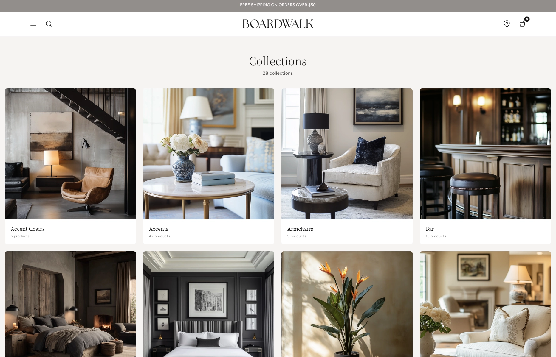
In the Boardwalk theme, the Collections section is the main listing page that displays all of your store's collections in a responsive, customizable grid. It includes a section header with an optional description and collection count, and each collection is rendered through a modular, block-based Collection Card that you can fully customize with child blocks like media, title, description, and product count. The section also includes built-in pagination when you have many collections.
How to Set Up the Collections Section
Follow these steps to configure and publish your collections listing page in Shopify using the Boardwalk theme.
Create Collections in Shopify
In your Shopify admin, go to
Products → Collections. Click
Create collection and give it a title,
description, and featured image. You can create
manual collections (hand-picked products)
or automated collections (products added
by rules like tags, price, or vendor).
Open the Theme Editor
Navigate to Online Store → Themes, find
Boardwalk, and click Customize. In the
page selector dropdown at the top center, choose
Collections list (or any custom list
collections template you've created).
Configure the Collections Section Settings
Click the Collections section in the sidebar. Set the content width, header alignment, grid columns, gap spacing, collections per page, and your color scheme. You can also add an optional description and toggle the collection count display.
Customize the Collection Card
Inside the Collections section, click the Collection Card block. This is the parent block that controls how each collection appears in the grid. Set the card border radius, text alignment, and color scheme. Then add child blocks like Collection Title, Description, and Product Count to build your desired card layout.
Arrange and Reorder Child Blocks
Drag and drop the child blocks inside the Collection Card to change their display order. For example, you might place the Product Count above the Description, or add a Spacer between blocks for visual separation.
Add Featured Images to Your Collections
For the best visual appearance, make sure each collection
has a featured image. Go to
Products → Collections, edit each
collection, and upload an image in the
Collection image section. If no image is
set, a placeholder will be displayed instead.
Note: Collection descriptions are optional. When provided, the Description block will show a truncated preview on each card. Without a description, the block is automatically hidden.
Save and Preview
Click Save in the Theme Editor. Preview your collections page to verify the grid layout, pagination, and card appearance are working as expected.
Section-Level Settings
These settings apply to the entire Collections section and are accessible by clicking the top-level section in the Theme Editor sidebar.
Collection Section Settings
Controls the maximum width of the collections container.
Options: Page (matches your theme's content
width) or Full (100% width).
Optional rich text shown below the page title. Use this to introduce your collections or provide helpful context for shoppers.
Displays the total number of collections below the header (e.g., "12 collections").
Aligns the page title, description, and collection
count. Options: Left, Center,
or Right.
Number of collection card columns in the grid on desktop. Range: 2 to 5.
Number of columns on mobile. Options:
1 column or 2 columns.
Spacing between collection cards in the grid. Range: 8px to 48px.
How many collections to display per page before pagination appears. Range: 8 to 48.
Top and bottom padding for the entire section. Range: 0px to 100px each.
Select any defined color scheme to style the section background and text.
Parent Blocks
Parent blocks serve as top-level containers that hold and organize child blocks within the section.
Collection Card
The parent block that wraps each collection in the grid. Controls the overall card appearance and holds all child blocks. Each card links directly to the collection page.
- Border radius — 0px to 24px
- Text alignment — Left, Center, or Right
- Card color scheme — Select any defined color scheme. When this differs from the section color scheme, card media automatically receives rounded corners.
Child Blocks
Child blocks are added inside parent blocks to build your desired layout — arrange, reorder, or remove them to customize the appearance.
Collection Media
Renders the collection's featured image. If no image is set, a placeholder icon is displayed. This block is always present as a static element within the card and includes a subtle zoom effect on hover.
- Aspect ratio — Adapt, Widescreen (16:9), Standard (4:3), Landscape (3:2), Square (1:1), or Portrait (3:4)
- Overlay style — None or Gradient. When set to Gradient, a bottom-to-top color overlay is applied over the image.
- Overlay color — Custom color with transparency support for the gradient overlay (visible only when Overlay style is set to Gradient)
Collection Title
Displays the collection's name. The title is pulled automatically from the collection you created in the Shopify admin.
- Font style — Heading, Body, Caption, or Menu
- Font weight — Normal, Medium, or Bold
- Font size — 12px to 30px
- Line height — 1.0 to 2.0
- Letter spacing — Tight, Normal, or Loose
- Padding — Top and bottom
Collection Description
Shows a truncated preview of the collection's description. The text is pulled from the description you entered in the Shopify admin. If no description exists, this block is automatically hidden.
- Font size — 10px to 20px
- Line height — 1.0 to 2.0
- Maximum words — 5 to 50 (truncates the description to this word count)
- Text opacity — 50% to 100%
- Padding — Top and bottom
Collection Count
Displays the number of products in each collection (e.g., "24 products"). The count updates automatically as you add or remove products from a collection.
- Font size — 10px to 20px
- Line height — 1.0 to 2.0
- Text opacity — 30% to 100%
- Padding — Top and bottom
Spacer
An invisible spacing block for adding vertical or horizontal padding between other blocks inside the collection card.
- Vertical padding — 0px to 40px
- Horizontal padding — 0px to 40px
Built-In Features
The Collections section comes packed with features that work automatically — no apps or custom code needed.
Feature Overview
The collection grid automatically adapts across screen sizes. Desktop shows your configured column count (2–5), tablets display 3 columns, and mobile uses your chosen 1 or 2 column layout.
When you have more collections than the "Collections per page" setting allows, numbered page navigation appears automatically with previous and next arrows.
Collection card images display a smooth loading animation while the images are being fetched, providing a polished experience for visitors.
Collection images gently zoom in when a visitor hovers over a card, providing an interactive visual cue that the card is clickable.
When the Collection Card's color scheme differs from the section's color scheme, the card media automatically receives rounded corners based on the card border radius. This creates a clean, inset card appearance.
If no collections exist yet, the section displays a friendly "No collections found" message with an icon, so the page never appears broken.
Admin Steps and Requirements
Some features require action in the Shopify admin before they'll appear in your theme.
Before You Begin
The Collections section requires at least one collection to exist. Go to Products → Collections and create a collection if you don't have one. You'll need at least one published collection for the grid to display.
The Collection Media block shows the collection's featured image. If no image is set in the Shopify admin, a placeholder icon will display instead. For the best appearance, add a featured image to every collection by editing it in Products → Collections.
For the Description block to display text on the card, add a description when creating or editing your collection in the Shopify admin. If left blank, the Description block will be automatically hidden on that card.
The Product Count block displays the number of products in each collection. Make sure you've added products to your collections — either manually or via automated rules — for accurate counts.
When the Collection Card's color scheme differs from the Collections section's color scheme, the card media automatically receives rounded corners based on your card border radius setting. This creates a clean, inset card appearance.
The Collections section is designed for the Collections list page template in Shopify. Make sure you select this template in the Theme Editor's page selector dropdown to see the section and configure it.