About
A comparison slider is an interactive element that places two images side by side — typically a "before" and "after" view — separated by a draggable handle. Visitors slide the handle left or right to reveal more of either image, making it easy to compare differences at a glance. This type of visual is commonly used to showcase product upgrades, room transformations, design variations, or any scenario where seeing two options next to each other tells a compelling story.
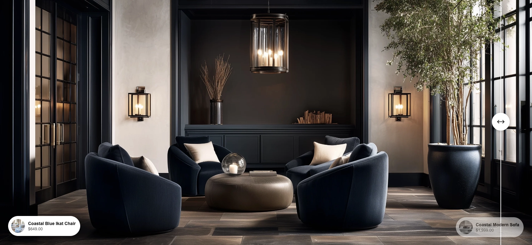
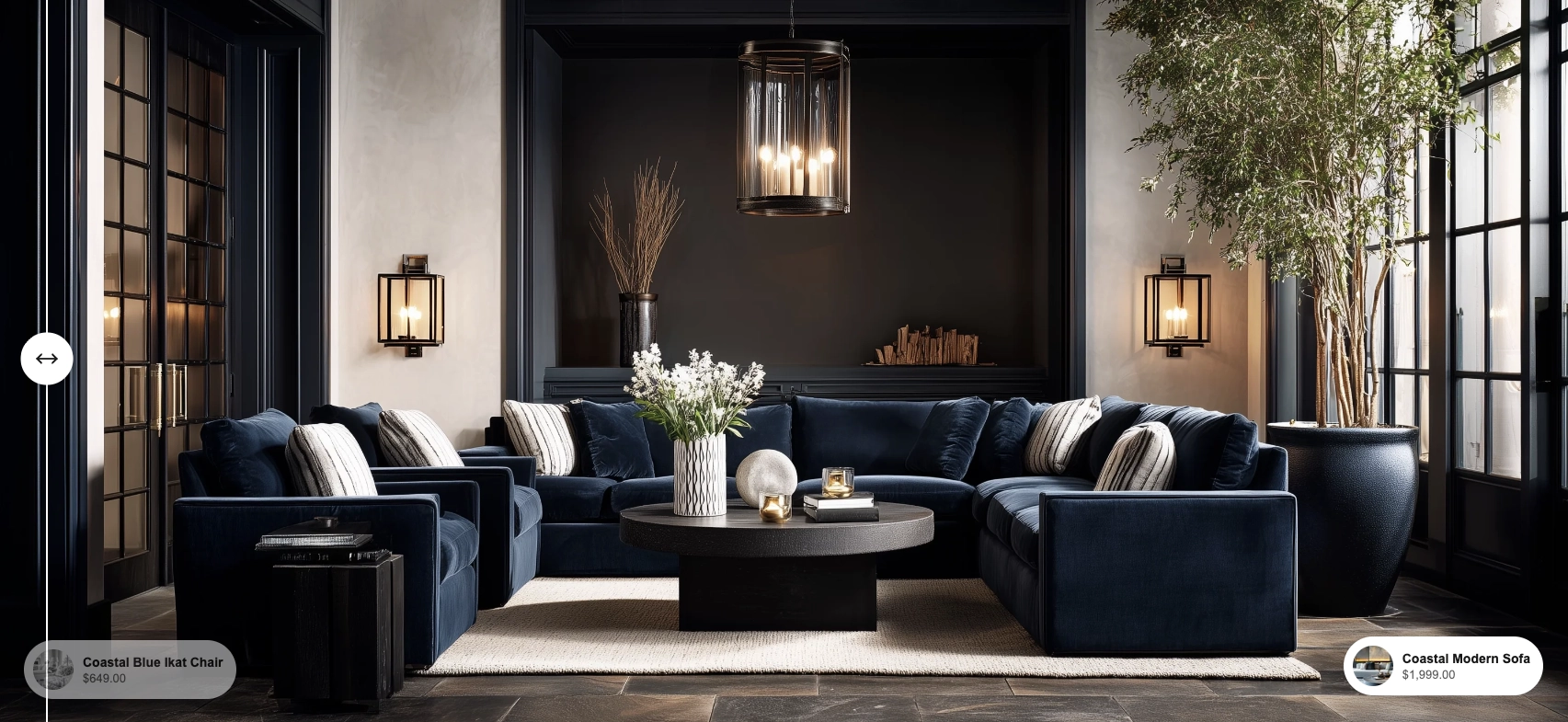
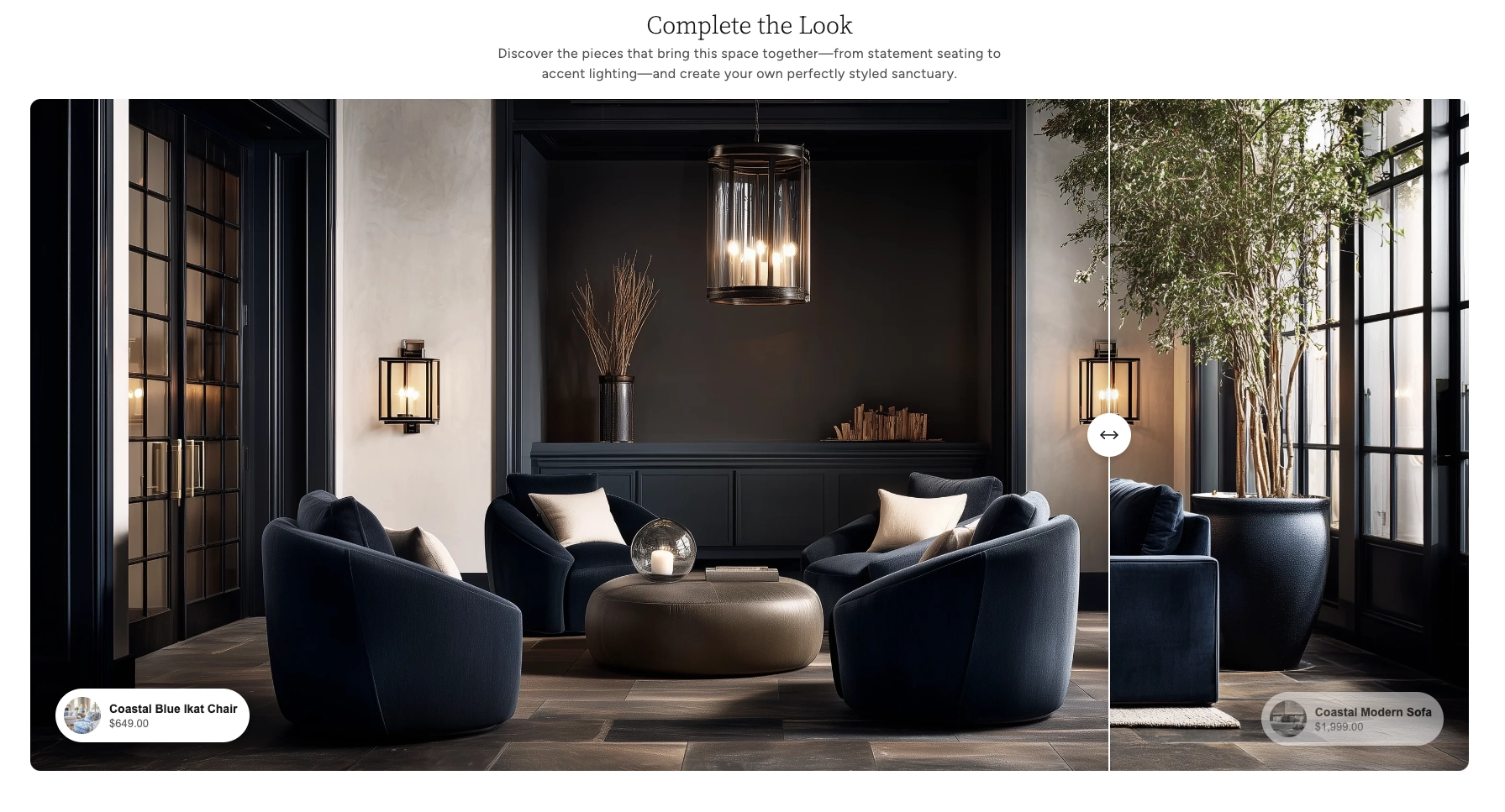
In the Boardwalk theme, the Comparison Slider section displays two full-width (or page-width) images with a vertical divider line and a circular drag handle. Each side of the slider can optionally display a product card that links to items in your store, letting you associate the "before" image with one product and the "after" image with another. The section also includes a heading group at the top for a title and description, and supports a Quick View modal so visitors can browse product details without leaving the page.
How to Set Up the Comparison Slider Section
Follow these steps to add and configure the Comparison Slider on any page of your Shopify store using the Boardwalk theme.
Open the Theme Editor
In your Shopify admin, go to
Online Store → Themes, find Boardwalk,
and click Customize. Navigate to the page
where you want to display the comparison slider using the
page selector dropdown at the top center of the editor.
Add the Comparison Slider Section
Click Add section in the Theme Editor sidebar and choose Comparison slider from the list. The section will appear on your page with a placeholder image.
Upload Your Before and After Images
Click the Comparison slider section in the sidebar and use the Before image and After image pickers to upload your two images. For the best results, use images that are the same size and aspect ratio so they line up perfectly.
Tip: Using images with the same dimensions ensures the divider line and drag handle align naturally across both sides. Mismatched sizes may cause unexpected cropping.
Configure the Section Settings
Adjust the section width, image height, slider start position, corner radius, product card placement, padding, and color scheme. These settings control the overall look and behavior of the entire section.
Add a Heading (Optional)
The section includes a built-in heading group at the top where you can add text blocks for a title and description (e.g., "Complete the Look"). Click the heading group in the sidebar and edit the text blocks to match your branding.
Link Products (Optional)
The section has two built-in product blocks — one for the "before" side and one for the "after" side. Click either the Before product or After product block in the sidebar and use the product picker to select a product from your store. A compact product card with the product image, name, and price will appear overlaid on the corresponding side of the slider.
Note: The products you link must be published and active in your Shopify admin. Products in draft status won't display on your storefront.
Save and Preview
Click Save in the Theme Editor. Preview your page to verify the slider images, drag handle, and any linked products are displaying as expected.
Section-Level Settings
These settings apply to the entire Comparison Slider section and are accessible by clicking the top-level section in the Theme Editor sidebar.
Comparison Slider Section Settings
Controls the maximum width of the slider container.
Options: Page (matches your theme's
content width) or Full (stretches edge to
edge across the entire browser window).
The image displayed on the left side of the slider. This represents the "before" state in your comparison.
The image displayed on the right side of the slider. This represents the "after" state. For the best results, use an image that is the same size as the before image.
Determines how the image height is calculated. Options:
Adapt to image (uses the natural height
of your before image) or Fixed (lets you
set a specific pixel height for desktop and mobile).
Sets a specific pixel height for the slider images on
desktop screens. Range: 300px to 1000px. Only visible
when Image height is set to Fixed.
Sets a specific pixel height for the slider images on
mobile screens. Range: 200px to 800px. Only visible
when Image height is set to Fixed.
Controls where the slider handle sits when the page first loads. Range: 10% to 90%. A lower value reveals more of the "after" image, while a higher value reveals more of the "before" image.
Rounds the corners of the slider banner. Range: 0px to 40px. Set to 0 for sharp corners.
Controls how far from the bottom edge of the slider the product cards sit. Range: 10px to 100px.
Controls how far from the left and right edges of the slider the product cards sit. Range: 10px to 100px.
Controls the top and bottom padding of the section. Range: 0px to 100px.
Select any defined color scheme to style the section background and text.
Before & After Product Blocks
The Comparison Slider section includes two built-in product blocks — one for the "before" side (left) and one for the "after" side (right). These blocks are optional; if you don't assign a product, that side of the slider will simply show the image without a product card.
Product
Use the product picker to select an active product from your Shopify catalog. When set, a compact product card with a thumbnail image, product name, and price appears overlaid on the slider. On desktop the card is positioned at the bottom corner of its respective side; on mobile the cards stack below the slider image.
Show price
When enabled, the product's price is displayed below the product name on the card. If the product has a compare-at price (sale pricing), both the discounted price and the original price are shown.
Color scheme
Sets the color scheme for the individual product card. This lets you style the before and after product cards independently from the section background.
Note: Both the before and after product blocks share the same settings. You configure each one separately so you can link a different product to each side of the slider.
Built-In Features
The Comparison Slider section comes with features that work automatically — no apps or custom code needed.
Feature Overview
Visitors drag the circular handle left or right to reveal more of either image. The interaction works with both mouse dragging on desktop and touch swiping on mobile devices, providing a smooth and engaging experience.
Link a product to each side of the slider. Compact product cards with a thumbnail, name, and price appear at the bottom corners of the image on desktop. On mobile, the cards move below the slider and stack vertically for easy tapping.
Clicking or tapping a product card opens a Quick View modal where visitors can browse product images, select variants, and add the item to their cart — all without leaving the page.
Choose between letting the slider match the natural aspect ratio of your images, or set a fixed pixel height for desktop and mobile independently for precise layout control.
When a linked product is on sale, the product card shows both the discounted price and the original (crossed out) price, making promotions clearly visible right on the slider.
The slider automatically adapts across screen sizes. On desktop, product cards are overlaid on the image. On mobile, the cards reposition below the slider and the image height adjusts to the mobile fixed height setting if enabled.
When scroll animations are enabled in your theme settings, the slider banner animates into view with a fade-in effect as the visitor scrolls down the page.
Product Quick View
When a product is linked to either side of the slider, visitors can interact with the product card directly without leaving the page.
Hovering over the product card's thumbnail image reveals a magnifying glass icon, indicating the product can be previewed. Clicking or tapping on the product card opens the Quick View modal — a pop-up overlay that displays detailed product information right on the page.
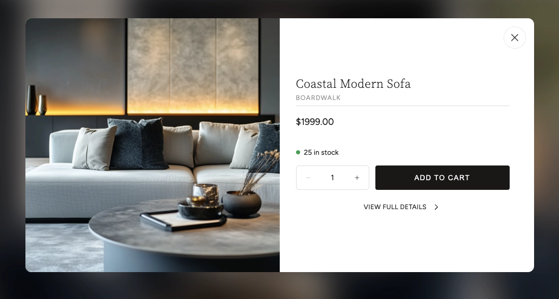
The Quick View modal includes several features that let customers shop without navigating away from the comparison slider:
Quick View Modal Features
Browse all product images using arrow navigation buttons. The gallery also shows an image counter so customers know how many photos are available.
Displays the product name, vendor (optional), and current price. If the product is on sale, both the original and discounted prices are shown.
If the product has multiple options (such as size or color), swatches or selection buttons appear so the customer can choose their preferred variant before adding to cart.
Shows the current inventory status with a color-coded dot — green for in stock, red for low stock or out of stock, and yellow for backorder items.
Customers can adjust the quantity and add the product directly to their cart. The button shows a loading animation followed by a checkmark confirmation when the item is successfully added.
A link at the bottom of the modal takes the customer to the full product page if they want to see the complete description, additional images, or other information.
Tip: The Quick View modal loads product data in the background without a page reload, so it opens quickly and keeps visitors engaged on your page.
Admin Steps and Requirements
Some features require action in the Shopify admin before they'll work as expected in your theme.
Before You Begin
If you link a product to either side of the slider, that product must have a status of Active in your Shopify admin. Products in draft status won't display on your storefront. Go to Products in your admin and make sure the product status is set to Active.
The product card displays the product's first image as a small thumbnail. For the best appearance, make sure your linked products have at least one image uploaded in the Shopify admin under Products → Media.
For the sale price to display on product cards, you need to set a Compare at price on the product variant in your Shopify admin. Go to Products → select the product → Pricing and enter a value in the "Compare at price" field.
For the cleanest comparison, upload before and after images with identical dimensions and aspect ratios. Mismatched image sizes may result in uneven cropping or alignment issues around the slider handle.
The section and each product card have their own color scheme setting. These color schemes are defined in Online Store → Themes → Customize → Theme settings → Colors. Make sure you've set up the color schemes you want to use before configuring this section.