About
A Featured Product is a dedicated showcase that highlights a single product on any page of your store. Unlike a product page that displays a full catalog listing, a featured product section lets you draw attention to a specific item — such as a best seller, new arrival, or limited-edition release — right alongside other content on your homepage, landing pages, or collection pages.
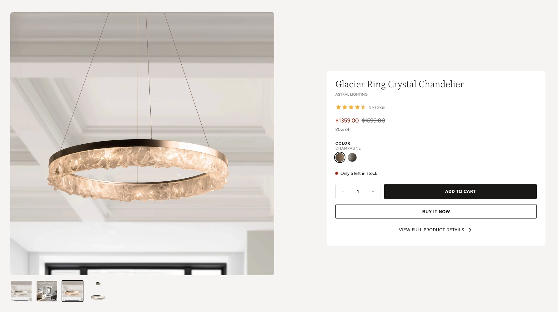
In the Boardwalk theme, the Featured Product section uses a side-by-side layout with an image gallery on one side and product details on the other. The product details area is built with a flexible system of parent and child blocks, allowing you to add and arrange elements like the product title, star ratings, price, variant pickers, inventory levels, buy buttons, and even complimentary product suggestions. You can also include additional content groups below the main product card for things like social sharing buttons, extra descriptions, or store pickup information.
How to Set Up the Featured Product Section
Follow these steps to add and configure a featured product on any page of your Shopify store using the Boardwalk theme.
Open the Theme Editor
In your Shopify admin, go to
Online Store → Themes, find Boardwalk,
and click Customize. Navigate to the page
where you want to display the featured product using the
page selector dropdown at the top center of the editor.
Add the Featured Product Section
Click Add section in the Theme Editor sidebar and choose Featured product from the list. The section will appear on your page with a placeholder layout.
Select a Product
Click the Featured product section in the sidebar and use the Product picker to choose the product you want to highlight. The image gallery, title, price, and other details will populate automatically based on the product you select.
Note: The product you select must be
published and active in your Shopify
admin. If a product is in draft status, it won't display
on your storefront. Go to Products in your
admin and make sure the status is set to
Active.
Configure the Section Settings
Click the Featured product section in the sidebar to access its settings. Set the image position (left or right), section width, column gap, card alignment, padding, and color schemes. These settings control the overall layout and appearance of the entire section.
Add a Section Heading (Optional)
The section includes a built-in Header group at the top where you can add text blocks for a title (e.g., "Featured Product" or "Our Best Seller"). Click the Header group in the sidebar and edit the text blocks to match your branding.
Customize the Product Content Blocks
Inside the Product content parent block, you'll find child blocks for the product title, vendor, rating, price, variant picker, inventory level, and buy buttons. Click on any child block to adjust its settings, or drag blocks to reorder them. You can also add new blocks like spacers, dividers, text, and buttons.
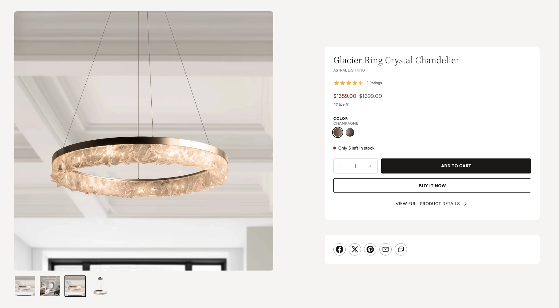
Add Extra Content Groups (Optional)
Below the main product card, you can add additional Group blocks and Complimentary products blocks. These appear as separate cards stacked vertically beneath the product details. Use them for social share buttons, shipping information, or to suggest products that pair well with the featured item.
Save and Preview
Click Save in the Theme Editor. Preview your page to verify the gallery, product details, and any additional content groups are displaying as expected.
Section-Level Settings
These settings apply to the entire Featured Product section and are accessible by clicking the top-level section in the Theme Editor sidebar.
Featured Product Section Settings
Select the product you want to feature. All of the section's content — images, title, price, variants — will be pulled from this product automatically.
Controls which side of the layout the image gallery
appears on. Options: Left or
Right. On mobile devices, the layout always
stacks vertically with the gallery on top.
Sets the spacing between the image gallery and the
product details card. Options: None,
Small, Medium, or
Large.
Controls the maximum width of the section container.
Options: Narrow (constrained to 900px),
Page (matches your theme's content width),
or Full (100% width).
Controls the spacing around the section. Top and bottom range: 0px to 100px. These values are automatically scaled down on mobile devices.
Sets where the product details card sits within the info
column. Options: Left, Center,
or Right.
Controls how the gallery and info columns align
vertically relative to each other. Options:
Top, Center, or
Bottom.
Controls the inner spacing of the product details card. Range: 16px to 60px.
Rounds the corners of the product details card and any additional group cards. Range: 0px to 40px.
Sets the maximum width of the product details card. Range: 360px to 700px. On mobile the card always stretches to full width.
Select any defined color scheme to style the overall section background and text.
Select a color scheme specifically for the product details card. Use a different scheme from the section to make the card visually stand out against the background.
Header Group
The Header group is a built-in container that sits above the product layout. Use it to add a section title, subtitle, or introductory text above the gallery and product card.
Text Blocks (Children)
Inside the Header group, you can add one or more Text blocks. Each text block has its own font, size, and line height settings. Use one block for a heading (e.g., "Featured Product") and optionally add another for a subheading or description.
Header Group Settings
Controls how wide the header content area stretches.
Aligns the heading text to the left, center, or right.
Spacing between the text blocks inside the header group.
Controls the top, bottom, and horizontal padding around the header group. Desktop and mobile padding can be configured independently.
Gallery Block
The Gallery is a built-in block that displays the product's images, videos, and 3D models in an interactive slideshow. Visitors can browse media using arrow buttons, thumbnail navigation, swipe gestures on mobile, or keyboard arrow keys. The gallery automatically shows all media that has been uploaded to your product in the Shopify admin.
Gallery Settings
Controls the proportion of the layout the gallery
occupies. Options: Small (40%),
Medium (50%), or Large
(60%). The product details column takes up the remaining
space.
Sets the shape of the gallery images. Options:
Auto (uses the original image proportions),
Portrait (3:4), Square (1:1),
Landscape (4:3), or
Widescreen (16:9).
When enabled, the gallery will never be taller than the visitor's browser window. This prevents very tall images from pushing the product details out of view.
Rounds the corners of the gallery images. Range: 0px to 24px.
Displays small thumbnail previews below the main image. Visitors can click a thumbnail to jump to that slide.
Displays dot indicators below the gallery for navigation. Useful as an alternative to thumbnails for a cleaner look.
Tip: When a visitor selects a different
variant using the variant picker or color swatches, the
gallery automatically jumps to the image associated with
that variant. Make sure you assign images to each variant in
your Shopify admin under
Products → Variants for the best
experience.
Product Group Block
The Product group block is the main parent container for all product detail elements. It renders as the primary product card next to the image gallery. Inside this parent block you can add, remove, and reorder a variety of child blocks to build the exact product card layout you want.
The Product group block itself has two settings:
Product Group Settings
Controls the spacing between child blocks inside the card. Range: 0px to 24px.
Sets the horizontal alignment of all child block
content. Options: Left,
Center, or Right.
Child Blocks
The following child blocks can be placed inside the Product group parent block. You can add, remove, reorder, and configure each one independently.
Product Title
Displays the product name pulled from your Shopify catalog. You can customize the font family (Heading, Body, Caption, or Menu), font weight (Normal or Bold), font size (12px–30px), line height, letter spacing, and padding.
Text
A flexible rich text block you can use for any content, such as a vendor name, product tagline, or short description. Supports multiple font families and size options. In the default preset, it is used to display the product vendor.
Rating
Shows a star rating and optional review count pulled from your product review app. You can control the star color, star size (Small or Medium), width (Auto or Full), and whether the review count is visible.
Note: For ratings to display, you need a compatible product review app installed (such as Judge.me or Shopify Product Reviews). The app must store ratings using Shopify's standard product rating metafield.
Price
Displays the product's price. Settings include the price display mode (selected variant or price range), whether to show the unit price, installments, tax info, and sale pricing details. You can also control the display order of the sale and regular price, apply a custom sale price color, and adjust the font size, line height, letter spacing, and opacity.
Discount Information
Automatically shows sale details when a product has a compare-at price set (e.g., "20% off"). You can customize the font family, font weight, font size, and line height.
Variant Picker
Lets customers select product options like size or color. When a variant is selected, the gallery automatically navigates to the image for that variant, and the price updates in real time without a page reload. Settings include whether to show the selected value label, enable color swatches, adjust the spacing between option buttons, set a minimum button width, use the theme's button corner radius or a custom value, and configure divider visibility and color.
Note: Color swatches require swatch
data to be set up in your Shopify admin. Go to
Online Store → Themes → Customize →
                          Theme settings → Swatches
to configure color swatch images or hex values for your
product options.
Inventory Level
Displays the current stock status of the selected variant. You can choose to show the exact stock count (e.g., "Only 5 left in stock") or a simple "In stock" label. A color-coded indicator dot shows green for in stock, red for low stock, and the dot can optionally pulse to draw attention. Set the low stock threshold (1–20) to control when the low stock warning appears.
Buy Buttons
Adds the quantity selector, Add to Cart button, and optional dynamic checkout button (such as "Buy it now" with Apple Pay, Google Pay, or Shop Pay). The Add to Cart button adds the item to the cart without a page reload and shows a loading animation followed by a checkmark when the item is successfully added. Settings include showing or hiding the dynamic checkout button and the gift card recipient form.
Note: Dynamic checkout buttons are
powered by Shopify Payments. If Shopify Payments is not
enabled on your store, this option will have no effect.
Go to Settings → Payments in your
Shopify admin to configure your payment providers.
Button
A general-purpose button block you can use for any call to action. In the default preset, it displays a "View full product details" link that takes the visitor to the product's full page. You can customize the button text, link URL, style (primary, secondary, or tertiary), size, whether it shows an arrow icon, full width mode, and color scheme overrides.
Divider
Adds a horizontal line between blocks. You can customize the color, line style (solid, dashed, etc.), thickness, and whether the edges fade out.
Spacer
Adds empty vertical space between blocks. Use spacers to visually separate groups of information within the product card without adding a visible line.
Store Pickup
Shows in-store pickup availability based on the selected
variant's location inventory. This requires pickup to be
enabled in your Shopify admin under
Settings → Shipping and delivery → Local
                        pickup
.
Tabs Group
A container block that organizes content into tabbed panels. Use it to create tabs for product descriptions, specifications, sizing charts, or care instructions within the product card.
Product Extras Block
The Product extras block is a parent container that renders as a separate card below the main product card. You can add multiple Product extras blocks, and each one appears stacked vertically in the product details column. Groups inherit the same card styling (corner radius, max width, and alignment) as the main product card.
Use Product extras blocks for content that supports the featured product but doesn't belong inside the main product card — such as social sharing buttons, trust badges, delivery information, or custom rich text.
Product Extras Block Settings
Spacing between child blocks inside the group card. Range: 0px to 40px.
Sets the horizontal alignment of content inside the
group. Options: Left, Center,
or Right.
Select a color scheme for the group card. You can use a different scheme from the main product card to create visual contrast.
Available child blocks: You can place any theme block inside a Product Extras block, including text, buttons, images, icons, dividers, spacers, social sharing, custom liquid, and the Store Pickup block. This makes the Group extremely versatile for adding supplementary content.
Complimentary Products Block
The Complimentary products block displays a curated list of products that pair well with the featured item. It renders as a separate card in the product details column — perfect for cross-selling accessories, matching items, or frequently bought-together suggestions.
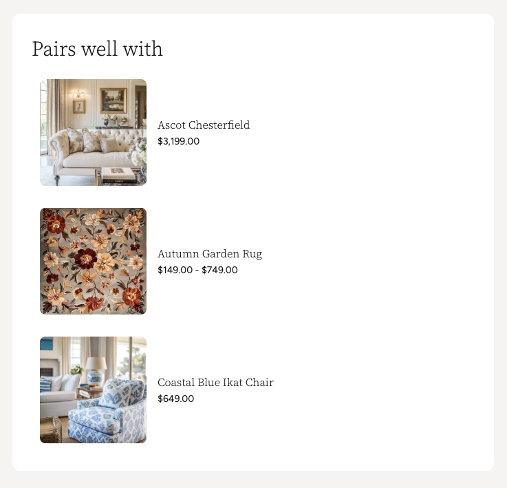
Note: Complimentary products are powered by Shopify's product recommendations. To configure which products appear, go to your Shopify admin and add complementary product recommendations through the Shopify Search & Discovery app. The app must be installed and products must be linked for recommendations to display.
Complimentary Products Settings
Limits how many complimentary products are displayed in the card.
Spacing between the product items inside the card.
Controls the size of the product thumbnail images within the complimentary products list.
Rounds the corners of the complimentary products card.
Aligns product names and prices to the left, center, or right within the card.
Select a color scheme for the complimentary products card.
Tip: Clicking on a complimentary product opens the Quick View modal, allowing customers to browse images, select variants, and add the item to their cart without leaving the page. This is a great way to drive additional sales by suggesting items that go well together.
Product Quick View
When visitors interact with complimentary products or other product links within the section, they can preview and purchase items without leaving the page using the Quick View modal.
Tapping or clicking on a complimentary product opens a pop-up overlay that loads the full product information in the background — no page reload needed. The modal provides a streamlined shopping experience so customers can browse, select options, and add items to their cart without navigating away from the featured product.
Quick View Modal Features
Browse all product images using arrow navigation buttons. The gallery also shows an image counter so customers know how many photos are available.
Displays the product name, vendor (optional), and current price. If the product is on sale, both the original and discounted prices are shown.
If the product has multiple options (such as size or color), swatches or selection buttons appear so the customer can choose their preferred variant before adding to cart.
Shows the current inventory status with a color-coded dot — green for in stock, red for low stock or out of stock, and yellow for backorder items.
Customers can adjust the quantity and add the product directly to their cart. The button shows a loading animation followed by a checkmark confirmation when the item is successfully added.
A link at the bottom of the modal takes the customer to the full product page if they want to see the complete description, additional images, or other information.
Tip: Quick View settings such as the image
aspect ratio, whether to show the vendor, quantity selector,
and inventory indicator are configured in your global theme
settings — not in this section. Go to
Online Store → Themes → Customize → Theme
                      settings
to adjust the Quick View preferences for your entire store.
Admin Steps and Requirements
Some features require action in the Shopify admin before they'll work as expected in your theme.
Before You Begin
The product you select must have a status of Active in your Shopify admin. Products in draft or archived status won't display on your storefront. Go to Products in your admin and make sure the product status is set to Active.
The gallery displays all media uploaded to the product. For the best experience, make sure your product has images uploaded in the Shopify admin under Products → Media. If you want the gallery to update when variants are selected, assign images to each variant under Products → Variants.
For the sale price and discount information to display, you need to set a Compare at price on the product variant. Go to Products → select the product → Pricing and enter a value in the "Compare at price" field.
The Rating block requires a product review app that stores ratings using Shopify's standard product rating metafield. Install an app like Judge.me or Shopify Product Reviews, and make sure customers have left ratings for the featured product.
Install the Shopify Search & Discovery app and set up complementary product recommendations for the featured product. Without this, the Complimentary products block will appear empty.
The Inventory Level block reads stock data from your Shopify admin. Make sure inventory tracking is enabled for the product's variants under Products → Variants → Inventory for accurate stock counts and low stock warnings.
The section, product card, and group cards each have their own color scheme setting. These color schemes are defined in Online Store → Themes → Customize → Theme settings → Colors. Make sure you've set up the color schemes you want to use before configuring this section.
App Blocks
The Featured Product section supports app blocks, which means third-party Shopify apps can inject their own content directly into the section. This includes apps for reviews, wishlists, size charts, product customizers, and more. To add an app block, click Add block inside the Product content parent block or the section itself and look for your installed app in the block list. The app's content will appear inline with the rest of your product details.