About
A footer is the area at the very bottom of your website that appears on every page. It's where visitors expect to find important links, contact information, legal details, and ways to stay connected with your brand. A well-organized footer makes your site feel complete and professional.
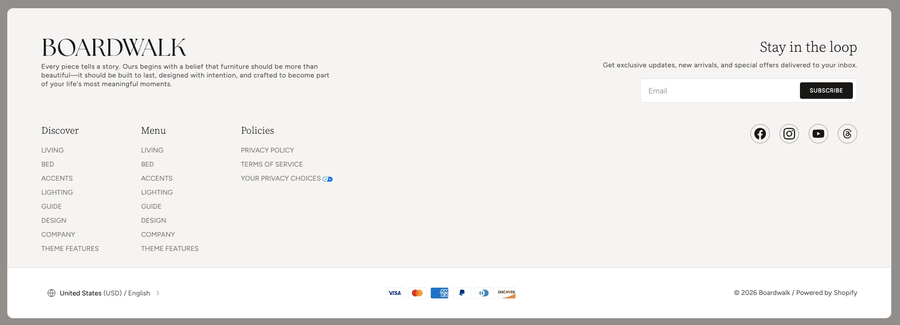
In the Boardwalk theme, the Footer section displays your content inside a styled, rounded card that sits at the bottom of every page. The footer uses a flexible Group block system, meaning you organize your content into groups that can each contain a wide variety of child blocks — including newsletter sign-up forms, social media links, navigation menus, text, buttons, your store logo, localization selectors, copyright notices, payment icons, and much more. You can add multiple Footer sections and they will automatically merge into a single, seamless card with shared rounded corners.
How to Set Up the Footer Section
Follow these steps to add and configure the footer on your Shopify store using the Boardwalk theme.
Open the Theme Editor
In your Shopify admin, go to
Online Store → Themes, find Boardwalk,
and click Customize. The footer area is
located at the very bottom of the editor sidebar, below
all page sections.
Add a Footer Section
Click Add section in the footer area of the sidebar and choose one of the available footer presets: Footer: Brand, Footer: Links, or Footer: Utility. Each preset comes pre-configured with common blocks, but you can fully customize any of them. You can also add multiple footer sections to create distinct rows.
Configure the Section Settings
Click the Footer section in the sidebar to access its settings. Adjust alignment, color schemes, card border radius, spacing, and padding to match your store's design. These settings control the overall appearance of that footer row.
Organize Content with Groups
Inside the footer section, content is organized using Group blocks. Each group acts as a container that can hold multiple child blocks. For example, one group might contain your logo and a brand description, while another holds a newsletter sign-up form. Add groups by clicking Add block and selecting Group.
Add Child Blocks to Each Group
Click on a group to expand it, then use Add block inside the group to add content blocks such as Text, Logo, Menu, Newsletter signup, Social icons, Localization button, Spacer, Button, and many more. You can reorder blocks by dragging them within the group.
Set Up Payment Icons (Optional)
Payment icons are controlled at the section level. Turn on Show payment icons in the section settings to display the logos of your store's active payment methods below the footer card.
Note: Payment icons are pulled
automatically from your active payment providers. To
add or remove payment methods, go to
Settings → Payments
in your Shopify admin. Only activated payment methods
will display.
Set Up Social Media Links (Optional)
If you plan to use a Social icons block, you'll need to configure your social media URLs first.
Note: Social media links are configured
globally in your theme settings, not inside the footer
block itself. Go to
Theme settings → Social media
in the Theme Editor to add your social profile URLs.
The Social icons block will then automatically display
icons for each platform you've configured.
Save and Preview
Click Save in the Theme Editor. Preview your store to verify the footer layout, navigation links, newsletter form, social icons, and payment icons are displaying as expected.
Section-Level Settings
These settings apply to the entire Footer section and are accessible by clicking the top-level section in the Theme Editor sidebar.
Footer Section Settings
Controls how the groups inside the footer are aligned
horizontally. Options: Left,
Center, Right, or
Space between.
Controls how the groups are aligned vertically within
the footer row. Options: Top,
Middle, Bottom, or
Space between.
Sets the color scheme for the area behind the footer card. This is visible around the edges of the rounded card.
Sets the color scheme for the footer card itself. Use a different scheme from the background to make the card visually stand out.
Rounds the corners of the footer card. Range: 0px to 40px. When multiple footer sections are stacked, the inner corners between them are automatically flattened so the sections appear as one continuous card.
Adds a subtle horizontal line at the bottom of the footer card. Useful for visually separating stacked footer sections.
Displays the logos of your store's active payment methods (e.g., Visa, Mastercard, PayPal) below the footer card. Only activated payment methods will appear.
Controls the spacing between groups inside the footer on desktop screens. Range: 0px to 100px.
Controls the top and bottom padding of the footer content area on desktop screens. Top and bottom range: 0px to 200px.
Controls the spacing between groups inside the footer on mobile screens. Range: 0px to 100px.
Controls the top and bottom padding of the footer content area on mobile screens. Top and bottom range: 0px to 36px.
Group Block
The Group block is the primary building block of the footer. Each group acts as a container that holds your content blocks (text, menus, newsletter forms, etc.) and controls how they are arranged. You can add as many groups as you need to organize your footer into distinct columns or sections.
Group Block Settings
Sets whether the child blocks inside the group are
arranged side by side (Horizontal) or
stacked on top of each other
(Vertical).
Controls whether the group sizes itself to its content
(Fit) or expands to fill all available
space (Fill).
Controls whether the group sizes its height to its
content (Fit) or stretches to match
the tallest group in the row (Fill).
Limits the width of the group's content. Options:
Auto (no limit) or
Narrow (600px maximum).
Sets the text alignment for all content inside the
group. Options: Left,
Center, or Right.
Controls how child blocks are positioned horizontally
inside the group. Options: Left,
Center, Right, or
Space between.
Controls how child blocks are positioned vertically
inside the group. Options: Top,
Middle, Bottom, or
Space between.
Controls the spacing between child blocks inside the group. Range: 0px to 100px.
Adds horizontal padding inside the group. Range: 0px to 200px.
Adds vertical padding inside the group. Range: 0px to 200px.
Available Child Blocks
Each Group inside the footer can contain a variety of child blocks. Below is a list of the most commonly used blocks in the footer along with a short description of what each one does. These are the same blocks available throughout the Boardwalk theme, so you have full flexibility to build exactly the footer you want.
Text
A rich text block for adding paragraphs, headings, or any custom text content. Use it for brand descriptions, taglines, copyright notices, or any other written content. Includes settings for font family, font size, and line height.
Logo
Displays your store's logo in the footer. You can choose between a light or dark version of your uploaded logo image, or use a text-based logo if no images are set up. The logo images are pulled from your global theme settings.
Menu
Displays a navigation menu from your Shopify admin. Use
this for footer navigation columns like "Shop,"
"Company," or "Policies." Select any menu you've created
in
Online Store → Navigation.
Note: Footer menus are created and
managed in your Shopify admin under
Online Store → Navigation. You'll need to create your menus there before
they become available to select in the footer block.
Newsletter Signup
Adds an email subscription form so visitors can sign up for your mailing list. Includes settings for button text, arrow visibility, alignment, and vertical padding. Submissions are collected through Shopify's built-in customer system.
Social Icons
Displays icons that link to your social media profiles. Supports platforms including Facebook, Instagram, YouTube, Threads, X, TikTok, Pinterest, LinkedIn, Bluesky, Snapchat, Tumblr, and Vimeo. Includes settings for icon size and spacing between icons.
Note: Social media URLs must be
configured in
Theme settings → Social media
before icons will appear. The block reads from these
global settings and automatically shows icons only for
platforms where you've provided a URL.
Localization Button
Adds a country and language selector so visitors can switch their preferred currency and language. You can choose to show the currency code alongside the country name. This is essential for stores that sell internationally.
Note: For the localization button to
work, you need to enable multiple currencies and/or
languages in your Shopify admin under
Settings → Markets and
Settings → Languages.
Button
Adds a clickable button with a link. Use it for call-to-action links like "Contact Us" or "Shop Now." Includes settings for button text, link URL, style (primary, secondary, or tertiary), and whether to show an arrow icon.
Image
Adds a static image to the footer. Useful for certifications, badges, partner logos, or decorative visuals. Includes settings for aspect ratio and mobile display options.
Spacer
An invisible block that adds empty space between other blocks. Includes settings for both vertical and horizontal spacing, giving you precise control over your footer layout.
Icon
Displays a single icon from the theme's built-in icon library. Choose from categories including navigation, e-commerce, shipping, user accounts, communication, apparel, furniture, and more. Includes settings for icon size and color.
Marquee
Creates a continuously scrolling text banner. Useful for promotions, announcements, or decorative text effects. Includes settings for speed, direction, gap between items, and an optional gradient fade effect at the edges.
Accordion
A collapsible content block that shows a title and reveals its content when clicked. Great for FAQ-style content or organizing information in a compact format within the footer.
Promotion
Displays a promotional image with an optional overlay badge showing a discount percentage or custom text. Use it to highlight active sales or special offers directly in your footer.
Follow on Shop
Adds a "Follow on Shop" button that lets customers follow your store through the Shop app by Shopify. This helps you build a direct audience on the Shop platform.
Note: For this button to appear, the Shop channel must be installed and Shop Pay must be activated in your Shopify admin.
Built-In Features
The Footer section comes with features that work automatically — no apps or custom code needed.
Feature Overview
When you add multiple Footer sections, they automatically merge into a single, continuous card. The inner corners between stacked footers are flattened while the outermost corners remain rounded, creating a polished, unified appearance.
The footer content sits inside a styled card with adjustable rounded corners. The card color scheme is independent from the background color scheme, giving you a layered visual effect.
On desktop, groups are arranged side by side in a horizontal row. On mobile screens, groups automatically stack vertically so all content remains easy to read and interact with.
Payment method logos are pulled directly from your active Shopify payment providers. There's nothing to update manually — when you add or remove a payment method in your Shopify admin, the footer icons update automatically.
The newsletter sign-up block connects directly to Shopify's built-in customer system. Subscribers are added to your customer list and marked as accepting marketing, so you can reach them through Shopify Email or any connected email marketing app.
The Group block system lets you build any footer layout you can imagine. Groups can be arranged horizontally or vertically, and each can contain over 24 different block types. Nest groups within groups for even more complex layouts.
An optional divider line can be added to the bottom of each footer section. This is especially useful when stacking multiple footer rows to create visual separation between them.
The Localization button block lets international visitors switch between languages and currencies directly from the footer. This works with Shopify's built-in market and language settings.