About
A gallery is a visual section that displays a collection of images, videos, and styled content blocks in a responsive grid layout. Galleries are an effective way to showcase product collections, lifestyle photography, brand storytelling, promotional campaigns, or social media-style feeds on your storefront.
In the Boardwalk theme, the Gallery section uses a flexible, block-based design where each item in the grid can be an image, a video, or a solid color content card. Every gallery item supports overlays, text content, buttons, countdown timers, promotion badges, and more. A built-in header group lets you add a title and description above the grid. The layout automatically adapts across desktop, tablet, and mobile screen sizes.
How to Set Up the Gallery Section
Follow these steps to add and configure a gallery on any page using the Boardwalk theme.
Open the Theme Editor
In your Shopify admin, navigate to
Online Store → Themes, find Boardwalk,
and click Customize. Use the page
selector dropdown at the top center to choose the page
where you want to add the gallery.
Add the Gallery Section
Click Add section in the sidebar and select Gallery from the list. The section will appear with a default header group and a Gallery Items container with a few starter blocks.
Configure the Section Settings
Click the Gallery section in the sidebar. Set the section width, number of desktop columns, column gap, color scheme, and padding for desktop and mobile.
Set Up the Gallery Items Container
Click the Gallery items block in the sidebar. This is the parent container that holds all your gallery items. Set the aspect ratio and border radius that will apply to every item in the grid.
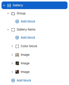
Add Gallery Items
Inside the Gallery Items container, click Add block and choose Image, Video, or Color block. Each item can hold its own overlay, text, buttons, and other child content. Add as many items as you need to fill your grid.
Customize the Header (Optional)
The Group block at the top of the section serves as the gallery header. Click it to add or edit text blocks for your gallery title and subtitle. You can also hide the header group if you prefer a gallery without a heading.
Save and Preview
Click Save in the Theme Editor. Preview your page to verify the grid layout, overlays, and content appear as expected across desktop, tablet, and mobile.
Section-Level Settings
These settings apply to the entire Gallery section and are accessible by clicking the top-level section in the Theme Editor sidebar.
Gallery Section Settings
Controls the maximum width of the gallery container.
Options: Page (matches your theme's content
width) or Full (100% width).
Number of columns in the grid on desktop. Range: 1 to 6. Columns automatically adjust on smaller screens — tablet shows a maximum of 2 columns, and mobile always displays a single column.
Spacing between gallery items. Options:
None, Small,
Medium, or Large.
Select any defined color scheme to style the section background and text.
Top and bottom padding for the section on desktop. Top and bottom range: 0px to 200px.
Top and bottom padding for the section on mobile. Top and bottom range: 0px to 200px.
Parent Block
The Gallery Items block is the top-level container that holds all the individual gallery items and controls their shared appearance.
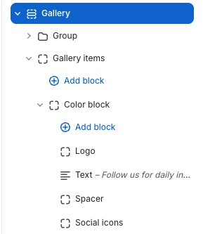
Gallery Items
The parent block that wraps all gallery items in the grid. Controls the shared aspect ratio and border radius for every item inside it. You add Image, Video, and Color block items inside this container.
- Aspect ratio — Auto (fit content), Widescreen (16:9), Standard (4:3), Landscape (3:2), Square (1:1), or Portrait (3:4)
- Border radius — 0px to 40px
Gallery Item Blocks
These are the blocks you add inside Gallery Items to build your gallery grid. Each block represents one cell in the grid and can hold its own overlay, text, and interactive content.
Image
Displays a single image in the gallery grid. Supports an optional link, overlay, and content overlay with child blocks for text, buttons, and your store logo. When a link is set, the image gently zooms on hover.
- Image — Select an image from your media library
- Link — Optional URL that wraps the entire image as a clickable link
- Overlay type — None, Solid, Fade from bottom, or Full gradient
- Overlay color — Custom color for the overlay layer
- Content alignment — Vertical (Top, Middle, Bottom), Horizontal (Left, Center, Right), and Text alignment
- Content padding — 10px to 60px
- Color scheme — Applies to the content overlay text and elements
Note: Image blocks accept Text, Button, and Logo as child blocks. These appear as a content overlay on top of the image, making it easy to add captions, calls to action, or your store branding.
Video
Embeds a video in the gallery grid. You can upload a video file directly through Shopify or paste a YouTube or Vimeo URL. Supports autoplay, looping, and an optional poster image that shows before the video plays or as a fallback.
- Video file — Upload a video through Shopify's media library
- Video URL — Alternatively, paste a YouTube or Vimeo link
- Poster image — Displayed before the video plays or as a fallback
- Link — Optional URL that wraps the entire block as a clickable link
- Autoplay — Automatically plays the video (muted when enabled)
- Loop — Continuously replays the video
- Show controls — Displays play, pause, and volume controls
- Overlay type — None, Solid, Fade from bottom, or Full gradient
- Overlay color — Custom color for the overlay layer
- Content alignment — Vertical (Top, Middle, Bottom), Horizontal (Left, Center, Right), and Text alignment
- Content padding — 10px to 60px
- Color scheme — Applies to the content overlay text and elements
Note: Video blocks accept Text, Button, and Logo as child blocks. These appear as a content overlay on top of the video.
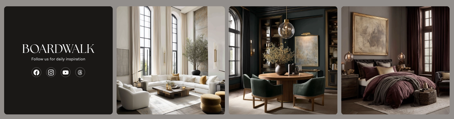
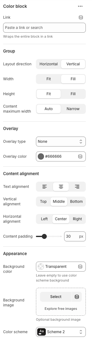
Color Block
A versatile content card that uses a solid background color, background image, or color scheme as its base. Ideal for brand messaging cards, social media call-outs, promotional banners, or any gallery item that needs text-focused content rather than a photo. Supports any theme block as child content, giving you maximum flexibility.
- Link — Wraps the entire block in a clickable link
- Layout direction — Horizontal or Vertical arrangement of child content
- Width — Fit (shrink to content) or Fill (stretch to column)
- Height — Fit (shrink to content) or Fill (stretch to match grid)
- Content maximum width — Auto or Narrow (600px cap)
- Overlay type — None, Solid, Fade from bottom, or Full gradient
- Overlay color — Custom color for the overlay layer
- Content alignment — Text alignment, Vertical (Top, Middle, Bottom), and Horizontal (Left, Center, Right)
- Content padding — 10px to 80px
- Background color — Custom background color. Leave empty to use the color scheme background
- Background image — Optional background image behind the content
- Color scheme — Applies a color scheme for background and text styling
Tip: Unlike Image and Video blocks, the Color block accepts any theme block as child content — including Text, Buttons, Logo, Social Icons, Timers, Spacers, and more. This makes it the most flexible gallery item for creating rich content cards.
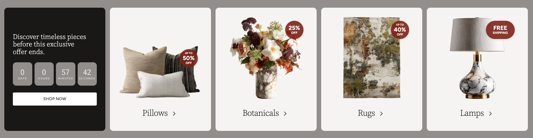
Promotion
Displays an image with a promotional overlay badge — perfect for highlighting sales, discounts, and special offers on gallery items. The badge appears as a circular overlay in the corner of the image with customizable text and colors.
- Image — Select an image from your media library
- Flip image horizontally — Mirrors the image for creative layouts
- Link — URL that wraps the entire block as a clickable link
- Open in new tab — Opens the link in a new browser tab
- Overlay type — None, Percent off, or Text only
- Show up to text — Adds "UP TO" text above the discount amount
- Percent off — The discount percentage to display
- Header text — Displayed in larger text on the badge (used with Text only overlay type)
- Body text — Displayed in smaller text below the header (optional)
- Overlay color — Background color of the promotion badge
- Text color — Color of the text inside the badge
Note: The Gallery Items container supports over 24 block types beyond the core Image, Video, Color block, and Promotion blocks listed above. These include Text, Buttons, Timers, Spacers, Social Icons, Logo, and many more. For a complete listing of available blocks and their settings, see the Blocks → Group article.
Admin Steps and Tips
Keep these tips in mind when setting up your Gallery section for the best results.
Before You Begin
Before configuring your gallery, upload your images to Shopify's media library via Content → Files. For the best appearance, use high-resolution images with consistent dimensions that match your chosen aspect ratio.
For Video blocks using uploaded files, go to Content → Files and upload your video. Then select it from the video picker in the block settings. Alternatively, paste a YouTube or Vimeo URL directly into the Video URL field.
The aspect ratio set on the Gallery Items parent block
applies to all items in the grid. For the most uniform
appearance, choose images and videos that match or are
close to the selected ratio. If your content varies
significantly, use the Auto aspect ratio to
let each item size to its own content.
To show social media icons inside a Color block, your social media URLs must be configured in the theme settings. Go to Online Store → Themes → Customize → Theme settings → Social media and add your profile links.
The Logo child block inside Image, Video, and Color blocks pulls from your theme's logo setting. Make sure your logo is uploaded in Theme settings → Logo for it to appear.
When autoplay is enabled, the video is automatically muted to comply with browser policies. Visitors can unmute the video if playback controls are enabled. If autoplay is turned off, the poster image (if set) will display until the visitor clicks to play.