About
A map is an interactive visual element that shows the physical locations of your stores, showrooms, studios, or pop-up shops on a real-world map. Displaying your locations helps customers find you, plan a visit, and get driving directions — all without leaving your website.
In the Boardwalk theme, the Map section displays an interactive map powered by Mapbox alongside a scrollable list of your locations. Each location card shows the name, address, business hours, and phone number, along with a Get Directions button that opens Google Maps. Location data is managed centrally through the Locations aside using individual Location blocks, and is shared across both the Map section and the Locations Drawer. The map supports an unlimited number of locations, multiple map visual styles (such as Streets, Satellite, and Dark), and customizable pin markers. Visitors can click a location in the list to zoom directly to that spot on the map.
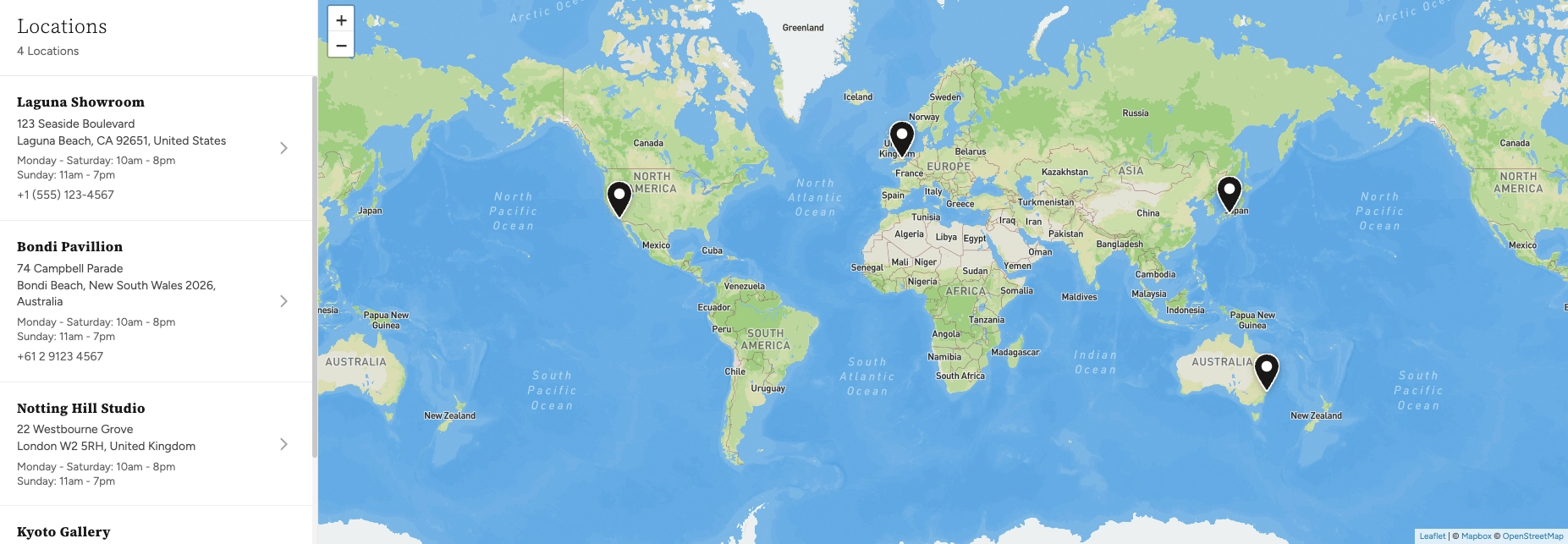
Note: When your locations are spread far apart (for example, across different continents) and the visitor's screen is wide enough, the map may repeat at the edges to fill all available space. This is normal behavior for world-level map views.
How to Set Up the Map Section
Follow these steps to add an interactive map to any page of your Shopify store using the Boardwalk theme.
Get a Mapbox Access Token
The Map section requires a free Mapbox access token to display the map tiles. Visit mapbox.com, create an account (or sign in), and copy your public access token from your account dashboard.
Note: Without a Mapbox access token, the Map section will display a placeholder image instead of an interactive map.
Mapbox pricing: The Map section uses two Mapbox APIs. On the Mapbox pricing page, look for the Static Tiles API (under Maps) — this serves the map tile images that appear on screen — and the Geocoding API (under Search) — this converts each location's address into map coordinates for pin placement. Both APIs include a generous free tier that is more than enough for most stores.
Add Your Mapbox Token to Theme Settings
In your Shopify admin, go to
Online Store → Themes, find Boardwalk,
and click Customize. Open
Theme settings (the gear icon at the
bottom-left of the editor) and look for the
Maps area. Paste your Mapbox
access token into the designated field.
Add Your Store Locations
In the Theme Editor, scroll to the very bottom of the left sidebar — below the Footer group — and find the Locations aside. Click into the Locations section, then click Add block and choose Location. For each location, provide the name, full address (used for the map pin placement), street address, city, country, phone number, and business hours. You can add as many locations as you need.
Note: The Address field is the most important — it is used to place the pin on the map. Enter a complete, accurate address so the map can locate it correctly. The street, city, and country fields are displayed in the location list panel but are not used for pin placement.
Add the Map Section to a Page
Navigate to the page where you want to display the map using the page selector dropdown at the top center of the editor. Click Add section in the Theme Editor sidebar and choose Map from the list. The section will appear on your page with your configured locations.
Configure the Section Settings
Click the Map section in the sidebar to access its settings. Set the heading text, section width, map height, marker style, map visual style, colors, and padding. These settings control the overall look and behavior of the map on this particular page.
Save and Preview
Click Save in the Theme Editor. Preview your page to verify the map loads correctly, your locations appear in the sidebar list, and the pins are placed accurately on the map.
Section-Level Settings
These settings apply to the Map section on the current page and are accessible by clicking the top-level section in the Theme Editor sidebar.
Map Section Settings
The title displayed above the location list panel. If left empty, the heading will show "Locations" by default.
Controls the maximum width of the map container.
Options: Page (matches your theme's
content width) or Full (stretches to 100%
of the screen width).
Sets the height of the map area on desktop screens. Range: 300px to 800px.
Sets the height of the map area on mobile screens. Range: 250px to 600px.
Controls the shape of the map pins that mark each
location. Options: Use global setting
(inherits from Theme settings), Pin,
Circle, or Flag.
Sets the color of the map markers. Leave blank to use the global marker color defined in Theme settings.
Changes the visual appearance of the map tiles. Options:
Use global setting,
Streets, Outdoors,
Light, Dark,
Satellite, or
Satellite Streets.
Rounds the corners of the map container. Range: 0px to 40px.
Controls the spacing above the map section. Range: 0px to 100px.
Controls the spacing below the map section. Range: 0px to 100px.
Select any defined color scheme to style the section background and text surrounding the map.
Select a color scheme for the location list panel that appears beside the map. Use a different scheme from the section to make the panel visually distinct.
Location Data (Locations Aside)
Location details are not managed inside the Map section itself. Instead, they are managed through the Locations aside — a dedicated section group that appears at the very bottom of the Theme Editor sidebar, below the Footer. Each location is its own Location block inside the Locations section. This data is shared across both the Map section and the Locations Drawer throughout your store.
Note: To add or edit your locations, open the Theme Editor and scroll to the bottom of the left sidebar. Click into Locations (in the Locations aside group), then add or edit Location blocks. There is no limit to the number of locations you can add.
Fields for Each Location
The display name for the location (e.g., "Laguna Showroom" or "Bondi Pavilion"). This appears as the bold title in the location list panel.
The full address used to place the pin on the map and to generate the Get Directions link. Enter a complete, accurate address including city, state/province, postal code, and country for best results.
The street address line displayed in the location list (e.g., "123 Seaside Boulevard"). This is a display-only field and does not affect pin placement.
The city, state, and postal code displayed below the street address in the location list (e.g., "Laguna Beach, CA 92651, United States").
The country name, displayed alongside the city in the location list.
Your business hours for this location. You can enter multiple lines (e.g., "Monday–Saturday: 10am–8pm" on one line, "Sunday: 11am–7pm" on the next). Line breaks are preserved automatically.
A contact phone number for the location. Displayed below the business hours in the location list.
Built-In Features
The Map section comes with features that work automatically — no apps or custom code needed.
Feature Overview
The map is fully interactive — visitors can zoom in and out using the on-screen buttons or their scroll wheel, and drag to pan around the map. On touch devices, pinch-to-zoom and swipe gestures work naturally.
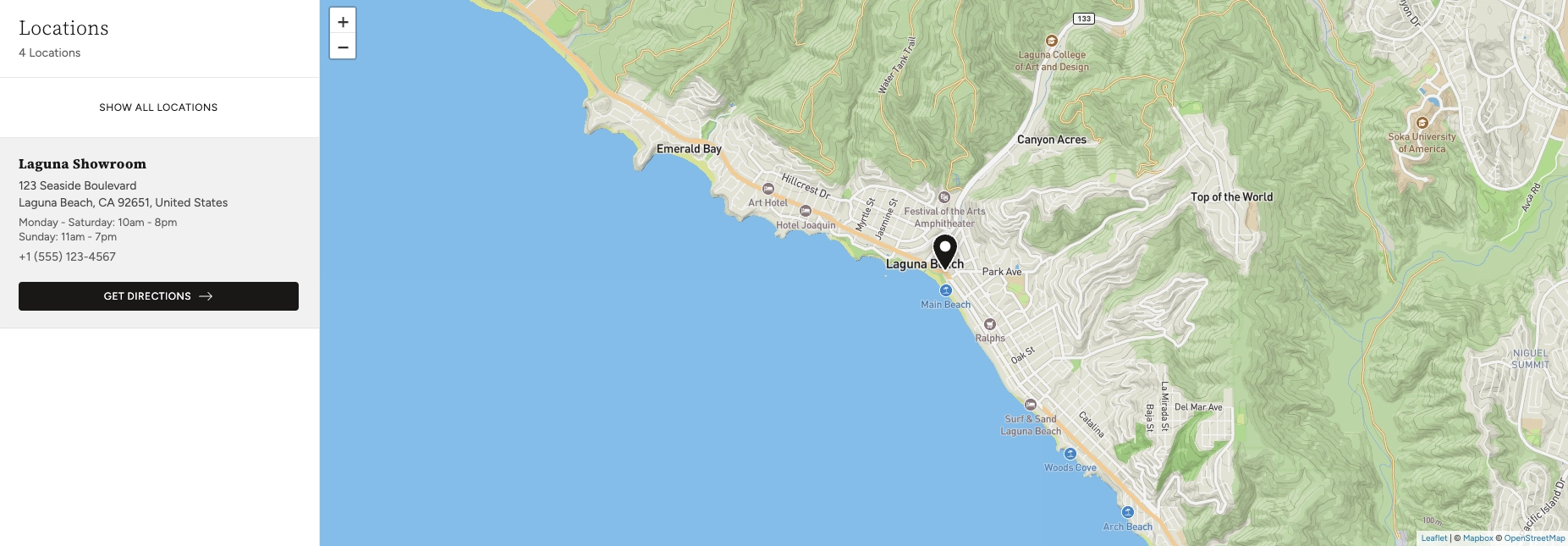
When a visitor clicks a location in the sidebar list, the map automatically zooms in and centers on that location's pin. The selected location card expands to reveal a Get Directions button.
Each location includes a button that opens Google Maps in a new tab with the location's address pre-filled as the destination. This lets visitors get turn-by-turn directions from wherever they are.
After zooming into a single location, a Show all locations button appears at the top of the list. Clicking it zooms the map back out to show all of your pins at once.
The total number of active locations is displayed below the heading in the location list panel (e.g., "4 Locations"), so visitors know how many spots you have at a glance.
Choose from seven different map visual styles including Streets, Outdoors, Light, Dark, Satellite, and Satellite Streets. Each style can be set per-section or inherited from your global theme settings.
Location pins can be displayed as a Pin, Circle, or Flag shape, with a fully customizable marker color. These can be set per-section or inherited from your global theme settings.
On desktop, the location list panel sits beside the map. On mobile, the layout adapts to fit smaller screens with an independently adjustable height. The mobile map height automatically scales to 75% of the desktop value for balanced spacing.
When locations are spread across the globe and the visitor's screen is wide enough, the map repeats at the edges to fill all available space. This ensures a seamless visual experience at world-level zoom.