About
A multicolumn layout is a design pattern that displays content side by side in equal-width columns. It's one of the most versatile ways to present information on a web page — perfect for showcasing team members, highlighting product features, comparing services, or displaying promotional cards.
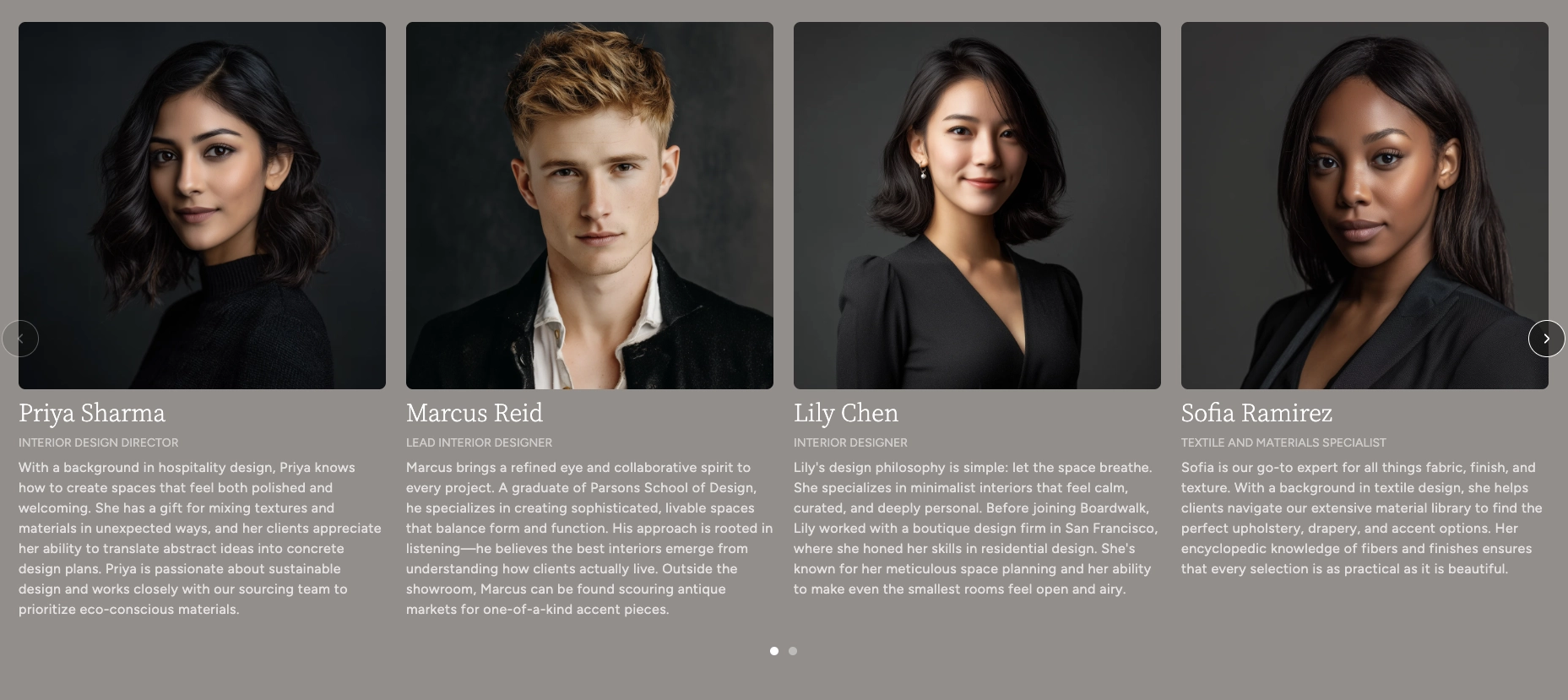
In the Boardwalk theme, the Multicolumn Carousel section arranges content into 3 to 5 columns on desktop and adapts gracefully to smaller screens. Each column is a flexible group that can hold any combination of blocks — images, text, buttons, promotions, and more. The section can display as a static grid or a swipeable carousel, with optional arrow buttons and a draggable progress slider for navigation. A built-in heading area at the top lets you add a title and description above the columns.
How to Set Up the Multicolumn Carousel Section
Follow these steps to add and configure the Multicolumn Carousel on any page of your Shopify store using the Boardwalk theme.
Open the Theme Editor
In your Shopify admin, go to
Online Store → Themes, find Boardwalk,
and click Customize. Navigate to the page
where you want to display the multicolumn layout using the
page selector dropdown at the top center of the editor.
Add the Multicolumn Carousel Section
Click Add section in the Theme Editor sidebar and choose Multicolumn carousel from the list. The section will appear on your page with a set of placeholder columns.
Configure the Section Settings
Click the Multicolumn carousel section in the sidebar. Set the number of desktop columns, carousel behavior, navigation options, column gap, padding, and color scheme. These settings control the overall look and behavior of the entire section.
Add a Heading (Optional)
The section includes a built-in heading group at the top where you can add text blocks for a title and description (e.g., "Meet Our Team" or "Featured Products"). Click the heading group in the sidebar and edit the text blocks to match your branding.
Edit Individual Columns
Each column is a Group block that acts as a container for other blocks. Click on any column group in the sidebar, then add or edit the blocks inside it — images, text, buttons, promotions, and more. You can add more columns by clicking Add block inside the section, or remove ones you don't need.
Customize Column Layout
Each column group has its own layout settings for content direction, alignment, spacing, and maximum width. Use these to fine-tune how the blocks inside each column are arranged and positioned.
Save and Preview
Click Save in the Theme Editor. Preview your page to verify the columns, carousel navigation, and content blocks are displaying as expected.
Section-Level Settings
These settings apply to the entire Multicolumn Carousel section and are accessible by clicking the top-level section in the Theme Editor sidebar.
Multicolumn Carousel Section Settings
Sets how many columns are visible on desktop screens. When the carousel is enabled, this determines how many columns are visible at once. Range: 3 to 5.
Controls the spacing between columns. Options:
Small, Medium, or
Large.
When turned on, columns display as a horizontally scrollable carousel on desktop instead of a static grid.
When turned on, columns display as a swipeable carousel on mobile devices instead of a stacked layout.
Displays previous and next arrow buttons on top of the carousel for manual navigation. Only visible when carousel mode is enabled. Arrow buttons are automatically hidden on mobile devices.
Displays a draggable progress slider below the carousel that tracks scroll position and lets visitors scrub between slides. Only visible when carousel mode is enabled.
Select any defined color scheme to style the section background and text.
Controls the vertical padding above and below the section content. Range: 0px to 100px. On mobile, the padding is automatically reduced to 75% of the desktop value.
Adds horizontal space at the beginning and end of the section. Range: 0px to 80px. This creates breathing room between the section content and the edge of the screen.
Column Group Block
Each column in the Multicolumn Carousel is a Group block — a flexible container that holds other blocks like images, text, buttons, and promotions. You can add, remove, and reorder columns to build your layout, and each column has its own settings that control how its content is arranged.
Column Group Settings
Determines how blocks inside the column are arranged.
Vertical stacks blocks from top to bottom.
Horizontal places blocks side by side.
Controls the width behavior of the column.
Fill stretches to use available space.
Fit sizes to the content.
Controls the height behavior of the column.
Fit sizes to the content.
Fill stretches to match the tallest column.
Limits the width of the content inside the column.
Auto has no limit.
Narrow caps the content at 600px. Useful
for keeping text readable in wider columns.
Sets the text alignment for all content within the column. Options: left, center, or right.
Controls horizontal positioning of blocks within the
column. Options: Left, Center,
Right, or Space between.
Controls vertical positioning of blocks within the
column. Options: Top, Middle,
Bottom, or Space between.
Controls the spacing between blocks inside the column. Range: 0px to 100px.
Adds horizontal padding inside the column on desktop. Range: 0px to 200px.
Adds vertical padding inside the column on desktop. Range: 0px to 200px.
Available Blocks Inside Columns
Each column group can contain any combination of the following theme blocks. Add, remove, and reorder blocks within a column to create your desired layout.
Image
Add a photo or graphic to the column. Supports custom aspect ratios and can be used for team photos, product shots, icons, or any visual content. Images can also be wrapped in a link.
Text
A rich text block for headings, descriptions, or any written content. You can choose from multiple font families (heading, body, caption, or menu) and control the font size and line height.
Button
Adds a clickable button with customizable text, link, style, and size. Options include primary, secondary, tertiary, and more button styles. You can also display an arrow icon and set the button to open links in a new tab.
Promotion
An image block with an optional promotional overlay — such as a percentage-off badge or custom text label. Great for highlighting deals, sales, or featured items. The overlay color and content are fully customizable.
Icon
Choose from a library of built-in icons to add visual interest to your columns. Useful for feature highlights, service descriptions, or informational layouts.
Spacer
Adds empty vertical or horizontal space between blocks. Use this to fine-tune the spacing and visual balance within a column.
Newsletter Signup
A compact email signup form that lets visitors subscribe to your mailing list directly from within a column.
Third-Party App Blocks
Columns also accept app blocks from any Shopify app that supports theme app extensions. This means you can embed content from third-party apps directly into your multicolumn layout.
Tip: The flexibility of the Group block means you can use the Multicolumn Carousel for almost any purpose — team profiles, feature comparisons, service highlights, promotional grids, and more. Experiment with different block combinations to find the layout that works best for your store.
Built-In Features
The Multicolumn Carousel section comes with features that work automatically — no apps or custom code needed.
Feature Overview
Choose between a horizontally scrollable carousel or a static grid layout. Desktop and mobile can be set independently, so you can use a carousel on mobile and a grid on desktop (or vice versa).
In carousel mode, visitors can swipe on touch devices or scroll horizontally with a mouse. Columns snap smoothly into position for a polished browsing experience.
Optional arrow buttons and a draggable progress slider give visitors additional ways to browse through columns. Both can be toggled on or off.
Each column is a Group block that can hold any combination of theme blocks — images, text, buttons, promotions, icons, and more. This makes the section adaptable for team pages, product features, service highlights, and other use cases.
A static heading area at the top of the section lets you add a title and description without using a separate section. This keeps everything together in one manageable unit.
The grid automatically adapts across screen sizes. On large desktops, it displays your chosen number of columns (3 to 5). On tablets, it adjusts to 2 columns. On mobile, it stacks to a single column (or swipeable carousel if enabled).
Each column card includes a slide-in animation that plays when the section enters the viewport. The animations cascade so columns animate in sequence for a polished entrance effect.
Admin Steps and Requirements
Some features require action in the Shopify admin before they'll work as expected in your theme.
Before You Begin
If your columns include image or promotion blocks, make sure you have uploaded the images you want to use. You can upload images directly in the Theme Editor when configuring each block, or add them to your Shopify admin under Content → Files beforehand.
The section uses a color scheme setting to control its background and text colors. These color schemes are defined in Online Store → Themes → Customize → Theme settings → Colors. Make sure you've set up the color schemes you want to use before configuring this section.
All column content — text, images, buttons, and promotions — is entered manually through the Theme Editor. The section does not pull content automatically from products, collections, or other data sources.
If you add button blocks to your columns, make sure to set the link destination for each button. Buttons without a link will still appear but won't navigate anywhere when clicked. You can link to any page, product, collection, or external URL.