About
Every Shopify store includes a built-in password page — a landing page that appears when you enable password protection on your store. This is commonly used before a store officially launches, during maintenance, or for exclusive invite-only access. Visitors see this page instead of your storefront and must enter the correct password to proceed.
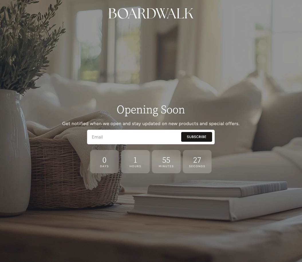
In the Boardwalk theme, the Password section is a fully customizable hero-style layout that serves as the main content area of your password page. It supports background images, videos, and repeating patterns with a color overlay, and uses a flexible Group block system that lets you build your layout with any combination of text, buttons, newsletter signups, images, and more. You can add up to three Group blocks, each containing any of the 24+ child blocks available in the Boardwalk theme.
How to Set Up the Password Section
Follow these steps to configure and customize your password landing page in Shopify using the Boardwalk theme.
Enable Password Protection
In your Shopify admin, go to
Online Store → Preferences. Scroll down
to the Restrict store access section,
check
Restrict access to visitors with the password, and set your password. Click Save.
Your store will now show the password page to all
visitors.
Open the Password Template in the Theme Editor
Navigate to Online Store → Themes, find
Boardwalk, and click Customize. In the
page selector dropdown at the top center, choose
Others → Password to open the
password template.
Configure the Section Settings
Click the Password section in the sidebar. Set the layout direction (horizontal or vertical), section width, content width, background media, color schemes, corner radius, and padding.
Add and Configure Group Blocks
The Password section uses Group blocks as its building system. Click Add block in the section to add a Group. Each Group acts as a container with its own layout direction, alignment, spacing, and padding settings. You can add up to 3 Group blocks total.
Note: For a full list of all 24+ child blocks you can add inside a Group (including text, buttons, images, icons, and more), see the Group Block documentation article.
Add Child Blocks Inside Each Group
Click into a Group block and add child blocks to build your layout. Common choices for a password page include Text blocks for a headline and description, a Newsletter Signup block so visitors can subscribe for launch updates, and Button blocks for calls to action. Drag and drop child blocks to reorder them.
Add a Background (Optional)
To add visual impact, set the Background media setting to Image, Video, or Pattern. Upload your media, then use the Color overlay setting to ensure your text remains readable over the background. Adjust the Image height to control how tall the section appears.
Save and Preview
Click Save in the Theme Editor. Visit your store's URL in an incognito or private browser window to see the password page as your visitors will experience it.
Section-Level Settings
These settings apply to the entire Password section and are accessible by clicking the top-level section in the Theme Editor sidebar.
Password Section Settings
Controls how the Group blocks are arranged within the
section. Options: Horizontal (side by side)
or Vertical (stacked).
Sets the overall width of the section. Options:
Page (matches your theme's content width)
or Full (spans the entire browser width).
Controls the maximum width of the content area inside
the section. Options: Narrow,
Page, or Full.
Choose a background for the section. Options:
None, Image,
Video, or Pattern. Each option
reveals its own upload field.
Upload a Shopify-hosted video to use as the background.
Only visible when Background media is set to
Video.
Upload an image to use as the section background. Only
visible when Background media is set to
Image.
Upload a small image that repeats across the background
as a tiled pattern. Only visible when Background media
is set to
Pattern.
Scales the repeating pattern image. A smaller value
creates more repetitions; a larger value makes each tile
bigger. Range: 50% to 300%. Only visible when Background
media is set to Pattern.
Controls the height of the section. Options:
Adapt to image (matches the uploaded
image's aspect ratio), Small,
Medium, Large, or
Full screen.
Select any defined color scheme to style the overall section background and text.
Select a color scheme for the content container area. This can differ from the section color scheme to create a layered visual effect.
Applies a semi-transparent color over the background media. Supports transparency so you can fine-tune the overlay intensity. Useful for ensuring text remains readable over busy images or videos. Only visible when a background media type is selected.
Rounds the corners of the section container. Range: 0px to 24px.
Top padding for the section. Range: 0px to 100px. Mobile padding is automatically calculated at 75% of the desktop value.
Bottom padding for the section. Range: 0px to 100px. Mobile padding is automatically calculated at 75% of the desktop value.
Available Blocks
The Password section uses Group blocks as its only direct block type. Inside each Group, you can add any combination of the 24+ child blocks available in the Boardwalk theme.
Parent Block
The Group block is the only top-level block type in the Password section.
Group
A flexible container block that holds child blocks and controls their arrangement. Each Group can stack its children vertically or lay them out horizontally, with full control over alignment, spacing, and padding. You can add up to 3 Group blocks in the Password section.
- Layout direction — Horizontal or Vertical
- Width — Fit (shrinks to content) or Fill (expands to available space)
- Height — Fit (shrinks to content) or Fill (expands to available space)
- Content max width — Auto or Narrow (600px)
- Text alignment — Left, Center, or Right
- Horizontal alignment — Left, Center, Right, or Space between
- Vertical alignment — Top, Middle, Bottom, or Space between
- Gap — Spacing between child blocks. Range: 0px to 100px
- Horizontal padding — 0px to 200px
- Vertical padding — 0px to 200px
Note: The Group block supports over 24
different child block types including Text, Button,
Image, Icon, Spacer, Divider, and many more. It also
supports @app blocks for third-party app
extensions. See the Group Block
article for the complete list.
Featured Child Block
A highlighted block commonly used in the Password section.
Newsletter Signup
An email subscription form that lets visitors sign up for updates — perfect for collecting emails before your store launches. Displays an email input with a customizable subscribe button. Shows success and error messages automatically after submission.
- Button text — Customize the text on the subscribe button
- Show arrow — Display an arrow icon on the subscribe button
- Alignment — Left, Center, or Right
- Vertical padding — 0px to 100px
- Use section color scheme — When enabled, the block inherits the section's colors. Disable to choose a separate color scheme.
- Color scheme — Select a custom color scheme (only visible when section color scheme is disabled)
Tip: A common password page setup is a single Group block set to vertical layout with centered alignment, containing a Text block for your headline, another Text block for a description, and a Newsletter Signup block so visitors can subscribe before launch.
Admin Steps and Requirements
Some features require action in the Shopify admin before they'll appear in your theme.
Before You Begin
The password page only appears when password protection is active. Go to Online Store → Preferences and enable Restrict access to visitors with the password. Without this, your password page will not be displayed.
Email addresses collected through the Newsletter Signup block are saved as customers in your Shopify admin under Customers. They are marked as having accepted email marketing, so you can use them in email campaigns through Shopify Email or third-party tools.
For the best results with background images, use a high-resolution image (at least 1920px wide). Videos should be uploaded through Content → Files in your Shopify admin before selecting them in the section settings.
When using a background image or video, always adjust the color overlay to ensure your text content is easy to read. The overlay supports transparency, so you can fine-tune the exact level of contrast you need.
The Password section supports up to 3 Group blocks. Use a horizontal layout direction at the section level to place Groups side by side (e.g., an image on one side and text content on the other), or use vertical to stack them.
Mobile padding is automatically calculated at 75% of your desktop padding values. There is no separate mobile padding setting — the theme handles responsive spacing for you.
Frequently Asked Questions
Video in the section settings, then select
a Shopify-hosted video. Make sure to upload the video
through Content → Files in your
admin first. Use the color overlay to ensure text
remains readable over the video.
Horizontal, then add two Group blocks. For
example, put an image or branding in the first Group and
your text content with a Newsletter Signup in the
second. Adjust each Group's width setting to control how
much space each side takes up.