About
A product bundle is a curated group of products presented together so shoppers can buy them as a set. Often labeled "Frequently Bought Together" or "Complete the Look," a bundle encourages a larger purchase by showing complementary items side by side and adding them to the cart in a single step.
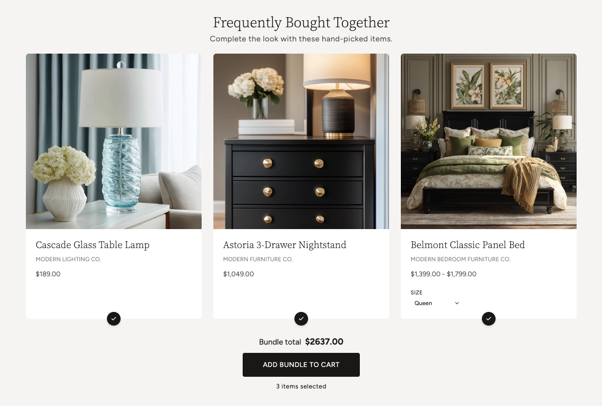
In the Boardwalk theme, the Product Bundle section displays up to five hand-picked products as a row of cards. Each card has a checkbox so shoppers can include or exclude that item, and the running Bundle total updates instantly as they make their choices. When a product has options like size or color, a variant picker appears on the card so shoppers can choose before adding to cart. One Add bundle to cart button adds every selected item at once. A heading group at the top lets you add a title and a short description above the cards.
How to Set Up the Product Bundle Section
Follow these steps to add and configure a product bundle on any page of your Shopify store using the Boardwalk theme.
Open the Theme Editor
In your Shopify admin, go to
Online Store → Themes, find Boardwalk,
and click Customize. Navigate to the page
where you want to display the bundle using the page
selector dropdown at the top center of the editor.
Add the Product Bundle Section
Click Add section in the Theme Editor sidebar and choose Product bundle from the list. The section appears on your page with three placeholder cards until you choose your own products.
Choose Your Bundle Products
Click the Product bundle section in the sidebar and use the Bundle products list to select the items you want to feature. You can add up to five products. The number of cards in the row matches the number of products you select.
Note: The products you add must be published and active in your Shopify admin. A product in draft status won't appear on your storefront.
Add a Heading (Optional)
The section includes a built-in Header group at the top with a Heading and a Description text block (for example, "Frequently Bought Together" and "Complete the look with these hand-picked items"). Click the Header group in the sidebar and edit the text blocks to match your branding.
Customize the Card Appearance
Open the Product card block to adjust how each product is presented — the title, vendor text, price, variant picker, and product media. Back in the section settings, set the card corner radius, section width, padding, and color scheme to suit your page.
Save and Preview
Click Save in the Theme Editor. Preview your page and try toggling items on and off to confirm the bundle total updates, the variant pickers work, and the Add bundle to cart button adds your selected items as expected.
Section Structure
The Product Bundle section is built from two parts: a Header group for your title and description, and a Product card that defines how each bundled product is displayed. The Product card holds a set of smaller blocks you can add, remove, and reorder to control the card layout.
Header
The group at the top of the section. It contains a Heading text block and a Description text block, both editable. Use these to introduce the bundle and set expectations (for example, "Frequently Bought Together").
Product Title
Shows the name of each product on its card. You can set the font family, weight, size, line height, and letter spacing.
Text
A rich text block on the card. In the default layout this is used to display the product's vendor (brand) name, but you can replace it with any text you like.
Price
Displays the product's price. You can choose to show a price range or the selected variant's price, and turn on extras like unit price, installment messaging, and a distinct sale price color.
Variant Picker
Lets shoppers choose a variant (such as size or color) right on the card. When a shopper changes a variant, the card's price and the bundle total update without a page reload. Options named "Color" or "Colour" can display as color swatches.
- Show color swatches — Displays color options as visual swatches instead of plain buttons
- Swatch size — Small, Medium, or Large
Product Media
The product image area at the top of each card. You can set the image aspect ratio and choose whether a second image appears when a shopper hovers over the card.
Section-Level Settings
These settings apply to the whole Product Bundle section and are accessible by clicking the top-level section in the Theme Editor sidebar.
Product Bundle Section Settings
Controls how wide the bundle container is on the page.
Choose Full width (edge to edge),
Page width (matches your store's page
margins), or Content width (a narrower,
centered column).
The list of products that make up the bundle. Add up to five products. The cards display in the order you arrange them here.
Rounds the corners of each product card. Range: 0px to 24px.
Adds spacing above the section. Range: 0px to 100px.
Adds spacing below the section. Range: 0px to 100px.
Sets the background and text colors for the section. Color schemes are defined under your theme's color settings.
How the Bundle Works
The Product Bundle section includes shopper-facing features that work automatically — no apps or custom code needed.
Feature Overview
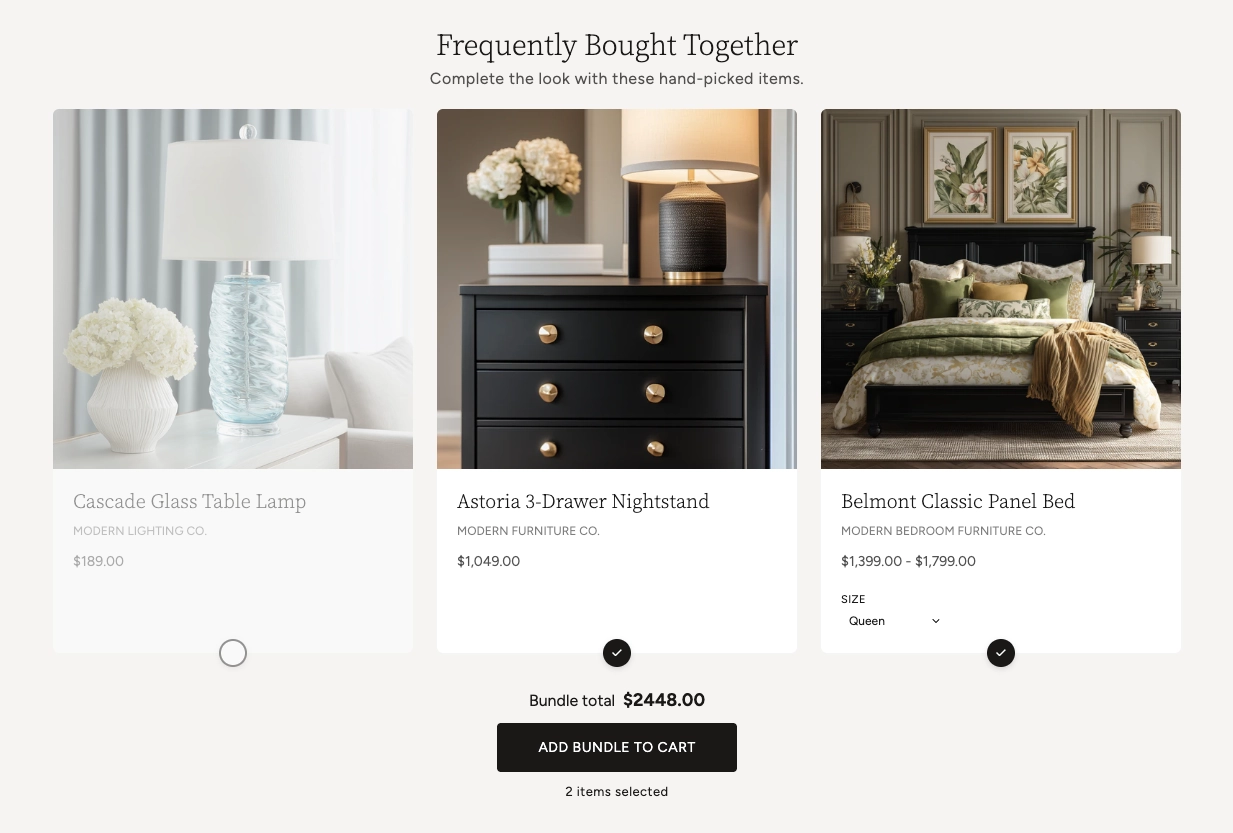
Every card has a checkbox. Shoppers can uncheck any item they don't want, and the bundle total recalculates right away. The button at the bottom adds only the items that are still checked.
The running total updates instantly as shoppers toggle items or switch variants — all without a page reload. A counter below the button shows how many items are currently selected.
Products with options like size or color show a variant picker on the card. Color options can appear as swatches. Choosing a variant updates that card's price and the bundle total.
The Add bundle to cart button adds all selected items together. The button shows a loading animation and then a checkmark to confirm the items were added, and the cart updates in the background.
Clicking a product image or title opens a quick view pop-up with more detail, so shoppers can review a product without leaving the page.
Sold-out products are labeled on their card, and the bundle keeps track of stock that's already in the shopper's cart so it won't try to add more than is available.
Tip: The bundle total and cart update in the background without a page reload, so the experience stays fast and shoppers keep their place on the page.
Admin Steps and Requirements
Some parts of the bundle depend on how your products are set up in the Shopify admin. Review these before publishing.
Before You Begin
Each product in the bundle must have a status of Active in your Shopify admin. Products in draft status won't appear on your storefront. Go to Products in your admin and confirm the status is set to Active.
Each card shows the product's image, so make sure your bundled products have at least one image uploaded under Products → Media. To use the hover-to-show second image, the product needs at least two images.
The variant picker only appears for products that have more than one variant. Set up your size, color, or other options under Products → select the product → Variants. For color swatches to show, name the option Color or Colour.
The bundle's stock awareness relies on your inventory settings. To show sold-out labels and prevent adding more than is available, enable inventory tracking on your variants under Products → select the product → Inventory.
For a sale price to display on a card, set a Compare at price on the product variant. Go to Products → select the product → Pricing and enter a value in the "Compare at price" field.
The section and the product cards use color schemes defined in Online Store → Themes → Customize → Theme settings → Colors. Set up the schemes you want before configuring this section.