About
Product hotspots are interactive markers placed on top of a lifestyle or product image that let visitors discover and shop for individual items directly from the photo. This "shop the look" style of presentation is popular for showcasing how multiple products work together in a real-world setting — such as a fully styled room, a complete outfit, or a curated workspace.
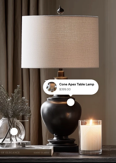
In the Boardwalk theme, the Product Hotspots section displays a full-width or page-width background image with animated, pulsing dot markers placed at specific coordinates. When a visitor clicks a hotspot, a small popup card appears showing the linked product's image, name, and price. Clicking the popup opens a Quick View modal so shoppers can browse product details and add items to their cart without leaving the page. The section also includes a built-in heading group above the image for a title or description.

How to Set Up the Product Hotspots Section
Follow these steps to add and configure product hotspots on any page of your Shopify store using the Boardwalk theme.
Open the Theme Editor
In your Shopify admin, go to
Online Store → Themes, find Boardwalk,
and click Customize. Navigate to the page
where you want to display hotspots using the page selector
dropdown at the top center of the editor.
Add the Product Hotspots Section
Click Add section in the Theme Editor sidebar and choose Product hotspots from the list. The section will appear on your page with a placeholder image and three sample hotspot markers.
Upload Your Background Image
Click the Product hotspots section in the sidebar and use the Background image picker to upload a lifestyle photo or product scene. For best results, use an image that is at least 1920×1080 pixels.
Configure the Section Settings
While the section is selected, adjust settings like section width, image aspect ratio, corner radius, overlay color, hotspot and popup colors, and padding. These settings control the overall look and feel of the entire section.
Add a Heading (Optional)
The section includes a built-in heading group above the image where you can add text blocks for a title and description (e.g., "Shop the Look"). Click the heading group in the sidebar and edit the text blocks to match your branding.
Position Your Hotspots
Inside the Hotspots group, click on any Hotspot block. Use the Horizontal position and Vertical position sliders to place the marker over the product you want to highlight in the image. You can add more hotspots by clicking Add block inside the group, or remove ones you don't need.
Link Products to Hotspots
In each hotspot block's settings, use the Product picker to select a product from your store. Once linked, a popup card showing the product image, name, and price will appear when visitors click that hotspot.
Note: The product you link must be published and active in your Shopify admin. If a product is in draft status, it won't display on your storefront. Hotspots without a linked product will appear as dashed outlines in the editor only and will not be visible to visitors.
Save and Preview
Click Save in the Theme Editor. Preview your page to verify that the hotspot markers are positioned correctly, the product popups display the right items, and the Quick View modal opens as expected.
Section-Level Settings
These settings apply to the entire Product Hotspots section and are accessible by clicking the top-level section in the Theme Editor sidebar.
Product Hotspots Section Settings
Controls the maximum width of the section container.
Options: Page (matches your theme's content
width) or Full (100% width).
Select any defined color scheme to style the section background and text surrounding the image.
The lifestyle or product image that serves as the backdrop for your hotspots. For the sharpest results, use an image that is at least 1920×1080 pixels.
Controls the shape of the image container. Options:
Adapt to image (uses the image's natural
proportions), Landscape (16:9),
Landscape (4:3), Square (1:1),
or Portrait (3:4).
Rounds the corners of the background image. Range: 0px to 40px.
Adds a color overlay on top of the background image. Supports transparency, so you can use a semi-transparent dark tint to improve contrast between the image and the hotspot markers.
Sets the fill color of the pulsing hotspot dots. Choose a color that stands out against your background image so visitors can easily spot each marker.
Sets the background color of the product popup cards that appear when a hotspot is clicked.
Sets the color of the product name and price text inside the popup cards.
Controls the top and bottom padding of the section on desktop screens. Range: 0px to 100px.
Controls the top and bottom padding of the section on mobile screens. Range: 0px to 100px.
Hotspot Block
Each hotspot is an individual block inside the Hotspots group. You can add, remove, and reorder hotspot blocks to highlight different products in your image.
Product
Select a product from your Shopify catalog to link to this hotspot. Once linked, a popup card with the product's featured image, name, and price will appear when a visitor clicks the hotspot. If no product is selected, the hotspot will appear as a dashed outline in the editor and will be hidden from visitors on the live storefront.
Horizontal position
Controls where the hotspot sits from left to right on the image. Drag the slider to position the marker directly over the product you want to highlight. Range: 5% to 95%.
Vertical position
Controls where the hotspot sits from top to bottom on the image. Drag the slider to position the marker directly over the product you want to highlight. Range: 5% to 95%.
Tip: Use the Theme Editor's live preview to fine-tune hotspot positions. As you drag the horizontal and vertical sliders, the hotspot marker moves in real time on the image so you can see exactly where it will appear.
Built-In Features
The Product Hotspots section comes with features that work automatically — no apps or custom code needed.
Feature Overview
Each hotspot dot has a smooth pulsing animation that draws the visitor's eye to the clickable markers. The pulse pauses automatically when a popup is open so the active hotspot stays visually calm.
Clicking a hotspot reveals a compact popup card with a circular product thumbnail, the product name, and the current price. If the product is on sale, both the original and discounted prices are shown. Popups close when clicking outside, clicking the same hotspot again, or pressing the Escape key.
Popups automatically adjust their position based on where the hotspot sits in the image. If a hotspot is near the left or right edge, the popup shifts horizontally to stay within view. If the hotspot is near the top of the image, the popup appears below it instead of above.
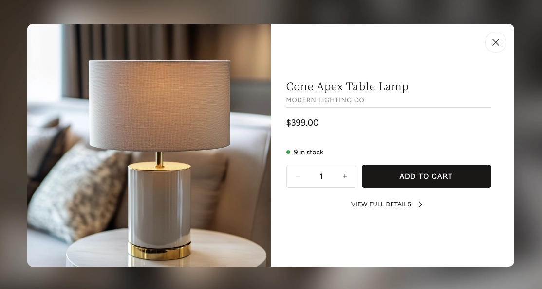
Hovering over a popup's product thumbnail reveals a magnifying glass icon. Clicking the popup opens the Quick View modal, which displays full product details, variant options, and an Add to Cart button — all without leaving the page. A loading spinner appears while the product data loads in the background.
When a linked product has a "Compare at price" set in the Shopify admin, the popup card automatically shows both the original price (with a strikethrough) and the current sale price highlighted in a contrasting color.
Apply a semi-transparent color layer over the background image to darken, lighten, or tint it. This is useful for ensuring hotspot markers and popup cards remain easy to see against busy or bright photographs.
On mobile devices, the hotspot dots and popup cards automatically scale down to a smaller size for a clean, touch-friendly experience. The image fills the full screen width on mobile regardless of the section width setting.
Visitors can navigate hotspots using a keyboard. Pressing the Escape key closes any open popup, and each hotspot button includes screen-reader labels with the linked product name.
Product Quick View
When a hotspot has a linked product, visitors can interact with the product directly without leaving the page.
Hovering over the product thumbnail in the popup reveals a magnifying glass icon, indicating the product can be previewed. Clicking the popup opens the Quick View modal — a pop-up overlay that displays detailed product information right on the page.
The Quick View modal includes several features that let customers shop without navigating away from the hotspots image:
Quick View Modal Features
Browse all product images using arrow navigation buttons. The gallery also shows an image counter so customers know how many photos are available.
Displays the product name, vendor (optional), and current price. If the product is on sale, both the original and discounted prices are shown.
If the product has multiple options (such as size or color), swatches or selection buttons appear so the customer can choose their preferred variant before adding to cart.
Shows the current inventory status with a color-coded dot — green for in stock, red for low stock or out of stock, and yellow for backorder items.
Customers can adjust the quantity and add the product directly to their cart. The button shows a loading animation followed by a checkmark confirmation when the item is successfully added.
A link at the bottom of the modal takes the customer to the full product page if they want to see the complete description, additional images, or other information.
Tip: The Quick View modal loads product data in the background without a page reload, so it opens quickly and keeps visitors engaged on your page.
Admin Steps and Requirements
Some features require action in the Shopify admin before they'll work as expected in your theme.
Before You Begin
Every product you link to a hotspot must have a status of Active in your Shopify admin. Products in draft or archived status won't display on your storefront. Go to Products in your admin and make sure the product status is set to Active.
The hotspot popup card displays the product's featured image as a circular thumbnail. For the best appearance, make sure your linked products have at least one image uploaded in the Shopify admin under Products → Media. Square or close-to-square images work best since the thumbnail is cropped to a circle.
For the sale price to appear in the hotspot popup, you need to set a Compare at price on the product variant in your Shopify admin. Go to Products → select the product → Pricing and enter a value in the "Compare at price" field.
You'll need to upload a background image for this section to work as intended. Without an image, a generic placeholder graphic is displayed. Use a high-resolution lifestyle photo (at least 1920×1080 pixels) that clearly shows the products you plan to tag with hotspots.
The section uses a color scheme for the background area around the image. Color schemes are defined in Online Store → Themes → Customize → Theme settings → Colors. Make sure you've set up the color schemes you want to use before configuring this section.