About
Recently viewed products are the items a visitor has browsed during their current shopping session. Showing these products on your store makes it easy for customers to find their way back to something they were interested in, reducing friction and encouraging return visits to product pages they may want to purchase from.
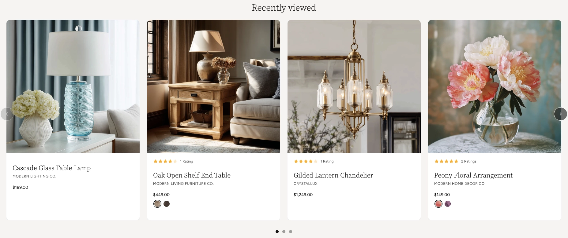
In the Boardwalk theme, the Recently Viewed Products section automatically tracks which products a visitor has looked at and displays them in a responsive grid or swipeable carousel. Each product appears as a card showing the product image, title, vendor, price, star ratings, and color swatches when available. The section is completely automatic — it stays hidden until a visitor has browsed at least one product, then appears with their viewing history. It also supports a heading group at the top for a customizable title.
How to Set Up the Recently Viewed Products Section
Follow these steps to add and configure the Recently Viewed Products section on any page of your Shopify store using the Boardwalk theme.
Open the Theme Editor
In your Shopify admin, go to
Online Store → Themes, find Boardwalk,
and click Customize. Navigate to the page
where you want to display recently viewed products using
the page selector dropdown at the top center of the
editor.
Add the Recently Viewed Products Section
Click Add section in the Theme Editor sidebar and choose Recently viewed products from the list. The section will appear on your page but will be empty in the editor — this is normal because the section only populates with products once a visitor has browsed your store.
Configure the Section Settings
Click the Recently viewed products section in the sidebar. Set the layout mode (grid or carousel), navigation options, column count, maximum number of products, column gap, padding, and color scheme. These settings control the overall look and behavior of the section.
Add a Heading (Optional)
The section includes a built-in heading group at the top where you can add text blocks for a title (e.g., "Recently Viewed"). Click the heading group in the sidebar and edit the text blocks to match your branding.
Choose What to Show on Product Cards
Use the Show vendor toggle in the section settings to control whether the product vendor name appears on each card. Product images, titles, prices, star ratings, and color swatches are displayed automatically when available.
Save and Preview
Click Save in the Theme Editor. To see the section in action, visit your live store and browse a few product pages first. Then navigate to the page where you placed the section — the products you viewed will appear automatically.
Note: The section will not display any products in the Theme Editor preview. You need to visit your live store and view some products first before the section will populate.
Section-Level Settings
These settings apply to the entire Recently Viewed Products section and are accessible by clicking the top-level section in the Theme Editor sidebar.
Recently Viewed Products Settings
Controls the maximum width of the section container.
Options: Page width (matches your theme's
content width) or Full width (stretches to
100%). This setting only appears when both desktop and
mobile carousels are turned off.
When turned on, product cards display as a horizontally scrollable carousel on desktop instead of a static grid.
When turned on, product cards display as a swipeable carousel on mobile devices instead of a stacked layout.
Displays previous and next arrow buttons on top of the carousel for manual navigation. Only visible when carousel mode is enabled. Arrows are automatically hidden on mobile devices.
Displays a draggable progress slider below the carousel that tracks scroll position and lets visitors scrub between slides. Only visible when carousel mode is enabled.
Number of product columns displayed in the grid or visible at once in carousel mode on desktop. Range: 2 to 5.
Limits how many recently viewed products are displayed in the section. Range: 2 to 10. If the visitor has viewed fewer products than this number, only the products they have actually viewed will appear.
Spacing between product cards. Options:
Small, Medium, or
Large.
Controls the spacing above the section content. Range: 0px to 100px.
Controls the spacing below the section content. Range: 0px to 100px.
Controls the left and right spacing of the section content. Range: 0px to 80px.
Toggles the product vendor name on or off across all product cards in the section. When hidden, the vendor line is removed from every card.
Select any defined color scheme to style the section background and text.
Product Card Details
Each recently viewed product is displayed as an individual card. The cards are generated automatically based on the product data in your store — there are no blocks to configure manually.
Product Image
Displays the product's featured image. The image is responsive and optimized for different screen sizes. If a product has no image, an empty placeholder is shown instead.
Star Rating
If a product has review ratings stored in its metafields, the card displays a visual star rating along with the total number of reviews. This data comes from your product reviews setup and is not entered manually.
Product Title
The product name as it appears in your Shopify admin. It links directly to the product page so visitors can click through for more details.
Vendor Name
Shows the product's vendor or brand name below the title. This can be toggled on or off globally using the Show vendor setting in the section settings.
Price and Sale Price
Displays the current product price. When a product is on sale (has a "Compare at price" set), both the original and discounted prices are shown. A discount percentage or savings amount also appears below the price when applicable.
Color Swatches
If a product has color or other swatch-based options, interactive swatch buttons appear on the card. Visitors can click a swatch to see the variant's image and updated pricing directly on the card without leaving the page.
Built-In Features
The Recently Viewed Products section comes with features that work automatically — no apps or custom code needed.
Feature Overview
Every time a visitor views a product page, that product is saved to their browsing history automatically. The most recently viewed product always appears first. Up to 15 products are stored in the visitor's browser so there is always a buffer of items to display.
The section is completely hidden until a visitor has viewed at least one product. If no browsing history exists (for example, on a first visit), the section takes up no space on the page.
When the section is placed on a product page, the product the visitor is currently viewing is automatically removed from the recently viewed list. This prevents duplication and keeps the section focused on other products the visitor may want to revisit.
While the product cards are being loaded, animated placeholder cards with a shimmer effect appear in the layout. This gives visitors a visual indication that content is on its way and prevents layout shifts as cards load in.
Product card data is fetched in the background after the page loads, so the section does not slow down the initial page load. Cards appear smoothly once the data is ready.
Choose between a horizontally scrollable carousel or a static grid layout. Desktop and mobile can be set independently, so you can use a carousel on mobile and a grid on desktop (or vice versa).
In carousel mode, visitors can swipe on touch devices or scroll horizontally with a mouse. Cards snap smoothly into position for a polished browsing experience.
Optional arrow buttons and a draggable progress slider give visitors additional ways to browse through products. Both can be toggled on or off. Arrows are automatically hidden on mobile.
Products with swatch-based options display interactive color or style swatches on the card. Clicking a swatch updates the product image and price to reflect the selected variant — all without leaving the page.
When a product is on sale, both the original and discounted prices are displayed along with a discount percentage or savings amount. The sale price is highlighted in a distinct color to draw attention.
The grid automatically adapts across screen sizes. On large desktops, it displays your chosen number of columns. On tablets, it caps at 2 columns, and on mobile it stacks to a single column (or swipeable carousel if enabled).
Product cards use a slide-in animation that triggers when the section scrolls into the visitor's view, adding a polished reveal effect to the layout.
Tip: Place this section at the bottom of your product pages to keep visitors engaged with items they've already shown interest in. It works especially well as a complement to product recommendations.
Admin Steps and Requirements
Some features require action in the Shopify admin before they'll work as expected in your theme.
Before You Begin
Only products with a status of Active in your Shopify admin will appear in the recently viewed section. Products in draft or archived status will be skipped. Go to Products in your admin and make sure the product status is set to Active.
Each product card displays the product's featured image. For the best appearance, make sure your products have at least one image uploaded in the Shopify admin under Products → Media.
For the sale price and discount to display on product cards, you need to set a Compare at price on the product variant in your Shopify admin. Go to Products → select the product → Pricing and enter a value in the "Compare at price" field.
Star ratings on product cards are pulled from the
product's review metafields. To display star ratings,
you need a product reviews app (such as Judge.me or
Shopify Product Reviews) that stores rating data in the
standard reviews.rating metafield. If no
review data exists for a product, the star rating is
simply not shown.
Swatches appear automatically on product cards when a product has options with swatch values configured. To set up swatches, go to Products → Options → edit the option and assign swatch colors or images to each value.
The section uses a color scheme setting to style the background and text. Color schemes are defined in Online Store → Themes → Customize → Theme settings → Colors. Make sure you've set up the color schemes you want to use before configuring this section.
This section uses the visitor's browser storage to remember which products they have viewed. If a visitor is using private or incognito browsing mode, their recently viewed history may not be saved between sessions. This is a browser limitation and cannot be changed.