About
Recommended products are items from your store that are related to a product a customer is currently viewing. Displaying relevant suggestions encourages shoppers to explore more of your catalog, increases average order value, and helps customers discover products they may not have found on their own.
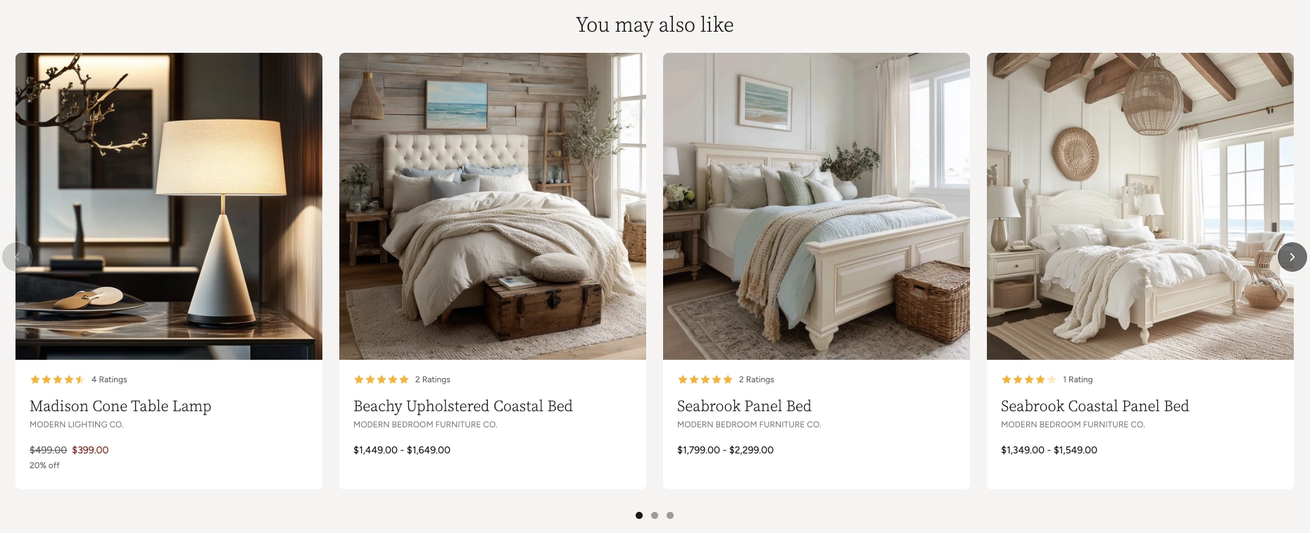
In the Boardwalk theme, the Recommended Products section automatically pulls products from the same collection as a selected product and displays them in a responsive grid or swipeable carousel. Each recommended item is shown as a fully featured product card that can include the product title, vendor, price, ratings, discount information, and color swatches. The section also supports a heading group at the top for a title such as "You may also like," and includes built-in carousel navigation with arrows and a draggable progress slider.
How to Set Up the Recommended Products Section
Follow these steps to add and configure recommended products on any page of your Shopify store using the Boardwalk theme.
Open the Theme Editor
In your Shopify admin, go to
Online Store → Themes, find Boardwalk,
and click Customize. Navigate to the page
where you want to display recommended products using the
page selector dropdown at the top center of the editor.
Add the Recommended Products Section
Click Add section in the Theme Editor sidebar and choose Recommended products from the list. The section will appear on your page with placeholder product cards.
Select a Source Product
Click the Recommended Products section in the sidebar. Use the Product picker to select the product you want to base recommendations on. The section will pull other products from the same collection as the selected product, automatically excluding the source product itself from the results.
Note: The source product must belong to
at least one collection in your Shopify admin. If the
product is not in any collection, no recommended items
will appear. To add a product to a collection, go to
Products → Collections
in your Shopify admin.
Configure the Section Settings
Set the layout mode (grid or carousel), navigation options, column count, maximum number of products, column gap, padding, and color scheme. These settings control the overall look and behavior of the entire section.
Edit the Heading (Optional)
The section includes a built-in heading group at the top where you can add text blocks for a title and description (e.g., "You may also like"). Click the heading group in the sidebar and edit the text blocks to match your branding.
Customize the Product Card
The section comes with a pre-configured product card that displays the product title, vendor, a divider, star rating, price, discount information, and color swatches. You can rearrange, remove, or add blocks within the product card to customize what information appears for each recommended item.
Save and Preview
Click Save in the Theme Editor. Preview your page to verify the recommended product cards, carousel navigation, and heading are displaying as expected.
Section-Level Settings
These settings apply to the entire Recommended Products section and are accessible by clicking the top-level section in the Theme Editor sidebar.
Recommended Products Section Settings
Select the product to base recommendations on. The section will display other products from the same collection, automatically excluding the selected product from the results.
Controls the maximum width of the section container.
Options: Page (matches your theme's content
width) or Full (100% width). This setting
only appears when both desktop and mobile carousels are
turned off.
When turned on, product cards display as a horizontally scrollable carousel on desktop instead of a static grid.
When turned on, product cards display as a swipeable carousel on mobile devices instead of a stacked single-column layout.
Displays previous and next arrow buttons on the carousel for manual navigation. Only visible when carousel mode is enabled. Arrows are automatically hidden on mobile devices regardless of this setting.
Displays a draggable progress slider below the carousel that tracks scroll position and lets visitors scrub between slides. Only visible when carousel mode is enabled.
Number of product columns displayed in the grid or visible at once in carousel mode on desktop. Range: 2 to 5.
Limits the total number of recommended products displayed in the section. Range: 2 to 10.
Spacing between product cards. Options:
Small, Medium, or
Large.
Controls the top and bottom padding of the section on desktop screens. Top and bottom range: 0px to 100px.
Controls the top and bottom padding of the section on mobile screens. Top and bottom range: 0px to 100px.
Select any defined color scheme to style the section background and text.
Product Card Blocks
Each recommended product is displayed using a product card. The card is made up of individual blocks that you can rearrange, add, or remove to control what information appears for each product. Below are the blocks included in the pre-configured card layout.
Product Media
Displays the product's featured image. This is the main visual element of the card and is always shown at the top. The card image links directly to the product page.
Spacer
Adds empty vertical space between other blocks on the card. Use spacers to fine-tune the visual rhythm and breathing room between elements like the product title, price, and swatches.
Product Title
Displays the name of the product. You can customize the font style, font weight, font size, line height, and letter spacing.
-
Font style — Choose from
Heading,Body,Caption, orMenu -
Font weight —
NormalorBold - Font size — Adjustable size in pixels
- Line height — Controls the vertical spacing between lines of text
-
Letter spacing —
Tight,Normal, orLoose
Text
A flexible rich text block that can display any custom content. In the pre-configured layout, this block is used to show the product vendor name. You can change the font style and size to match your design.
- Text — Rich text content (supports bold, italic, and other formatting)
-
Font style — Choose from
Heading,Body,Caption, orMenu
Divider
A horizontal line that visually separates content within the card. Useful for creating clear sections between the title area and the pricing area.
- Use section color — When enabled, the divider inherits the section's text color
- Custom color — Set a specific color for the divider line
- Line style — Choose the divider's visual style (e.g., solid)
- Line thickness — Controls the weight of the divider line
- Fade edges — When enabled, the divider fades out at both ends for a softer look
Rating
Displays a star rating and optional review count pulled from your connected reviews app. This block only shows data when a compatible reviews app is installed and customers have left ratings for the product.
-
Width —
AutoorFull - Show review count — Toggle the number of reviews next to the stars
- Star color — Set the color of the star icons
-
Star size —
SmallorMedium
Note: Star ratings require a compatible Shopify reviews app (such as Judge.me or Loox) to be installed and configured. Without a reviews app, this block will not display any content.
Price
Shows the product price. For products with multiple variants, you can choose to display a price range or the selected variant price only. Sale pricing, unit prices, installment information, and tax details can all be toggled independently.
-
Price display —
Price rangeorSelected variant only - Show unit price — Displays per-unit pricing (only applies in "Selected variant only" mode)
- Show installments — Displays installment payment information if available
- Show tax info — Shows tax-related details beneath the price
- Show sale price first — When a product is on sale, places the discounted price before the original price
- Show sale color — Enables a custom color for sale prices
- Sale price color — Sets the custom color for sale price text
- Font size — Controls the size of the price text
Discount Information
Displays sale or discount details for the product, such as the percentage or amount saved. This block appears only when the product has an active sale price.
-
Font style — Choose from
Heading,Body,Caption, orMenu -
Font weight —
NormalorBold - Font size — Controls the text size
Swatches
Displays color swatches when the product has a Color option configured. Swatches let customers see available color variants at a glance directly on the product card.
-
Swatch size —
Small,Medium, orLarge
Note: Swatches only appear when your
products have a Color option configured and connected to
a color source in the Shopify admin. To set this up, go
to Products, select a product, then go to
Variants and add color options there.
Built-In Features
The Recommended Products section comes with features that work automatically — no apps or custom code needed.
Feature Overview
Once you select a source product, the section automatically pulls related products from the same collection. The source product is excluded from the results so customers only see new suggestions.
Choose between a horizontally scrollable carousel or a static grid layout. Desktop and mobile can be set independently, so you can use a carousel on mobile and a grid on desktop (or vice versa).
In carousel mode, visitors can swipe on touch devices or scroll horizontally with a mouse. Cards snap smoothly into position for a polished browsing experience.
Optional arrow buttons and a draggable progress slider give visitors additional ways to browse through recommended products. Both can be toggled on or off.
The grid automatically adapts across screen sizes. On large desktops, it displays your chosen number of columns. On tablets, it caps at 2 columns, and on mobile it stacks to a single column (or a swipeable carousel if enabled).
Each product card animates into view with a slide-in effect as the visitor scrolls down the page, creating an engaging and polished presentation.
Each product card is built from individual blocks (title, vendor, price, rating, swatches, dividers, and spacers) that you can rearrange, add, or remove to create a layout that fits your store's style.
Frequently Asked Questions
Common questions about the Recommended Products section.
Products, select a product, navigate to
Variants, and make sure color options
are set up there. Products without color variants will
not show any swatches.