About
The search page in Shopify is the dedicated results view that customers see after submitting a search query on your store. It displays matching products, articles, and pages in a unified interface, letting shoppers quickly find exactly what they're looking for.
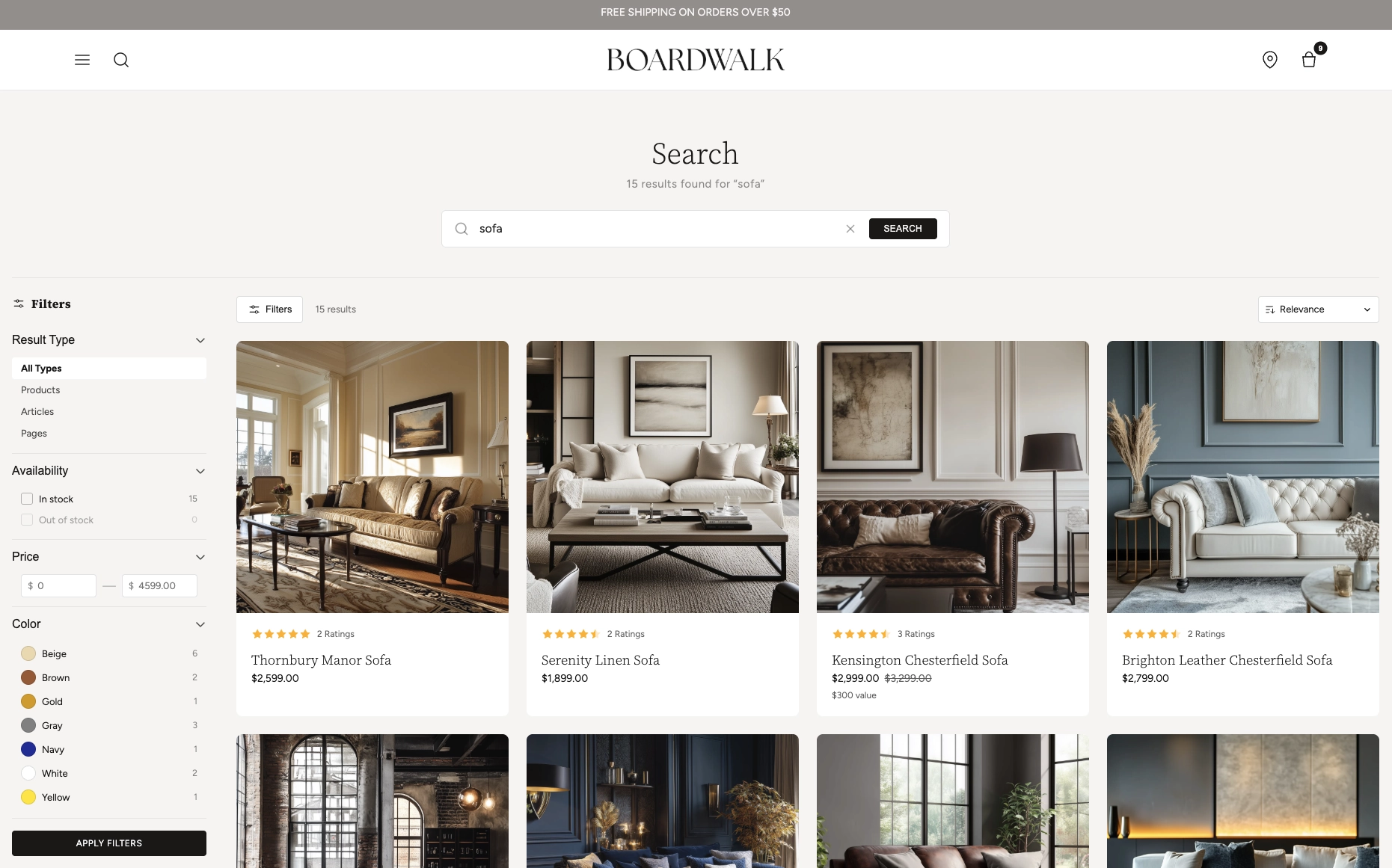
In the Boardwalk theme, the Search section is a feature-rich results page that includes a predictive search bar with live suggestions, a left sidebar with result-type and product filters (availability, price, vendor, and more), a responsive grid of mixed results (products, articles, and pages), built-in sorting and pagination, and a mobile-friendly filters drawer. Each result type is rendered through its own modular, block-based card — Product Card, Article Card, or Page Card — that you can fully customise with child blocks directly in the Theme Editor.
How to set up the Search Section
Follow these steps to configure and publish your search results page in Shopify using the Boardwalk theme.
Open the Theme Editor
In your Shopify admin, navigate to
Online Store → Themes, find Boardwalk,
and click Customize. In the page selector
dropdown at the top center, choose
Search. The Search section is already
included in the default template.
Configure Section Settings
Click the Search section in the sidebar. Set the content max width, header alignment, grid columns and gap, results per page, color scheme, and padding. Customize the predictive search placeholder text and card appearance.
Enable & Configure Filters
Toggle Enable product filters to show a left sidebar with availability, price, vendor, and other Shopify product filters. Choose whether filters appear by default on desktop and whether filter groups start expanded or collapsed.
Shopify Admin required: Product filters
shown on search are managed by the
Search & Discovery app by Shopify.
Open the app from your Shopify admin and go to
Filters to choose which filters appear. The
theme will automatically render whatever you enable
there.
Customize the Result Cards
Inside the Search section, you'll find three card blocks: Product Card, Article Card, and Page Card. Each is a parent block that controls how its result type appears in the grid. Click a card to set its border radius, text alignment, and color scheme, then add or reorder child blocks (media, title, price, swatches, etc.) to build your desired layout.
Save & Preview
Click Save in the top right corner. Use the search bar in the Theme Editor preview to test a query and confirm that your layout, filters, and card designs look exactly how you want. Predictive search suggestions will also appear in the preview.
Tip: The search section automatically includes a built-in Result Type filter that lets customers switch between All Types, Products, Articles, and Pages — no configuration needed.
Section-Level Settings
These settings apply to the entire Search section and are accessible by clicking the top-level section in the Theme Editor sidebar.
Layout & Header
Controls the maximum width of the search content area.
Options: Page (matches your theme's content
width) or Full (100% of viewport).
Aligns the search title, result count text, and search
bar. Options: Left, Center ,
or Right.
Filtering
Shows a left sidebar with availability, price, vendor, and other product filters configured in the Search & Discovery app.
When enabled, the filter sidebar is visible on page load. When disabled, filters are hidden but can be opened with the Filters toggle button.
When enabled, all filter groups (availability, price, vendor, etc.) start open instead of collapsed.
Grid
Number of columns for the results grid on desktop.
Range:
2 to 4.
Number of columns on mobile devices. Options:
1 column or 2 columns
.
Spacing between grid items. Range: 8px to
48px (step 4).
How many results to display before paginating. Range:
8 to 48 (step 4).
Appearance & Padding
Select any color scheme defined in your theme settings.
A color picker that sets the background color for the search input and active filter tags.
Top and bottom padding for the entire section. Range:
0px to 100px (step 4).
Predictive Search
The placeholder text shown inside the search input before a customer starts typing.
Color scheme applied to the predictive search suggestion cards in the dropdown.
Border radius of the predictive search suggestion cards.
Range: 0px to 24px (step 2).
Result Card Blocks
The Search section uses three parent card blocks — one for each result type. Each parent card contains child blocks that you can add, remove, and reorder to build your desired layout.
Product Card
The Product Card is the parent block for all product search results, with child blocks you can add, remove, and reorder.
Product Card (Parent)
The Product Card is the parent block for all product results. It wraps each product in a clickable card with its own styling controls.
- Border radius — Rounds the card corners
- Text alignment — Left, Center, or Right
- Card color scheme — Overrides the section color scheme for product cards
Product Media
Displays the product's featured image with an optional secondary image on hover. This block is static (always present).
- Aspect ratio — 16:9, 4:3, 3:2, 1:1 , Portrait, or Adapt
- Show secondary image — Reveals a second product image on hover
Product Rating
Shows a star rating pulled from the product's
reviews.rating metafield, plus an optional
review count.
- Width — Auto or Full
- Show review count — Displays "X Ratings" next to stars
- Star color — Color picker
- Star size — Small or Regular
Note: Ratings require a reviews app
(e.g., Shopify Product Reviews, Judge.me, Loox) that
writes to the standard
reviews.rating metafield. Without this
metafield, the block will not render.
Product Title
Renders the product name as a clickable link to the product page.
- Font family — Primary, Body, Caption, or Menu
- Font weight — Normal or Bold
- Font size — In pixels
- Line height — Unitless ratio
- Letter spacing — Normal, Tight, or Wide
Price
Displays product pricing with support for ranges, sale prices, unit prices, installments, and tax info.
- Price display mode — Range (shows "From $X") or Selected variant
- Show unit price — For products sold by weight/volume
- Show installments — Displays installment pricing info
- Show tax info — Shows tax-included notice
- Show sale price first — Puts the discounted price before the compare-at price
- Show sale color — Highlights sale prices in a custom color
- Font size, line height, letter spacing, opacity, alignment — Full typography controls
Product Sale Badge
Shows a sale/discount badge when a product has a compare-at price. Automatically calculates the maximum discount percentage across all variants and handles pre-order and out-of-stock states.
- Font family, weight, size, line height, letter spacing — Full typography controls
Swatches
Renders color or image swatches for any product option that has swatches configured. Clicking a swatch updates the product image and price in real time.
- Swatch size — Small or Large
Note: Swatches must be configured in
Shopify Admin → Settings → Custom data
                          → Product options
by assigning color or image values to your variant
options. Only options with swatch data will display.
Spacer
An invisible spacing block that adds vertical or horizontal padding between other child blocks. Useful for fine-tuning card layouts.
- Vertical padding — 0–40px (step 2)
- Horizontal padding — 0–40px (step 2)
Article Card
The Article Card is the parent block for blog post search results, with child blocks for building the card layout.
Article Card (Parent)
The Article Card is the parent block for blog post results. It wraps each article in a clickable card linking to the full article page.
- Border radius — Rounds the card corners
- Text alignment — Left, Center, or Right
- Card color scheme — Overrides the section color scheme for article cards
Article Media
Displays the article's featured image. This block is static (always present). Shows a placeholder icon when no image is set.
- Aspect ratio — 16:9, 4:3, 3:2, 1:1 , Portrait, or Adapt
Article Title
Renders the article's title as a heading inside the card.
- Font family — Primary, Body, Caption, or Menu
- Font weight — Light, Normal, Medium , or Bold
- Font size — In pixels
- Line height — Unitless ratio
- Letter spacing — Normal, Tight, or Wide
Article Read Time
Automatically calculates and displays reading time based on the article's word count (200 words per minute, rounded up, minimum 1 minute).
- Format — Abbreviated ("5 min read"), Short ("5 min"), or Long ("5 minutes read")
- Show icon — Displays a clock icon before the text
- Font family — Body or other options
- Font size — In pixels
- Opacity — 0–100%
Text (Type Label)
A rich text block used to display a type label (e.g., "ARTICLE") above the title, helping customers distinguish result types at a glance.
- Text content — Rich text editor
- Font family — Menu or other options
- Font sizes — Separate sizes for primary, body, caption, and menu fonts
- Line height — Unitless ratio
Page Card
The Page Card is the parent block for static page search results, with child blocks for the card layout.
Page Card (Parent)
The Page Card is the parent block for static page results. It wraps each page in a clickable card linking to the page. Shows a page featured image if available, otherwise displays a placeholder icon.
- Border radius — Rounds the card corners
- Text alignment — Left, Center, or Right
- Card color scheme — Overrides the section color scheme for page cards
Page Title
Renders the page's title as a heading inside the card.
- Font family — Primary, Body, Caption, or Menu
- Font weight — Light, Normal, Medium , or Bold
- Font size — In pixels
- Line height — Unitless ratio
- Letter spacing — Normal, Tight, or Wide
Page Description
Displays a truncated excerpt of the page's body content, with HTML stripped. Useful for giving customers a preview of the page before clicking through.
- Description length — Max characters to show
- Max lines — Clamp text to this many lines with an ellipsis
- Font family, size, line height, opacity — Full typography controls
Text (Type Label)
A rich text block used to display a type label (e.g., "PAGE") above the title for visual differentiation in mixed search results.
- Text content — Rich text editor
- Font family — Menu or other options
- Font sizes — Separate sizes for primary, body, caption, and menu fonts
- Line height — Unitless ratio
Built-In Features
The Search section comes packed with features that work automatically — no apps or custom code needed.
Feature Overview
As customers type in the search bar, a live dropdown appears with suggested results — no page reload required. Shows a loading spinner while fetching, result cards grouped by type, and a "no results" message when nothing matches. Closes automatically when clicking outside or pressing Escape.
A dedicated "Result Type" filter group always appears at the top of the sidebar, letting customers narrow results to All Types, Products, Articles, or Pages. This filter is automatically included — no Shopify admin configuration needed.
Filter product results by availability, price range, vendor, and any other product filters configured in your Shopify admin. Supports boolean, list, and price range filter types with real-time checkbox and input controls.
Sort results using Shopify's built-in sort options (relevance, price ascending/descending, etc.) via a toolbar dropdown. Selection applies instantly without a full page reload.
Page numbers load new results without a full page refresh. Supports browser back/forward navigation and updates the URL.
On tablet and mobile, the sidebar is replaced by a slide-out drawer with the same filter controls. The Filters button in the toolbar opens and closes it.
When filters are applied, active tags appear as removable badges above the grid. Clicking the "×" on a tag removes that filter, and a "Clear all" link resets everything.
When a filter group has more than 8 items, a search input automatically appears within the group so users can quickly find the value they're looking for.
Products, articles, and pages all render in a single responsive grid. Each result type uses its own card block, so you can give products, articles, and pages completely different visual treatments in a unified layout.
When a search returns zero results, a friendly message is shown with a search icon and guidance text. Before any search is performed, the page shows just the title and search bar in a centered, vertically-filled layout.
Admin Steps and Requirements
Some features require action in the Shopify admin before they'll appear in your theme.
Before You Begin
Product filters shown on search are managed by Shopify's Search & Discovery app. Open the app from your Shopify admin, go to Filters, and choose which filters appear. The theme automatically renders whatever you enable there.
The Product Rating block requires a reviews app (such as
Shopify Product Reviews, Judge.me, or Loox) that writes
to the standard reviews.rating metafield.
If the metafield is empty, the rating block simply won't
render — no broken layout.
Swatches must be configured in Settings → Custom data → Product options by assigning color or image values to your variant options. Only options with swatch data will display in search result cards.
Article and page cards show featured images when available. If no featured image is set, a placeholder icon displays instead. For the best appearance, add a featured image to every article and page.
Each result card type (Product, Article, Page) can have its own color scheme. When the card color scheme differs from the section's, the card media automatically receives rounded corners based on your card border radius setting.
By default, search includes products, articles, and
pages. Customers can use the Result Type filter to
narrow by type. To restrict which content types are
searchable globally, you would need to modify the hidden
type input in the search form.
Frequently Asked Questions
reviews.rating metafield to be populated.
You need a reviews app (such as Shopify Product Reviews,
Judge.me, or Loox) that writes to this metafield. If the
metafield is empty, the rating block simply won't render
— no broken layout.
type input in the search form or manage
this at the Shopify admin level.
search.sort_options (relevance, price
ascending/descending, etc.) and applies the selected
sort without a full page reload.