About
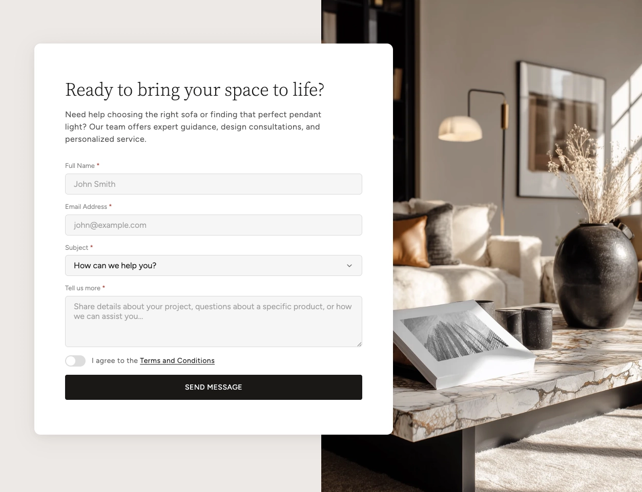
The Split Card Overlay section is a visually striking two-column layout that pairs a solid color background on one side with a full-bleed image on the other. An elevated card floats across the divide, creating a layered, overlapping effect that draws attention to your content.
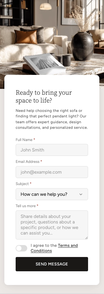
This section is ideal for contact forms, calls to action, lead-generation forms, or any content that benefits from strong visual contrast. The card accepts flexible content blocks — including a Group block (which can hold over 24 different child blocks such as text, buttons, images, and more) and a Form block for building custom contact forms — giving you complete control over what appears inside the overlay card. On mobile, the layout stacks gracefully with the image on top and the card below.
How to Set Up the Split Card Overlay
Follow these steps to add and configure a Split Card Overlay section in your Shopify store using the Boardwalk theme.
Open the Theme Editor
In your Shopify admin, navigate to
Online Store → Themes, find Boardwalk,
and click Customize. Select the page
where you want to add the section from the page selector
dropdown at the top center.
Add the Split Card Overlay Section
Click Add section in the left sidebar, then search for or select Split card overlay from the Content category.
Upload an Image
In the section settings, upload or select an image for the image side of the layout. Choose whether the image appears on the left or right. The image uses your Shopify media library's built-in focal point, so you can set the focal point on your image to control how it crops at different screen sizes.
Adjust the Card and Layout
Set the desktop and mobile heights, card width, how far the card shifts from center, vertical alignment, and corner radius. Pick a section color scheme for the background side and a separate card color scheme for the overlay card itself.
Add Content Blocks to the Card
Click inside the section to add blocks. Use a Group block to add flexible content like headings, body text, buttons, images, and more. Use a Form block to build a contact or lead-capture form. You can also add third-party App blocks. Drag and drop blocks to rearrange their order inside the card.
Save and Preview
Click Save in the Theme Editor. Preview your page to verify the layout, card positioning, and content look correct on both desktop and mobile.
Section-Level Settings
These settings apply to the entire Split Card Overlay section and are accessible by clicking the top-level section in the Theme Editor sidebar.
Image Settings
Upload or select the image that appears on one side of the section. If no image is set, a placeholder graphic is shown. The image automatically uses the focal point set in your Shopify media library to control cropping.
Choose which side the image appears on. Options:
Right or Left.
Layout Settings
Controls the overall height of the section on desktop. Range: 400px to 1000px.
Controls the height of the image area on mobile. On small screens the layout stacks vertically, so this only affects the image portion — the card sits below it. Range: 200px to 700px.
Card Settings
Sets the maximum width of the overlay card. Range: 360px to 700px.
Controls how far the card shifts toward the background color side. A higher value pushes the card further away from the image, while zero keeps it centered on the split. Range: 0% to 40%.
Controls where the card sits vertically within the
section on desktop. Options: Top,
Center, or Bottom.
Rounds the corners of the overlay card. Range: 0px to 40px.
Appearance & Spacing
Sets the color scheme for the background color side of the layout. This side contrasts with the image and is visible behind the card.
Sets the color scheme for the overlay card itself. Choosing a different scheme from the section creates visual contrast between the card and the background.
Top padding for the section. Range: 0px to 100px.
Bottom padding for the section. Range: 0px to 100px.
Blocks
The Split Card Overlay accepts three types of blocks that render inside the overlay card. Add one or more blocks to build your desired card content.
Group
A flexible container that holds child blocks. The Group block accepts over 24 different child blocks — including text, buttons, images, icons, spacers, dividers, and many more — giving you full creative control over the card's content. You can nest multiple types of content and arrange them in any order. For full details on all available child blocks, see the Group Block article.
- Layout direction — Horizontal or Vertical
- Width — Fit (auto) or Fill (full width)
- Height — Fit (auto) or Fill (full height)
- Content max width — Auto or Narrow (600px)
- Text alignment — Left, Center, or Right
- Horizontal alignment — Left, Center, Right, or Space between
- Vertical alignment — Top, Middle, Bottom, or Space between
- Gap — Spacing between child blocks, 0px to 100px
- Padding — Horizontal and vertical desktop padding
Form
A contact form block that uses Shopify's built-in contact form system. Submissions are sent to the store owner's email. The form includes a submit button and shows success or error messages automatically. Add child field blocks inside the form to build your fields.
- Button text — Custom label for the submit button
- Button style — Primary, Secondary, or Tertiary
- Success message — Custom text shown after a successful submission
- Color scheme — Select any defined color scheme
- Corner radius — 0px to 40px
- Field gap — Spacing between fields (desktop and mobile, 0px to 40px)
- Padding — Top and bottom padding for desktop and mobile
App
Allows you to embed any Shopify app that supports theme app extensions directly inside the overlay card. This is useful for adding third-party functionality like reviews, booking widgets, or custom forms without writing any code.
Tip: You can add multiple blocks to the card. For example, combine a Group block for a heading and description text with a Form block below it to create a complete contact section with both introductory content and a form.
Form Field Blocks
When you use a Form block, you build your form by adding field blocks inside it. These field blocks only appear as options when you're working inside a Form block. Each field maps to a Shopify contact form field name so submissions are captured correctly.
Text Field
A single-line input for collecting short text like names, emails, phone numbers, or URLs.
- Label — The label shown above the field
- Field type — Text, Email, Phone, URL, or Number
- Placeholder — Hint text shown inside the empty field
- Field name — Which Shopify contact field this maps to (Name, Email, Phone, Company, Website, Subject, Budget, or Custom 1–3)
- Autocomplete — Browser autofill hint (Off, Name, Email, Phone, URL, or Company)
- Required — Whether the field must be filled in before submitting
Textarea
A multi-line text area for longer messages, descriptions, or notes.
- Label — The label shown above the field
- Placeholder — Hint text shown inside the empty field
- Field name — Which Shopify contact field this maps to (Body, Notes, Details, or Custom 1–2)
- Rows — Height of the text area, 2 to 10 rows
- Required — Whether the field must be filled in before submitting
Select (Dropdown)
A dropdown menu for presenting a list of choices. Options are entered one per line in the settings.
- Label — The label shown above the dropdown
- Placeholder — Text shown before a selection is made
- Options — The list of choices, one per line
- Field name — Which Shopify contact field this maps to (Budget, Subject, Interest, Timeline, Referral, or Custom 1–2)
- Required — Whether a selection must be made before submitting
Checkbox (Toggle)
A toggle switch for yes/no options like agreeing to terms and conditions or opting in to a newsletter. The label supports rich text, so you can include links (for example, a link to your terms page).
- Label — Rich text label (supports inline links)
- Field name — Which Shopify contact field this maps to (Terms, Newsletter, Privacy, or Custom 1–2)
- Required — Whether the checkbox must be checked before submitting
Note: Form submissions are sent to your store's contact email address. You can check and update this email in your Shopify admin under Settings → Store details.
Admin Steps and Requirements
Some features require action in the Shopify admin before they'll work in your theme.
Before You Begin
Form submissions are delivered to your store's contact email. Make sure this is set correctly in Settings → Store details before publishing a form.
The image side uses your Shopify media library's focal point setting. To control how the image crops at different screen sizes, go to Content → Files, select your image, and set the focal point.
Each form field has a Field name setting that determines how it appears in your submission email. Make sure each field is mapped to a unique name so no data is overwritten. If two fields share the same field name, only the last one's value will be included in the submission.
On mobile, the two-column layout stacks into a single column. The image appears on top and the card overlaps slightly below it. The card offset and vertical alignment settings are not applied on mobile — the card always displays at full width below the image.
To add an App block, the app must support Shopify's theme app extensions. Install the app from the Shopify App Store and it will automatically appear as an option when adding blocks to this section.
Frequently Asked Questions
@app blocks, so third-party Shopify apps
with theme app extensions can be embedded too. For a
complete list, refer to the
Group Block article.