About
A split content layout is a design pattern that divides a section into two columns, placing different types of content side by side. It's one of the most popular ways to present information on a modern website — pairing a compelling image with descriptive text, a video alongside a call-to-action, or even two images together.
In the Boardwalk theme, the Split Content: Image section creates a responsive two-column grid that accepts up to two blocks. You can combine images, videos, content groups (with headings, text, and buttons), and animated image reveals. The section offers flexible column widths, adjustable spacing, and full color scheme support — making it ideal for storytelling, product highlights, feature showcases, and FAQ layouts.
How to Set Up Split Content: Image
Follow these steps to add and configure a Split Content: Image section in your Shopify store using the Boardwalk theme.
Open the Theme Editor
In your Shopify admin, go to
Online Store → Themes, find Boardwalk,
and click Customize. Navigate to the page
where you want to add the section (e.g., your homepage, a
landing page, or any template).
Add the Section
Click Add section in the Theme Editor sidebar, then search for and select Split content: Image. The section will appear with a default layout containing an Image block and a Group block.
Configure Section Settings
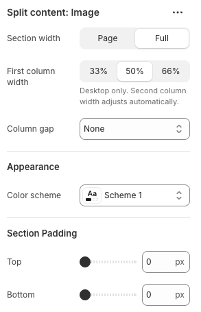
Click the Split content: Image section in the sidebar. Choose your section width, first column width, column gap, color scheme, and top/bottom padding to match your design.
Add and Customize Your Blocks
The section supports up to two blocks. Click an existing block to customize it, or remove it and add a different block type. For example, pair an Image block with a Group block that contains a heading, body text, and a button. You can swap the column order by dragging blocks in the sidebar.
Save and Preview
Click Save in the Theme Editor. Preview your page to check the layout on both desktop and mobile. On mobile devices, the two columns automatically stack vertically.
Section Settings
These settings control the overall layout and appearance of the Split Content: Image section.
Split Content: Image Settings
Controls how wide the section stretches. Options:
Page (matches your theme's content width)
or Full (spans the full width of the
browser window). When set to Full, images and videos
extend edge-to-edge with no padding.
Sets the width of the left column on desktop. Options:
33%, 50%, or 66%.
The right column adjusts automatically to fill the
remaining space. This setting only applies on desktop —
on mobile, both columns stack to full width.
The amount of space between the two columns. Options:
None, Small,
Medium, or Large. On mobile,
the gap is automatically reduced to half the desktop
value.
Select any defined color scheme to style the section background and text colors.
Top and bottom padding for the entire section. Range: 0px to 100px. On mobile, padding is automatically reduced to 75% of the desktop value.
Available Blocks
The Split Content: Image section supports up to two blocks. You can use any combination of the following block types to create your desired layout.
Image
Displays a responsive image with optional link wrapping. You can set separate images and aspect ratios for desktop and mobile, flip the image horizontally, adjust the corner radius, and control the image width.
- Image — Select an image from your media library
- Aspect ratio — Adapt (uses the image's natural proportions), Widescreen (16:9), Standard (4:3), Landscape (3:2), Square (1:1), or Portrait (3:4)
- Image width — Full width or Custom scale (10% to 100%)
- Corner radius — 0px to 40px
- Flip horizontal — Mirror the image horizontally
- Link — Make the entire image clickable with an optional "open in new tab" setting
- Mobile settings — Use a different image for mobile, or set a separate mobile aspect ratio
Video
Embeds a video player that supports Shopify-hosted videos, YouTube, and Vimeo links. Includes autoplay, loop, and playback controls along with a color overlay option for external videos.
- Video source — Upload (Shopify-hosted) or Link (YouTube/Vimeo URL)
- Color overlay — Apply a semi-transparent color layer over the video
- Cover image — Display a thumbnail image over linked videos before playback
- Aspect ratio — Widescreen (16:9), Landscape (4:3), or Square (1:1)
- Autoplay — Start playing automatically (muted)
- Loop — Replay continuously
- Show controls — Display play/pause and other video controls
- Accessibility description — A text description of the video for screen readers
Image Reveal
A scroll-activated animation block that layers two images on top of each other. As the visitor scrolls, the top image gradually fades and sharpens into view over the bottom image. You can also enable a black-and-white to color transition for extra visual impact.
- Bottom layer — The image that shows initially
- Top layer — The image that reveals during scrolling
- Greyscale to color — The bottom image starts in black and white and transitions to full color as the top layer reveals
- Aspect ratio — Adapt, Widescreen (16:9), Classic (4:3), Photo (3:2), Square (1:1), or Portrait (3:4)
Group
A flexible container block that holds child elements like headings, body text, buttons, and more. Use it to build a text column with a title, description, and call-to-action button. Groups can also nest other theme blocks and app blocks.
- Layout direction — Arrange child elements horizontally or vertically
- Width — Fit (shrink to content) or Fill (stretch to available space)
- Height — Fit (shrink to content) or Fill (stretch to match sibling)
- Content max width — Auto or Narrow (600px)
- Alignment — Text alignment (left, center, right) plus horizontal and vertical alignment for child elements
- Padding — Gap between child elements, plus horizontal and vertical padding
Group: Scroll Reveal
A special version of the Group block that adds a scroll-based text reveal animation. As the visitor scrolls down the page, the text content inside this block gradually fades into view. Accepts Text and Button child blocks.
- Layout direction — Horizontal or Vertical
- Content max width — Auto or Narrow (600px)
- Alignment — Text alignment plus horizontal and vertical positioning
- Desktop padding — Gap, horizontal padding, and vertical padding
- Mobile padding — Separate gap, horizontal padding, and vertical padding for mobile devices
Tip: The section also supports
@app blocks, so any Shopify app with theme app
extensions can be placed directly inside one of the two
columns.
Common Layout Ideas
Here are some popular ways to use the Split Content: Image section on your store.
Layout Examples
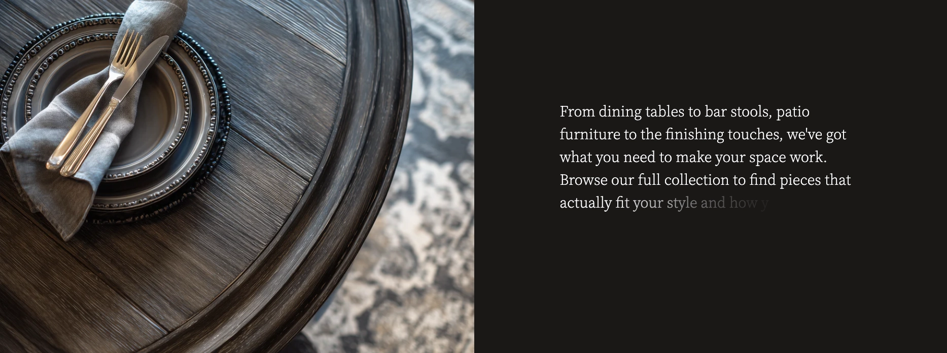
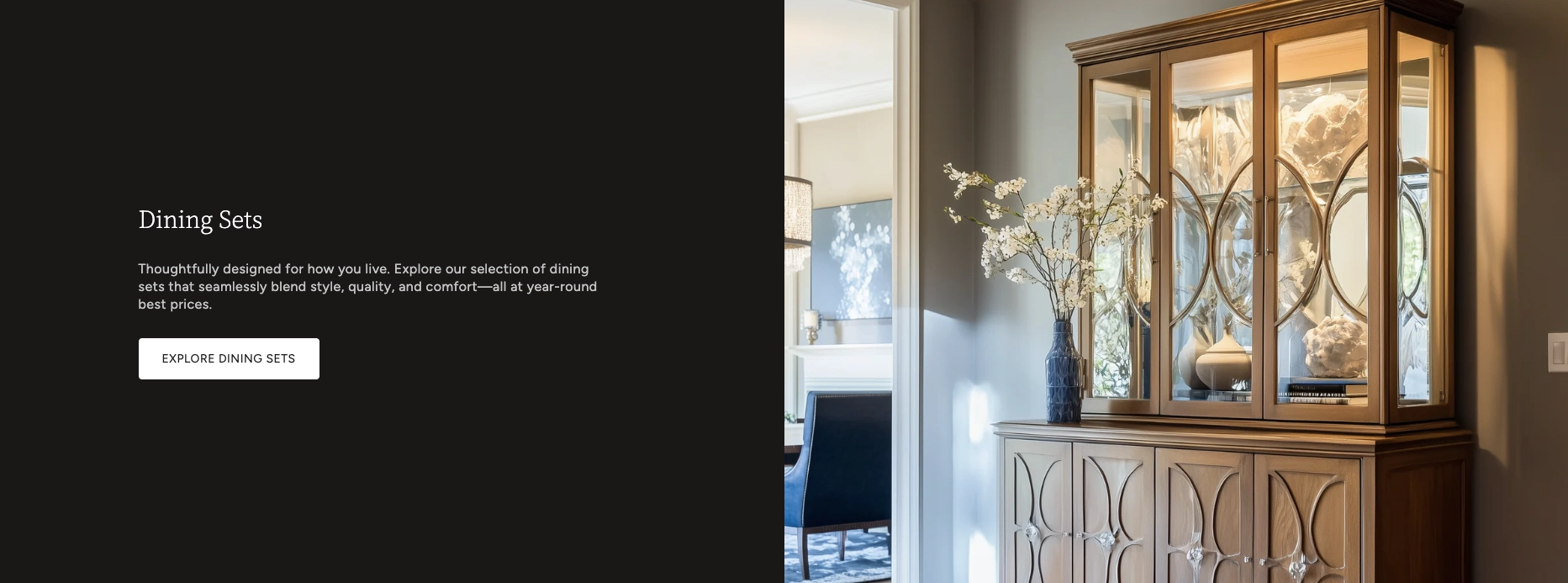
The most common layout. Place an Image block in one column and a Group block with a heading, description, and button in the other. Great for brand storytelling, product highlights, and collection showcases.
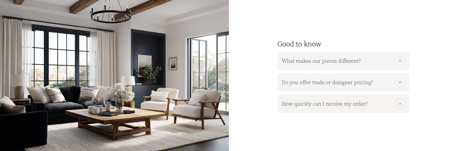
Pair an Image block with a Group block containing collapsible content. This is ideal for FAQ sections or feature breakdowns where each item can expand to reveal more detail.
Replace the Image block with a Video block to pair a product demo, brand video, or tutorial alongside descriptive text and a call-to-action.
Use the Image Reveal block to create an eye-catching scroll-driven transition, paired with a Group block for supporting content. Perfect for before-and-after showcases or visual storytelling.
Combine a Group: Scroll Reveal block with an Image block for a text column that animates into view as visitors scroll past the section.
Tips and Requirements
Keep the following in mind when working with the Split Content: Image section.
Good to Know
This section supports exactly two blocks — one for each column. If you need more content in a column, use a Group block and add child blocks inside it (headings, text, buttons, images, and more).
The first block in the Theme Editor sidebar appears in the left column, and the second block appears in the right column. To swap sides, simply drag the blocks to reorder them. On mobile, the first block always stacks on top.
On screens smaller than 750px, the two-column grid automatically switches to a single column with both blocks stacking vertically. The column gap is reduced to half the desktop value, and section padding shrinks to 75%.
The Image block lets you upload a separate image for mobile devices. This is helpful when your desktop image has a wide aspect ratio that doesn't look great on a phone screen. You can also set a different aspect ratio for mobile.
When the section width is set to Full,
images and videos stretch all the way to the edges of
the browser window with no horizontal padding. Combine
this with Column gap: None for a seamless,
edge-to-edge layout.
For the Video block, you can either upload a video directly to Shopify (in Content → Files) or paste a YouTube or Vimeo URL. Uploaded videos always play muted when autoplay is enabled.
For a visually dynamic page, add multiple Split Content: Image sections and alternate the block order — image on the left in one section, image on the right in the next. Use alternating color schemes for extra visual contrast.