About
Testimonials are quotes, reviews, or endorsements from your customers that help build trust and credibility with potential buyers. Displaying real feedback alongside star ratings and product links gives visitors confidence that your products deliver on their promise.
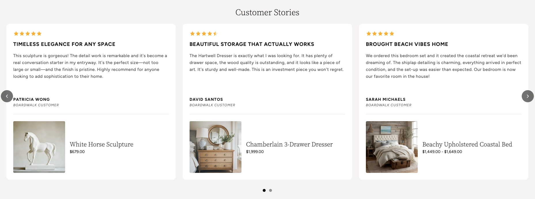
In the Boardwalk theme, the Testimonials section displays customer reviews in a responsive grid or swipeable carousel. Each testimonial is a card that can include a star rating, a headline, review text, the customer's name and title, and an optional linked product. The section also supports a heading group at the top for a title and description, and includes built-in carousel navigation with arrows and a draggable progress slider.
How to Set Up the Testimonials Section
Follow these steps to add and configure testimonials on any page of your Shopify store using the Boardwalk theme.
Open the Theme Editor
In your Shopify admin, go to
Online Store → Themes, find Boardwalk,
and click Customize. Navigate to the page
where you want to display testimonials using the page
selector dropdown at the top center of the editor.
Add the Testimonials Section
Click Add section in the Theme Editor sidebar and choose Testimonials from the list. The section will appear on your page with a few placeholder testimonial cards.
Configure the Section Settings
Click the Testimonials section in the sidebar. Set the layout mode (grid or carousel), navigation options, column count, column gap, padding, and color schemes. These settings control the overall look and behavior of the entire section.
Add a Heading (Optional)
The section includes a built-in heading group at the top where you can add text blocks for a title and description (e.g., "From Our Customers' Homes"). Click the heading group in the sidebar and edit the text blocks to match your branding.
Edit Individual Testimonials
Inside the Testimonials group, click on any Testimonial block. Fill in the star rating, headline, review text, customer name, and customer title. You can add more testimonials by clicking Add block inside the group, or remove ones you don't need.
Link a Featured Product (Optional)
Each testimonial can display a product card below the review. In the testimonial block settings, use the Product picker to select a product from your store. The product image, title, and price will appear automatically.
Note: The product you link must be published and active in your Shopify admin. If a product is in draft status, it won't display on your storefront.
Save and Preview
Click Save in the Theme Editor. Preview your page to verify the testimonial cards, carousel navigation, and any linked products are displaying as expected.
Section-Level Settings
These settings apply to the entire Testimonials section and are accessible by clicking the top-level section in the Theme Editor sidebar.
Testimonials Section Settings
Controls the maximum width of the testimonials
container. Options: Page (matches your
theme's content width) or Full (100%
width). This setting only applies when both desktop and
mobile carousels are turned off.
When turned on, testimonial cards display as a horizontally scrollable carousel on desktop instead of a static grid.
When turned on, testimonial cards display as a swipeable carousel on mobile devices instead of a stacked layout.
Displays previous and next arrow buttons on top of the carousel for manual navigation. Only visible when carousel mode is enabled.
Displays a draggable progress slider below the carousel that tracks scroll position and lets visitors scrub between slides. Only visible when carousel mode is enabled.
Number of testimonial columns displayed in the grid or visible at once in carousel mode on desktop. Range: 2 to 4.
Spacing between testimonial cards. Options:
Small, Medium, or
Large.
Controls the top and bottom padding of the section on desktop screens. Top and bottom range: 0px to 100px.
Controls the top and bottom padding of the section on mobile screens. Top and bottom range: 0px to 100px.
Select any defined color scheme to style the section background and text.
Select a color scheme for the individual testimonial cards. Use a different scheme from the section to make cards visually stand out.
Rounds the corners of each testimonial card. Range: 0px to 24px.
Sets the color scheme for the featured product cards that appear inside testimonials.
Rounds the corners of the featured product cards inside testimonials. Range: 0px to 24px.
Testimonial Block
Each testimonial is an individual block inside the Testimonials group. You can add, remove, and reorder testimonial blocks to build your desired layout.
Star Rating
Displays a visual star rating above the review text. Supports full and half stars. Set to 0 to hide the rating entirely.
- Rating — 0 to 5 (in half-star increments)
Headline
A short, bold title for the review (e.g., "Absolutely Stunning" or "Best Purchase Ever"). This appears prominently at the top of the testimonial card.
Testimonial Text
The body of the customer review. This is a rich text field, so you can use bold, italic, and other formatting to highlight key phrases in the review.
Customer Name
The name of the person who wrote the review. Displayed at the bottom of the testimonial card in uppercase styling.
Title or Company
An optional secondary line below the customer name. Use this for a job title, company name, or location to add context to the review.
Featured Product
Optionally link a product from your store to the testimonial. When set, a product card with the product image, title, and price appears below the review text. This is a great way to connect customer feedback directly to the product being reviewed.
- Product — Select any active product from your Shopify catalog
Testimonials Group Settings
The Testimonials group is the container that holds all individual testimonial blocks. It also has settings that control how linked product cards look across all testimonials.
Product Card Settings
Controls the font size of the product name inside the featured product card. Range: 12px to 30px.
Sets the font family for the product title. Options:
Heading, Body,
Caption, or Menu.
Controls the font size of the product price. Range: 12px to 20px.
When a product is on sale, this option displays the discounted price before the original price instead of after it.
Enables a custom color for the sale price text so it stands out from the regular price.
Sets the color of the sale price text. Only visible when the custom sale price color option is enabled.
Built-In Features
The Testimonials section comes with features that work automatically — no apps or custom code needed.
Feature Overview
Choose between a horizontally scrollable carousel or a static grid layout. Desktop and mobile can be set independently, so you can use a carousel on mobile and a grid on desktop (or vice versa).
In carousel mode, visitors can swipe on touch devices or scroll horizontally with a mouse. Cards snap smoothly into position for a polished browsing experience.
Optional arrow buttons and a draggable progress slider give visitors additional ways to browse through testimonials. Both can be toggled on or off.
Each testimonial supports star ratings from 0 to 5 in half-star increments. Stars are rendered visually with full, half, and empty states. Set the rating to 0 to hide stars entirely on a specific card.
Link a product to any testimonial to display a product card with image, title, and price directly below the review. Product cards include a quick view overlay on hover.
When a linked product is on sale, both the original and discounted prices are displayed. You can choose the display order and apply a custom color to the sale price.
The grid automatically adapts across screen sizes. On large desktops, it displays your chosen number of columns. On tablets, it caps at 2 columns, and on mobile it stacks to a single column (or swipeable carousel if enabled).
Each testimonial card animates into view with a slide-in effect as the visitor scrolls down the page, creating an engaging and polished presentation.
Product Quick View
When a testimonial has a linked product, visitors can interact with the product card directly without leaving the page.
Hovering over the product image reveals a magnifying glass icon, indicating the product can be previewed. Tapping or clicking on the product image or title opens the Quick View modal — a pop-up overlay that displays detailed product information right on the page.
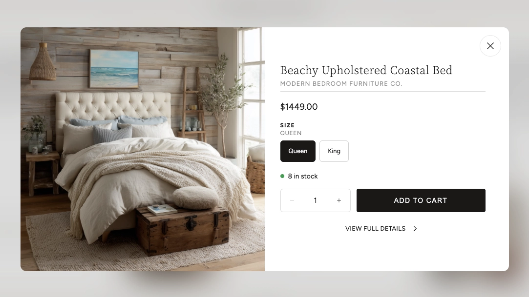
The Quick View modal includes several features that let customers shop without navigating away from the testimonials:
Quick View Modal Features
Browse all product images using arrow navigation buttons. The gallery also shows an image counter so customers know how many photos are available.
Displays the product name, vendor (optional), and current price. If the product is on sale, both the original and discounted prices are shown.
If the product has multiple options (such as size or color), swatches or selection buttons appear so the customer can choose their preferred variant before adding to cart.
Shows the current inventory status with a color-coded dot — green for in stock, red for low stock or out of stock, and yellow for backorder items.
Customers can adjust the quantity and add the product directly to their cart. The button shows a loading animation followed by a checkmark confirmation when the item is successfully added.
A link at the bottom of the modal takes the customer to the full product page if they want to see the complete description, additional images, or other information.

Tip: The Quick View modal loads product data in the background without a page reload, so it opens quickly and keeps visitors engaged on your testimonials page.
Admin Steps and Requirements
Some features require action in the Shopify admin before they'll work as expected in your theme.
Before You Begin
If you link a product to a testimonial, that product must have a status of Active in your Shopify admin. Products in draft status won't display on your storefront. Go to Products in your admin and make sure the product status is set to Active.
The featured product card displays the product's first image. For the best appearance, make sure your linked products have at least one image uploaded in the Shopify admin under Products → Media.
For the sale price to display on product cards, you need to set a Compare at price on the product variant in your Shopify admin. Go to Products → select the product → Pricing and enter a value in the "Compare at price" field.
Testimonials in this section are entered manually through the Theme Editor — they are not pulled automatically from a reviews app. You'll need to copy and paste customer reviews into each testimonial block yourself.
The section, testimonial card, and product card each have their own color scheme setting. These color schemes are defined in Online Store → Themes → Customize → Theme settings → Colors. Make sure you've set up the color schemes you want to use before configuring this section.