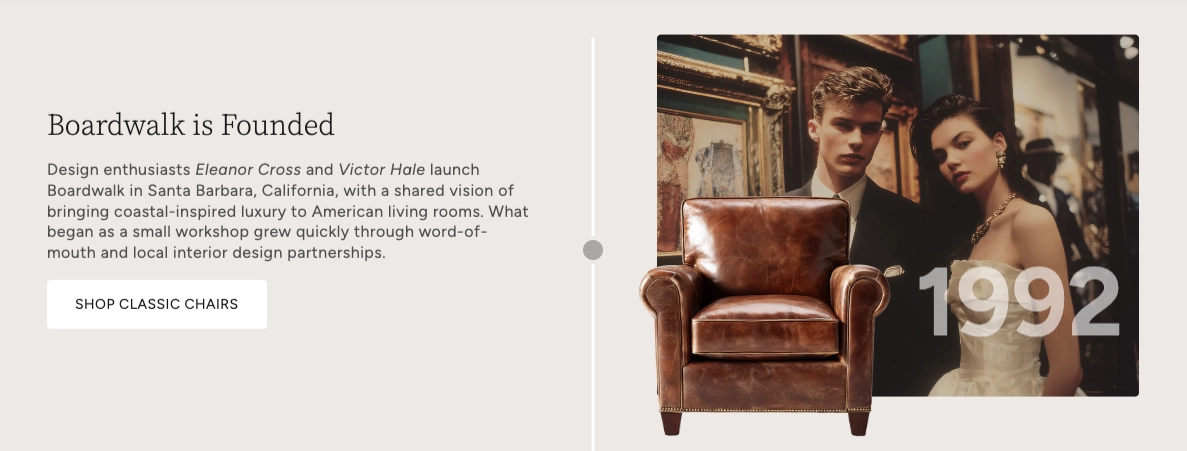
About
A timeline is a visual storytelling tool that displays events or milestones in chronological order along a vertical line. Timelines are a compelling way to share your brand history, product evolution, company milestones, project phases, or any narrative that unfolds over time.
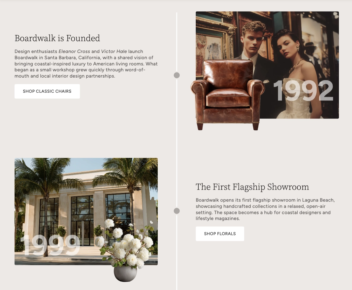
In the Boardwalk theme, the Timeline section is a beautifully designed vertical layout where events alternate between left and right sides of a central line. Each event can include up to two layered images with a large date overlay, paired with a content area for headings, descriptions, buttons, and more. The section features smooth scroll-triggered animations and a parallax scrolling effect that brings each event to life as visitors scroll down the page.
How to Set Up the Timeline Section
Follow these steps to add and configure a timeline on any page in your Shopify store using the Boardwalk theme.
Open the Theme Editor
In your Shopify admin, go to
Online Store → Themes, find Boardwalk,
and click Customize. Use the page
selector dropdown at the top center to navigate to the
page where you want the timeline (for example, your Home
page or a custom page).
Add the Timeline Section
Click Add section in the left sidebar and search for Timeline. Click it to add the section to your page. The section comes pre-loaded with three sample events to help you get started.
Configure the Section Settings
Click the Timeline section header in the sidebar to access the section-level settings. Here you can adjust the content width, timeline line color and thickness, dot styling, date font size, color scheme, and section padding.
Customize Each Event
Click any Event block in the sidebar to edit it. Upload a primary image (and optionally a secondary image that overlaps it), set the date text, choose an aspect ratio for the primary image, and adjust the secondary image scale. Each event's images and content automatically alternate sides — odd events show content on the left and images on the right, while even events flip the layout.
Add Content Blocks Inside Each Event
Inside each Event, add child blocks to build your content. Available blocks include Text (for headings and descriptions), Button (to link to collections, pages, or products), Image, Logo, and Divider. Drag and drop these blocks to arrange them in any order.
Add More Events
To add a new milestone, click Add block below the existing events in the sidebar and select Event. There is no limit to how many events you can add. You can also reorder events by dragging them in the sidebar.
Save and Preview
Click Save in the Theme Editor. Preview your page to see the timeline with its alternating layout, scroll-triggered animations, and parallax effects in action.
Section-Level Settings
These settings apply to the entire Timeline section and are accessible by clicking the top-level section in the Theme Editor sidebar.
Timeline Section Settings
Controls the maximum width of the timeline container.
Options: Page (matches your theme's content
width) or Full (100% width).
Controls the width of the content area within each
event. Options: Auto (content fills
available space) or Narrow (caps content at
600px for a more compact layout).
The color of the vertical line that runs down the center of the timeline.
The width of the central timeline line. Range: 1px to 8px.
The color of the circular dot markers that sit on the timeline line at each event.
The diameter of the dot markers on the timeline line. Range: 8px to 24px.
Controls how large the date text appears overlaid on the
images. Options: Small,
Medium, Large, or
Extra Large.
Select any defined color scheme to style the section background, text, and timeline elements.
Spacing above the timeline content. Range: 0px to 100px.
Spacing below the timeline content. Range: 0px to 100px.
Event Block
Each milestone on your timeline is represented by an Event block. Events are the top-level building blocks of the section — they hold the images, date overlay, and all content blocks for a single point in time.
Event Block Settings
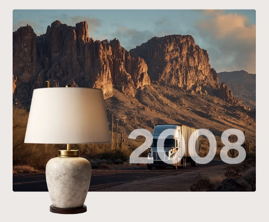
The main image displayed for this event. This is the larger, background image in the image stack. If no image is uploaded, a placeholder graphic is shown.
Controls the shape of the primary image. Options:
Widescreen (16:9),
Standard (4:3),
Landscape (3:2), Square (1:1),
or Portrait (3:4).
An optional smaller image that overlaps the bottom corner of the primary image, creating a layered, editorial look. This image has its own parallax scrolling speed for added depth.
Controls the size of the secondary image relative to the
primary image. Use the slider to set a value from
25% to 75% in
5% increments. Default: 55%.
Lower values create a smaller, more subtle overlap;
higher values make the secondary image more prominent.
The date or label text displayed as a large overlay on the images. This is a free text field, so you can enter a year (e.g., "2024"), a date range ("2020–2023"), or any short label you like.
When enabled, the date text color inherits from the section's color scheme. When disabled, a custom date color picker appears so you can set any color you want.
A custom color for the date overlay text. This setting only appears when Use section color scheme is turned off.
Child Blocks
Child blocks are added inside each Event to build the content area that appears alongside the images. You can arrange, reorder, or remove them to create the exact layout you want for each milestone.
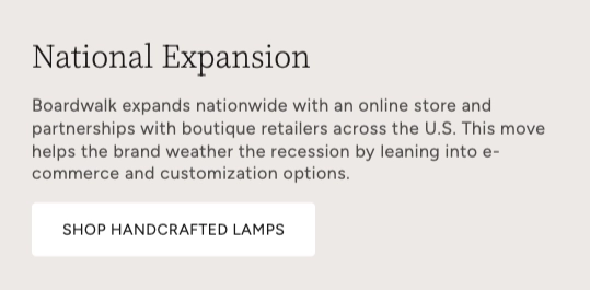
Text
A rich text block for adding headings, descriptions, or any formatted text to an event. You can use the rich text editor to add headings, paragraphs, bold text, links, and more. Add multiple Text blocks within a single event to create distinct heading and body sections.
- Text — Rich text editor for your content
- Font family — Heading, Body, Menu, or Caption
Button
Adds a call-to-action button to an event, useful for linking visitors to a collection, product, page, or any URL related to that milestone.
- Button text — The label shown on the button
- Button link — The URL or page the button links to
Image
Adds an inline image within the content area of an event. This is separate from the primary and secondary images and appears within the text content column.
Logo
Adds a logo image within the content area. Useful for showing partner logos, certification badges, or brand marks associated with a particular milestone.
Divider
A horizontal line for visually separating content within an event's content area.
Tip: A common approach is to use two Text blocks per event — one set to the Heading font family for the title, and another set to the Body font family for the description. Then add a Button block below to link to a related collection or page.
Built-In Features
The Timeline section includes several visual features that work automatically — no apps or custom code needed.
Feature Overview
Events automatically alternate between left and right sides of the timeline. Odd events (1st, 3rd, 5th…) display content on the left and images on the right, while even events flip the layout. This creates a natural zigzag reading pattern.
Images, dates, and content move at different speeds as the visitor scrolls, creating a subtle depth effect. The primary image, secondary image, date overlay, and content each have their own scroll speed, making the timeline feel dynamic and engaging.
Each event fades in and slides up as it enters the viewport. The dot markers also animate with a bounce effect. These animations play automatically and only trigger once per event as the visitor scrolls down.
Each event supports two images that stack with the secondary image overlapping the bottom corner of the primary image. This creates a polished, editorial-style composition. The secondary image's position automatically mirrors on alternating events.
The date text appears as a bold, semi-transparent overlay directly on top of the images, creating a strong visual anchor for each milestone. The overlay automatically aligns left or right depending on which side the images appear.
On mobile devices, the timeline automatically switches to a single-column layout with the line moved to the left edge. Images always appear above the content on mobile, and font sizes scale down for smaller screens.