About
Color schemes are reusable sets of colors that control the look and feel of your store. Instead of setting individual colors on every section, you define a handful of schemes — each with its own background, text, button, and input colors — and then assign them wherever you need them. This makes it easy to keep your branding consistent and to change your store's appearance in one place.
In the Boardwalk theme, color schemes are created under Theme Settings → Colors. Each scheme includes colors for the section background, foreground (text and icons), primary and secondary buttons, and form inputs. Once you've defined your schemes, every section and block in the theme offers a Color scheme dropdown that lets you pick which scheme to apply.
How to Set Up Color Schemes
Follow these steps to create and apply color schemes across your Shopify store using the Boardwalk theme.
Open Theme Settings
In your Shopify admin, go to
Online Store → Themes, find Boardwalk,
and click Customize. In the Theme Editor,
click the gear icon (⚙) in the left
sidebar to open Theme settings.
Navigate to Colors
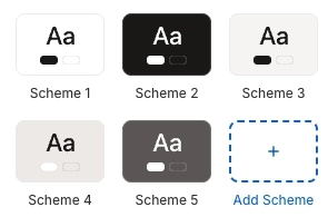
Inside Theme settings, click on Colors. You'll see a list of your existing color schemes. Boardwalk comes with a few pre-configured schemes to get you started.
Edit an Existing Scheme
Click on any scheme to expand it and see its color settings. Each scheme includes colors for the background, foreground, primary button, secondary button, and inputs. Click on any color swatch to open the color picker and choose a new color.
Note: Scheme 1 is special — it defines the color palette for pages that don't have sections, including policy pages, default template pages, and auto-generated pages. Make sure Scheme 1 works well as your base or default look.
Add a New Scheme (Optional)
To create a new color scheme, click the Add scheme button at the bottom of the list. Give it a name and set all its colors. You can create as many schemes as you need — for example, a light scheme, a dark scheme, and an accent scheme for promotional sections.
Apply Schemes to Sections
Navigate to any section in the Theme Editor. In its settings, look for the Color scheme dropdown and select the scheme you want to use. Many sections also offer separate color scheme options for cards, inner boxes, or other nested elements.
Save and Preview
Click Save in the Theme Editor. Preview your store across several pages to verify that your color schemes look consistent and that text remains readable against all background colors.
What's Inside a Color Scheme
Each color scheme in Boardwalk contains four groups of color settings. Together, they control the appearance of every visual element within a section that uses the scheme.
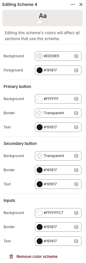
Background & Foreground
These are the two foundational colors in every scheme. The Background color fills the section area, while the Foreground color is used for text, icons, and links. Choosing colors with strong contrast between them ensures your content remains easy to read.
Background & Foreground Settings
The fill color for the section or card area. This color appears behind all content within the section. Supports transparency.
The color used for body text, headings, icons, and links within the section. Choose a color with strong contrast against the background for readability. Supports transparency.
Primary Button
Primary buttons are used for the most important actions on a page, such as "Add to Cart" or "Subscribe." These settings control the background fill, border, and text color of primary buttons within the scheme.
Primary Button Settings
The fill color of the primary button. Supports transparency — set to fully transparent if you want an outlined or "ghost" style primary button.
The border color of the primary button. Set to transparent to remove the border entirely. Supports transparency.
The color of the label text inside the primary button. Make sure this contrasts well with the button's background color. Supports transparency.
Secondary Button
Secondary buttons are used for less prominent actions, such as "Learn More" or "View Details." They're typically styled as outlined or understated buttons to create visual hierarchy alongside the primary button.
Secondary Button Settings
The fill color of the secondary button. This is commonly set to transparent to create an outlined button style. Supports transparency.
The border color of the secondary button. Often set to a visible color to define the button's outline when the background is transparent. Supports transparency.
The color of the label text inside the secondary button. Supports transparency.
Inputs
Input settings control the appearance of form fields such as email sign-up fields, quantity selectors, search bars, and contact form text boxes. Consistent input styling helps your forms feel like a natural part of the page.
Input Settings
The fill color inside text fields, dropdown menus, and other input areas. Supports transparency.
The border color surrounding input fields. Supports transparency.
The color of text typed into input fields. Choose a color that's easy to read against the input background. Supports transparency.
Where Color Schemes Are Used
Color schemes appear throughout the theme. Here are the most common places you'll see them referenced.
Common Color Scheme Locations
Nearly every section in the theme has a Color scheme setting. This controls the background, text, button, and input colors for the entire section.
Sections that display cards — such as product grids, testimonials, or collection lists — often have a separate Card color scheme setting. Use a different scheme from the section to make cards visually stand out against the section background.
Some sections offer a separate background color scheme to create layered or contrasting backgrounds within a single section area.
Sections with nested content areas — like hero sections with a content box on top of an image — may offer an Inner box color scheme to style the content container separately.
Some blocks include a Use section color scheme toggle. When enabled, the block inherits colors from its parent section rather than its own settings. This is useful for maintaining consistency when a block needs to blend into its surrounding section.
Important Notes
Keep these details in mind when working with color schemes.
Things to Know
Scheme 1 is automatically applied to pages that don't have sections — including policy pages, default template pages, and auto-generated pages. Treat it as your store's base palette.
Every color in a scheme supports transparency (alpha channel). This lets you create semi-transparent backgrounds, invisible borders, or ghost-style buttons. Use the opacity slider in the color picker to adjust transparency.
Always check that your foreground text has enough contrast against the background color. Low contrast makes text hard to read, especially for visitors with visual impairments. A good rule of thumb is to pair light backgrounds with dark text, or dark backgrounds with light text.
When you edit a color scheme, the change is applied everywhere that scheme is used across your store. This makes it easy to update your brand colors in one place, but be careful — a change to a widely used scheme will affect many sections at once.
Some sections and blocks offer individual color pickers (like arrow color or dot color on carousels) that override specific parts of the color scheme. These let you fine-tune individual elements without creating a new scheme.