About
Corner radius (sometimes called border radius) controls how rounded the corners of an element appear. A value of 0px produces perfectly square corners, while higher values create progressively rounder shapes. Corner rounding is a subtle but powerful design detail — it can make your store feel sharp and modern or soft and approachable, depending on the values you choose.
In the Boardwalk theme, the Corner Radius settings are found under Theme Settings and let you set the rounding for four categories of elements across your entire store: buttons, inputs, badges, and cards. These global settings ensure a consistent look without needing to adjust corners individually on every section. Some sections also offer their own corner radius overrides for more specific control.
How to Configure Corner Radius
Follow these steps to set the corner rounding for buttons, inputs, badges, and cards across your store.
Open Theme Settings
In your Shopify admin, go to
Online Store → Themes, find Boardwalk,
and click Customize. In the Theme
Editor, click the gear icon (⚙) in the
left sidebar to open Theme settings.
Navigate to Corner Radius
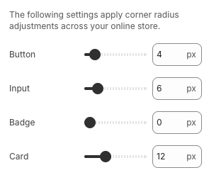
Inside Theme settings, click on Corner radius. You'll see four sliders — one each for buttons, inputs, badges, and cards.
Adjust the Button Corner Radius
Use the Button slider to control how rounded your buttons appear. Set to 0px for sharp square corners, or increase the value for rounder buttons. A high value (like 40px) creates a fully pill-shaped button. Range: 0px to 40px.
Adjust the Input Corner Radius
Use the Input slider to control the rounding on text fields, search bars, dropdown menus, quantity selectors, and other form elements. Range: 0px to 40px.
Adjust the Badge Corner Radius
Use the Badge slider to control the rounding on product badges — such as "Sale," "Sold Out," or custom labels that appear on product cards. Range: 0px to 40px.
Adjust the Card Corner Radius
Use the Card slider to control the rounding on product cards, collection cards, and other card-style elements throughout your store. Range: 0px to 40px.
Tip: For a cohesive look, try using similar values across all four sliders. For example, setting everything to 0px creates a sharp, geometric aesthetic, while values around 8–12px give a soft, modern feel.
Save and Preview
Click Save in the Theme Editor. Preview your store and check buttons, product cards, badges, and form fields across several pages to make sure the rounding looks consistent and matches your brand style.
Settings Reference
These settings are found under Theme settings → Corner radius in the Theme Editor. They apply corner radius adjustments across your entire online store.
Corner Radius Settings
Controls the corner rounding on all buttons throughout your store, including "Add to Cart," "Shop Now," newsletter sign-up buttons, and any other button elements. Range: 0px to 40px (in 2px increments). Set to 0px for square corners or 40px for a fully pill-shaped button.
Controls the corner rounding on form input fields, including text boxes, search bars, email sign-up fields, dropdown menus, and quantity selectors. Range: 0px to 40px (in 2px increments).
Controls the corner rounding on product badges and labels — the small tags that appear on product cards to indicate status like "Sale," "Sold Out," or "New." Range: 0px to 40px (in 2px increments).
Controls the corner rounding on card-style elements throughout your store, including product cards, collection cards, and other container elements that use the global card radius. Range: 0px to 40px (in 2px increments).
Global vs. Section-Level Corner Radius
The corner radius settings here set the baseline for your entire store. However, some sections and blocks include their own corner radius controls that can override the global value for specific elements.
How the Global Setting Works
The four sliders in Theme Settings apply across your entire store. Every button, input, badge, and card that doesn't have a section-specific override will use these values. This gives you a consistent default with minimal effort.
Section-Level Overrides
Some sections include their own corner radius settings
that let you customize rounding for elements within
that specific section. For example, the Testimonials
section has separate Testimonial card corner
radius and Product card corner
radius settings. Accordion groups offer
corner radius options like None,
Small, and Medium. The
Header section includes a Card corner
radius for mega menu cards. When a section
has its own corner radius setting, that value takes
priority over the global card setting for elements
within that section.
Block-Level Overrides
Individual blocks like images, forms, and page cards may also include a Corner radius setting. These block-level values override the global setting for that specific block only, letting you create intentional design variations — like a rounded image inside a sharp-cornered section.
Design Approaches
Here are some common ways to use corner radius settings to achieve different visual styles.
Style Guide
Set all four values to 0px. This produces perfectly square corners on every element, creating a clean, architectural feel. Works well with bold typography and minimal design.
Set values between 6px and 12px. This is a popular middle ground that softens edges without making elements look overly rounded. It feels approachable and contemporary.
Set values above 16px. Higher values produce noticeably round corners that feel friendly and casual. Setting buttons to 40px creates fully pill-shaped buttons, which pairs well with colorful, energetic designs.
You don't have to use the same value for everything. For example, pill-shaped buttons (40px) with square-cornered cards (0px) is a common combination that creates visual contrast between interactive elements and content containers.
Important Notes
Keep these details in mind when working with corner radius settings.
Things to Know
These four sliders apply globally across your entire store. Changing a value here updates every element of that type on every page — unless a section or block has its own corner radius override.
All four sliders move in 2px steps (0, 2, 4, 6, 8, and so on). This keeps values clean and consistent across your design.
If a section has its own corner radius setting, that value is used instead of the global one for elements within that section. This means you may need to update both the global setting and any section-specific overrides to achieve a fully consistent look.
The same radius value can look different on different-sized elements. A 10px radius on a large product card produces a subtle rounding, while the same 10px on a small badge creates a much more noticeable curve. Preview your store after making changes to make sure the proportions look right across all element sizes.