About
Layout controls the structural foundation of your store — how wide your content area is, and how much space sits between your content and the edges of the browser window. These settings affect every page on your store and establish the visual framework that all your sections and blocks live inside.
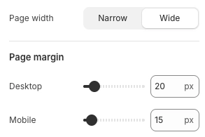
In the Boardwalk theme, the Layout settings are found under Theme Settings and include three controls: the overall page width, and separate page margin settings for desktop and mobile. Together, these determine how much horizontal space your content occupies and how much breathing room it has on each side. Individual sections can then choose to stay within this page width or stretch beyond it to fill the full screen.
How to Configure Your Layout
Follow these steps to set up the page width and margins for your store.
Open Theme Settings
In your Shopify admin, go to
Online Store → Themes, find Boardwalk,
and click Customize. In the Theme
Editor, click the gear icon (⚙) in the
left sidebar to open Theme settings.
Navigate to Layout
Inside Theme settings, click on Layout. You'll see the page width selector and page margin sliders for desktop and mobile.
Choose a Page Width
Select the maximum content width for your store. This
sets an upper limit on how wide your content area can
stretch on large screens. Boardwalk offers two options:
Narrow and Wide. On smaller
screens, the content area automatically shrinks to fit,
so this setting primarily affects how your store looks
on larger desktop monitors.
Tip: Narrow tends to
give a more focused, editorial feel — great for
stores with less content per row. Wide
takes advantage of larger screens and works well for
stores with multi-column product grids or galleries.
Set the Desktop Page Margin
Use the Desktop slider under Page margin to control the horizontal space between your content and the left and right edges of the browser window on desktop screens. Range: 10px to 100px.
Set the Mobile Page Margin
Use the Mobile slider under Page margin to control the same horizontal spacing on mobile devices. Range: 10px to 100px. A slightly smaller margin is common for mobile to make the most of the narrower screen.
Save and Preview
Click Save in the Theme Editor. Preview your store on different screen sizes to make sure the content width and margins look balanced. Pay particular attention to how your sections align with the header and footer.
Settings Reference
These settings are found under Theme settings → Layout in the Theme Editor.
Layout Settings
Sets the maximum width of your store's content area
on desktop. Options: Narrow or
Wide. Content is centered on the page
and will never stretch beyond this width, even on
very large monitors. On smaller screens, the content
area automatically adjusts to fit.
The horizontal space between your content and the left and right edges of the browser window on desktop screens. Range: 10px to 100px. This margin is applied on both sides, so a value of 20px creates 20px of space on the left and 20px on the right.
The horizontal space between your content and the left and right edges of the screen on mobile devices. Range: 10px to 100px. A smaller value gives your content more room on narrow screens, while a larger value adds more breathing room at the edges.
How Layout Works with Sections
The page width and page margin you set here establish a global framework, but individual sections have their own layout controls that work within (or beyond) these boundaries.
Section Width Options
Many sections offer a Section width
or Content maximum width setting.
When set to Page, the section content
stays within the page width you defined here. When set
to Full, the section stretches to fill
the entire browser window, ignoring the page width
limit. Some sections also offer a
Content option that constrains to the
page width, or a Full (edge to edge)
option that removes both page width and page margin
constraints.
Section Padding
Most sections include their own Desktop padding and Mobile padding settings with separate controls for top, bottom, and edge spacing. These paddings are applied inside the section itself and are independent of the global page margin. The edge padding on a section controls how much space sits between the section content and its own boundaries — not the browser window.
Content Width on Specific Pages
Some page types have their own width controls. For
example, the Article section has a
Content width setting that limits how
wide the article body, comments, and other content
blocks can be. The Article body block also offers its
own width setting with options like
Narrow and Medium. These
settings work alongside the global page width to give
you precise control over how content is displayed on
individual page types.
Grid Spacing
Sections that display content in a grid — such as product collections, galleries, or testimonials — often include a Column gap or Grid spacing setting. This controls the space between items within the grid and is separate from both the page margin and section padding.
Important Notes
Keep these details in mind when working with layout settings.
Things to Know
The page width and page margins you set here apply across your entire store. Every page — home, product, collection, blog, and more — uses this as its base layout structure.
When a section's width is set to Full,
it stretches beyond the page width to fill the
entire browser window. This is intentional — it lets
you create edge-to-edge hero banners, galleries, or
promotional sections while keeping other sections
constrained within the page width.
The global page margin and a section's edge padding are different settings. The page margin creates space between the browser window edge and your store's overall content area. A section's edge padding creates space within the section itself. Both can contribute to the total visible margin on a page, so keep both in mind when fine-tuning your layout.
The page width sets a maximum, not a minimum. On screens narrower than the page width value, the content area automatically shrinks to fit. The separate desktop and mobile margin sliders let you optimize spacing for each screen size independently.
The header, footer, and all page-width sections share the same page width and margin settings, so their content edges align vertically down the page. This creates a clean, consistent visual line throughout your store.
Frequently Asked Questions
Full
or Full (edge to edge) are designed to
ignore the global page width and stretch across the
entire browser window. This is common for hero
banners, image galleries, and promotional sections.
Other sections set to Page stay within
the page width you defined in Layout settings. You
can change any section's width in its own settings.
Narrow, try switching to
Wide to give your content more room.
Second, check the Page margin
sliders — a large value creates more space on the
sides. Reduce the margin to bring your content closer
to the screen edges. Also check the individual
section's edge padding settings, as those add space
on top of the global margin.