About
Typography is the style, arrangement, and appearance of text on your store. The fonts you choose set the visual tone for your brand — a sleek sans-serif feels modern and minimal, while a classic serif can feel sophisticated and editorial. Consistent typography makes your store look polished and helps customers focus on your content.
In the Boardwalk theme, the Typography settings are found under Theme Settings and let you choose two primary fonts: one for headings and one for body text. These two fonts form the foundation of your store's type system. Individual sections and blocks can then reference these fonts — along with two additional styles, Menu and Caption — to fine-tune how text appears in specific areas of your store.
How to Set Up Your Fonts
Follow these steps to choose and configure the fonts used across your Shopify store.
Open Theme Settings
In your Shopify admin, go to
Online Store → Themes, find Boardwalk,
and click Customize. In the Theme
Editor, click the gear icon (⚙) in the
left sidebar to open Theme settings.
Navigate to Typography
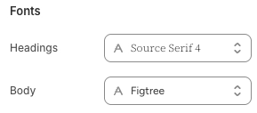
Inside Theme settings, click on Typography. You'll see a Fonts section with two font pickers — one for headings and one for body text.
Choose a Heading Font
Click the Headings font picker to browse Shopify's font library. This font is used for all major titles, section headings, and prominent text elements across your store. You can search by name or scroll through the available options. Shopify's library includes hundreds of free fonts from Google Fonts and other sources.
Choose a Body Font
Click the Body font picker to select the font used for paragraphs, descriptions, product details, and general content. Choose a font that's easy to read at smaller sizes, since body text appears throughout your store in many different contexts.
Tip: Pairing a serif heading font with a sans-serif body font (or vice versa) creates visual contrast and hierarchy. If you're unsure, stick with one serif and one sans-serif — they almost always complement each other.
Save and Preview
Click Save in the Theme Editor. Preview several pages of your store — including product pages, collection pages, and blog posts — to make sure both fonts look good at different sizes and in different contexts.
Settings Reference
These settings are found under Theme settings → Typography in the Theme Editor.
Font Settings
The font used for headings, section titles, and other prominent text elements throughout your store. This font is also referenced as the Heading option when individual blocks offer a font family setting. Choose a font that reflects your brand personality and works well at larger sizes.
The font used for paragraphs, descriptions, product details, and general content. This font is also referenced as the Body option when individual blocks offer a font family setting. Choose a font that's comfortable to read at smaller sizes and in longer passages of text.
The Font Style System
While the Typography theme settings only include two font pickers (Headings and Body), many individual blocks and sections across the theme offer a Font family or Text style setting with four options. These options reference the fonts you've chosen here, giving you fine-grained control over how text appears in specific areas.
Font Style Options
Uses the font you selected in the Headings font picker. Best for titles, section headings, and other large, prominent text that should carry your brand's visual identity.
Uses the font you selected in the Body font picker. Best for paragraphs, descriptions, and longer passages of content where readability is the priority.
A variation typically used for navigation links, labels, and interface elements. The Menu style is often rendered in a clean, compact way that works well for smaller UI text like buttons, breadcrumbs, and menu items.
A variation typically used for secondary or supporting text, such as image captions, meta information, dates, and small labels. The Caption style is designed to feel understated and complement the main content without competing for attention.
Where Font Styles Appear
Many blocks and sections throughout the theme give you the ability to choose which font style to use. Here are some common examples.
Blocks with Font Family Settings
These blocks include a Font family setting with all four options (Heading, Body, Menu, Caption), plus controls for font weight, font size, line height, and letter spacing.
These blocks offer a Font style setting with the same four options, along with font weight, font size, line height, and letter spacing controls.
Blog-related blocks include a Font family setting to let you choose which style to use for metadata text like dates, author names, and reading time indicators.
Content blocks like page descriptions and article comments offer font family settings so you can match the style to the surrounding section design.
Product cards within testimonial sections include a Product title font style setting that lets you pick from the same four options for the product name text.
Additional Typography Controls
Beyond font family, many blocks offer additional settings that let you further customize text appearance on a per-block basis.
Per-Block Typography Settings
A slider that controls the text size in pixels. Available on most text blocks. Each block has its own range depending on the type of content.
Controls how thick or thin the text appears. Common
options include Light,
Normal, Medium, and
Bold. Available on title-style blocks
such as page titles, article titles, and product
titles.
Controls the vertical spacing between lines of text. A higher value adds more breathing room, which can improve readability for longer passages. Available on blocks like titles and descriptions.
Controls the horizontal spacing between individual
characters. Options typically include
Tight, Normal,
Wide, and Extra wide.
Wider letter spacing is often used for uppercase text
or menu items to create an airy, editorial feel.
Reduces the visibility of text to create a softer, more subdued appearance. Useful for secondary or supporting text that shouldn't compete with headings or primary content. Available on blocks like descriptions, metadata, and counts.
Important Notes
Keep these details in mind when working with typography settings.
Things to Know
The fonts you choose here apply across your entire store. Changing a font in Typography settings will update every section and block that references that font style.
The font pickers use Shopify's built-in font library, which includes hundreds of web-safe fonts. These fonts are hosted by Shopify and load quickly for your visitors. Custom fonts uploaded outside the font library are not supported through these settings.
Each font you use adds to your store's page load time. Using two fonts (one for headings, one for body) is a good balance between visual variety and fast loading. Adding extra fonts through custom code could slow down your store.
Not all fonts support every language or character set. If your store is translated into multiple languages, check that your chosen fonts include the characters needed for each language. Fonts with broad Unicode coverage are the safest choice for multilingual stores.