About
A hero is the large, prominent banner that sits at the top of a page and sets the visual tone for your entire store. It's usually the first thing visitors see, so it's your best opportunity to make a strong first impression with bold imagery, a compelling headline, or a clear call to action.
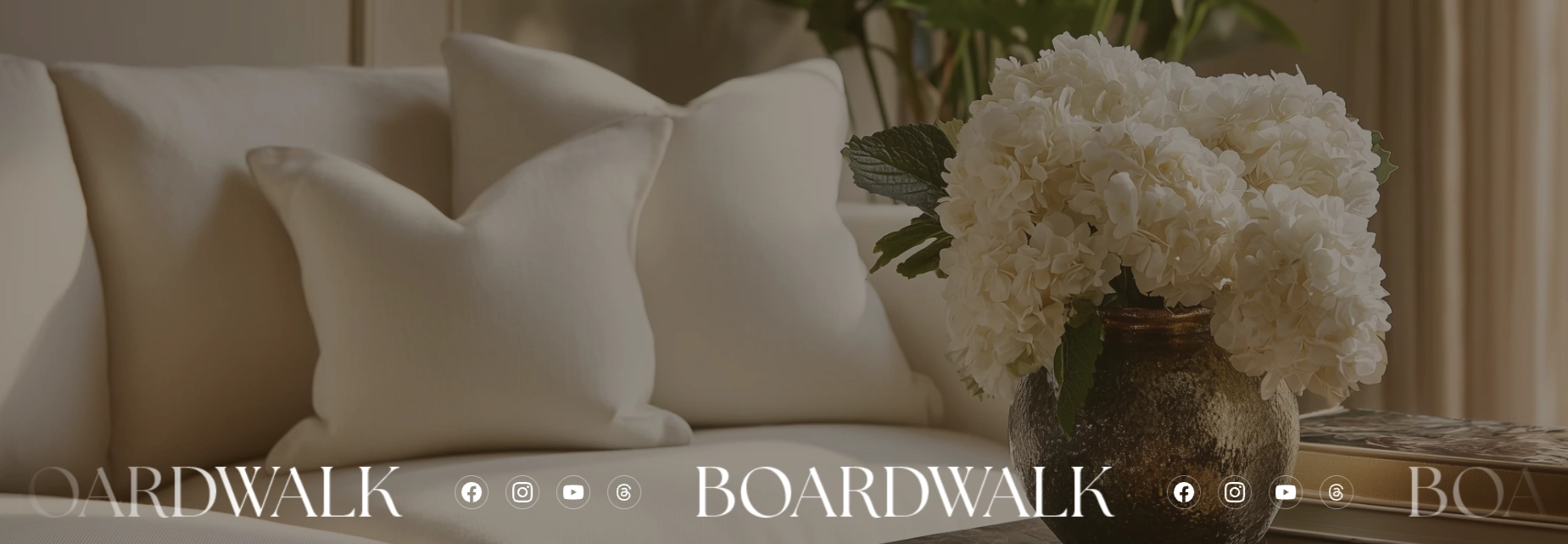
In the Boardwalk theme, the Hero section is a highly versatile full-featured banner that can display a background image, video, repeating pattern, or solid color behind your content. Content is organized through powerful Group parent blocks that accept more than 24 different kinds of theme blocks — including text, buttons, images, icons, and more. The section also supports a Scroll Reveal Text group for animated line-by-line text reveals and a Marquee block for continuously scrolling content such as logos, social icons, or short text phrases. For detailed information about the blocks available inside groups, see the Blocks › Group article.
How to Set Up the Hero Section
Follow these steps to add and configure a Hero section on any page of your Shopify store using the Boardwalk theme.
Open the Theme Editor
In your Shopify admin, go to
Online Store → Themes, find Boardwalk,
and click Customize. Navigate to the page
where you want to display a hero banner using the page
selector dropdown at the top center of the editor.
Add the Hero Section
Click Add section in the Theme Editor sidebar and choose Hero from the list. The section will appear on your page with a default Group block containing placeholder text. A second preset called Scroll reveal text is also available if you'd prefer an animated text-reveal layout.
Choose a Background
Click the Hero section in the sidebar to
open its settings. Under the
Media heading, choose your background
type: None for a solid color,
Image for a photo,
Video for a Shopify-hosted video, or
Pattern for a repeating tile image. Upload
or select your media file from the picker that appears.
Configure the Section Settings
Set the layout direction, section width, content width, image height, alignment, color schemes, overlay color, corner radius, and padding. These settings control the overall structure and appearance of the entire Hero section.
Add and Arrange Content Blocks
Inside the Hero section, add a Group, Scroll Reveal Text, or Marquee block. Groups are containers that hold your actual content — text, buttons, images, icons, and many more block types. Click Add block inside a Group to add content. You can add up to 3 top-level blocks in a single Hero section.
Note: Groups accept over 24 different theme block types as well as third-party app blocks. For a full list of available blocks and their settings, see the Blocks › Group article.
Fine-Tune the Overlay (Optional)
If you're using a background image, video, or pattern, use the Color overlay setting to add a tinted layer over the media. This helps text stand out against busy backgrounds. The overlay supports transparency, so you can adjust how much of the background shows through.
Save and Preview
Click Save in the Theme Editor. Preview your page to verify the background, content blocks, alignment, and any animations are displaying as expected.
Section-Level Settings
These settings apply to the entire Hero section and are accessible by clicking the top-level section in the Theme Editor sidebar.
Hero Section Settings
Controls how top-level blocks inside the Hero are
arranged. Horizontal places them side by
side, Vertical stacks them on top of each
other.
Sets the maximum width of the Hero section.
Page matches your theme's content width,
Full stretches the section to 100% of the
browser window.
Limits the width of the content area inside the Hero.
Options: Narrow, Page, or
Full. This is useful for centering text in
a narrower column even when the section itself is full
width.
Choose what appears behind your content. Options:
None (solid color from the section color
scheme), Image (a single photo),
Video (a Shopify-hosted video), or
Pattern (a repeating tile image).
Additional settings appear based on your selection.
Select a Shopify-hosted video to use as the background.
Only visible when Background media is set to
Video.
Select or upload a photo to use as the background. Only
visible when Background media is set to
Image.
Upload a small image to tile as a repeating pattern
across the background. Only visible when Background
media is set to Pattern. For best results,
use a seamless tileable image.
Controls how large each tile of the pattern appears.
Range: 50% to 300%. Only visible when Background media
is set to Pattern.
Sets the height of the Hero section. Options:
Adapt to image (matches the uploaded
image's aspect ratio), Small,
Medium, Large, or
Full screen (fills the entire browser
viewport).
Controls the horizontal position of the content inside
the Hero. Options: Left,
Center, Right, or
Space between.
Controls the vertical position of the content inside
the Hero. Options: Top,
Middle, Bottom, or
Space between.
Select any defined color scheme to style the section background and text. This is the outer wrapper color that shows behind the content area.
Select a color scheme for the inner content container. Use a different scheme from the section to create layered visual depth.
Adds a tinted color layer over the background media to
improve text readability. Supports transparency so you
can control how much of the background shows through.
Only visible when Background media is not set to
None.
Rounds the corners of the Hero section container. Range: 0px to 24px.
Controls the top and bottom padding of the section on desktop screens. Range: 0px to 100px.
Controls the top and bottom padding of the section on mobile screens. Range: 0px to 100px.
Available Blocks
The Hero section accepts up to 3 top-level blocks. Each block type serves a different purpose and offers its own set of settings.
Group
A flexible container that holds your content blocks. It accepts all theme blocks (over 24 types) as well as third-party app blocks. Use groups to organize headings, body text, buttons, images, icons, and other content into structured layouts. You can nest content horizontally or vertically, control alignment and spacing, and set padding independently.
- Layout direction — Horizontal or Vertical
- Width — Fit (shrink to content) or Fill (expand to available space)
- Height — Fit (shrink to content) or Fill (expand to available space)
- Content max width — Auto or Narrow (600px)
- Alignment — Text alignment, horizontal alignment, and vertical alignment
- Gap — Spacing between child blocks (0px to 100px)
- Padding — Horizontal and vertical padding (0px to 200px each)
Note: For a complete guide to all the block types available inside a Group — including text, buttons, images, icons, spacers, and more — see the Blocks › Group article.
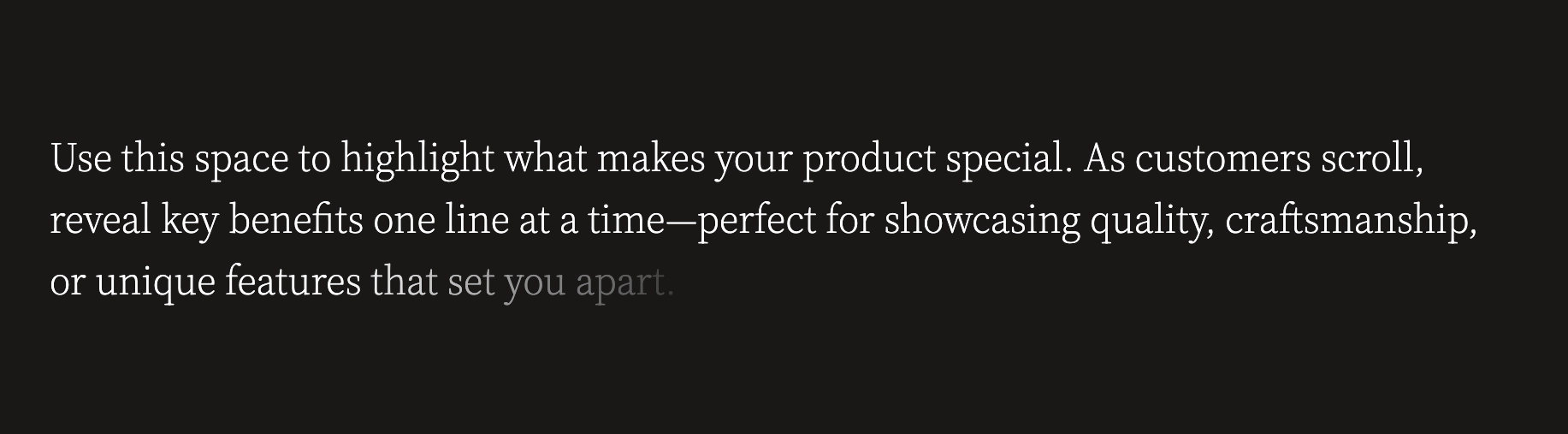
Scroll Reveal Text
A special group that reveals text line by line as visitors scroll down the page. This creates an engaging reading experience — perfect for highlighting product benefits, brand values, or key selling points one phrase at a time. The Scroll Reveal Text group accepts Text and Button blocks.
- Layout direction — Horizontal or Vertical
- Content max width — Auto or Narrow (600px)
- Alignment — Text alignment, horizontal alignment, and vertical alignment
- Desktop padding — Gap, horizontal, and vertical (0px to 200px each)
- Mobile padding — Gap, horizontal, and vertical (0px to 200px each)
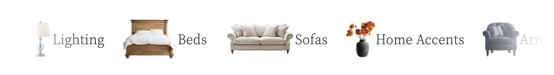
Marquee
A continuously scrolling horizontal band of content that loops infinitely. Use it to display brand logos, social media icons, short text phrases, or small images with text in a smooth, eye-catching animation. The marquee automatically pauses when a visitor hovers over it and respects the visitor's reduced-motion preferences for accessibility. The Marquee block accepts Logo, Social Icons, Text, and Image with Text blocks.
- Speed — Controls the scrolling speed (1x to 30x)
- Movement direction — Forward or Reverse
- Gap between items — Spacing between each item in the marquee (0px to 120px)
- Text style — Heading or Body font
- Font size — 20px to 80px
- Gradient edges — Adds a fade-out effect at the left and right edges for a smoother look
Built-In Features
The Hero section comes with features that work automatically — no apps or custom code needed.
Feature Overview
Choose between a static image, video, repeating pattern tile, or a simple solid color for the section background. Each option reveals its own set of related settings in the editor.
Add a tinted layer over background media to ensure your text stays readable against busy images or videos. The overlay supports adjustable transparency so you can fine-tune the balance between media and text visibility.
Arrange content horizontally or vertically using the layout direction setting. Combine with alignment options and Group blocks to build multi-column hero layouts, centered headline designs, or side-by-side image-and-text compositions.
The Scroll Reveal Text block gradually reveals content line by line as visitors scroll, creating an engaging storytelling effect that draws attention to your messaging.
Display a continuously scrolling band of logos, social media icons, text phrases, or small images. The marquee runs on a smooth, performance-optimized animation that pauses on hover and automatically respects the visitor's reduced-motion accessibility preferences.
Group blocks accept third-party app blocks, so you can add custom functionality from Shopify apps directly inside your Hero section.
The Hero section plays a slide-in entrance animation when it scrolls into view. This is handled automatically and requires no configuration.
When the Hero section is the first section on a page, background images are automatically loaded with high priority so they appear quickly. This helps improve perceived page speed for your visitors.
When using a background image, a subtle placeholder animation is displayed while the image loads. This gives visitors a visual indicator that content is loading rather than showing a blank space.
Admin Steps and Requirements
Some features require action in the Shopify admin before they'll work as expected in your theme.
Before You Begin
For the best experience, prepare your hero background image before configuring the section. High-resolution images work best. Go to Content → Files in your Shopify admin to upload images ahead of time, or upload them directly through the image picker in the Theme Editor.
If you want to use a video background, the video must be uploaded to your Shopify admin first. Go to Content → Files and upload your video file. Only Shopify-hosted videos are supported — external video links (such as YouTube or Vimeo) cannot be used as a background.
The Hero section has both a section color scheme and a container color scheme. These color schemes are defined in Online Store → Themes → Customize → Theme settings → Colors. Make sure you've set up the color schemes you want to use before configuring this section.
When using a pattern background, the image you upload is repeated (tiled) across the section. For a clean, professional look, use a seamless tileable image so the edges blend naturally where the tiles meet.
The Hero section cannot be placed inside the header area. It is designed for use in the main body of your page templates.
Frequently Asked Questions
Image (not None).
Then check that you've actually selected an image in
the Image picker that appears below
the media setting. If the image still doesn't appear,
try removing and re-selecting it.